Active Topics | Member List | Search | Help | Register | Login
The John Byrne Forum
Byrne Robotics > The John Byrne Forum << Prev Page of 95 Next >>
Topic: ELSEWHEN Inking &c Post ReplyPost New Topic
Author
Message
Eric Ladd
Byrne Robotics Member
Avatar

Joined: 16 August 2004
Location: Canada
Posts: 4506
Posted: 02 March 2019 at 6:21pm | IP Logged | 1 post reply

Lots of lines lost in this one with the image reduction, but still a good page to try to achieve that "zen" feeling.

Back to Top profile | search
 
Darren Taylor
Byrne Robotics Member
Avatar

Joined: 22 April 2004
Location: Scotland
Posts: 5994
Posted: 03 March 2019 at 7:59am | IP Logged | 2 post reply

Brilliant inks Eric. 

I made myself two PS-brushes for Kirby Krackle. One is my own design based on Kirby's effect and the other is based on John's Kirby-Krackle.

It is too easy to find oneself 'placing' rather than affecting the Krackle. Having a brush apply the Krackle allows me the freedom to 'paint' in the negative space, as you would do with any other tool.

Your Krackle is great, I just offer this as an alternative.


edit-I should note that the total time taken for these two demonstrative panels was five minutes. One could spend a lot longer fine-tuning things and adding whit krackle to accent some areas.


Edited by Darren Taylor on 03 March 2019 at 8:02am
Back to Top profile | search | www e-mail
 
Mike Baswell
Byrne Robotics Member
Avatar

Joined: 02 May 2004
Location: United States
Posts: 1966
Posted: 03 March 2019 at 9:15am | IP Logged | 3 post reply


This was a lot of fun on a slow day at work with some admittedly limited tools at my disposal, so please don't judge me too harshly. And this is a phone photo too, so ....

Back to Top profile | search e-mail
 
Darren Taylor
Byrne Robotics Member
Avatar

Joined: 22 April 2004
Location: Scotland
Posts: 5994
Posted: 03 March 2019 at 4:50pm | IP Logged | 4 post reply

Nice one Mike. I enjoy seeing photo's which include the tools used.
Back to Top profile | search | www e-mail
 
Eric Ladd
Byrne Robotics Member
Avatar

Joined: 16 August 2004
Location: Canada
Posts: 4506
Posted: 03 March 2019 at 5:18pm | IP Logged | 5 post reply

Darren, thanks for the brush suggestion. I do have Photoshop, but I am doing everything on the page. I need the practice.

Mike, take a photo or scan of just the art and reduce it to 600 pixels wide. Can't make heads or tails of your picture.

Here is my latest. Since JB added the lettering I thought it would be fun to add it to this page as well. What do you think?

Back to Top profile | search
 
Eric Ladd
Byrne Robotics Member
Avatar

Joined: 16 August 2004
Location: Canada
Posts: 4506
Posted: 03 March 2019 at 5:24pm | IP Logged | 6 post reply

Here is just the panels if anyone cares to comment.

Back to Top profile | search
 
John Wilcox
Byrne Robotics Member
Avatar

Joined: 04 January 2006
Location: United States
Posts: 73
Posted: 18 March 2019 at 11:56pm | IP Logged | 7 post reply

Nice work from all involved! Makes me miss my days as a colorist! (I can no longer color since my stroke back in 2013) A real treat to see all this!
Back to Top profile | search | www e-mail
 
Scott Barnett
Byrne Robotics Member
Avatar

Joined: 14 December 2018
Location: United States
Posts: 254
Posted: 19 March 2019 at 6:15am | IP Logged | 8 post reply

Eric,

That page is really stunning. I realize our host had a little something to do with that, too, but you really did a wonderful job with the inks.

Wow. I love your textures and your line weights.
Back to Top profile | search
 
Eric Ladd
Byrne Robotics Member
Avatar

Joined: 16 August 2004
Location: Canada
Posts: 4506
Posted: 24 March 2019 at 9:54am | IP Logged | 9 post reply

I messed up the lighting effect around the ship so this one goes on the "do over" pile.

Back to Top profile | search
 
Sebastien Herve
Byrne Robotics Member
Avatar

Joined: 10 March 2019
Location: France
Posts: 48
Posted: 25 March 2019 at 1:46pm | IP Logged | 10 post reply

Mr. Ladd, your inking work is very respectful of JB's work, and very interesting. The raw material is of course exceptional. The whole thing makes me really dream (and sorry for my bad English).
Back to Top profile | search
 
Paul Wills
Byrne Robotics Member
Avatar

Joined: 18 August 2018
Location: United States
Posts: 833
Posted: 25 March 2019 at 11:49pm | IP Logged | 11 post reply


I've always loved John's jungle scenes. I got a kick out of inking this page. Every single panel space was filled with detail (quite a bit was lost with limited resolution for posting).
Back to Top profile | search | www e-mail
 
Eric Ladd
Byrne Robotics Member
Avatar

Joined: 16 August 2004
Location: Canada
Posts: 4506
Posted: 28 March 2019 at 8:11am | IP Logged | 12 post reply

Paul, you and I seem to be fairly consistent with postings so I wanted to give you my two cents. First, I recently picked up two new inking tools I want to suggest to you. Marvy Le Pen Drawing pens are fantastic! I've tried lots of different brands of pens from Rapidograph to Microns. I picked up the Le Pen Drawing pens and like them the most. You may have different tastes, but this is my go to "tech pen" for inking. I also picked up the hard and soft versions of Tombow Fudenosuke Brush Pens and like them for the same kind of work you might do with a crow quill. I still like brush and quill, but these additional tools might come in handy if you care to give them a try.

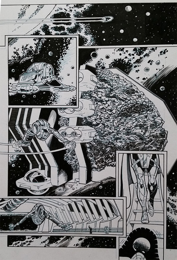
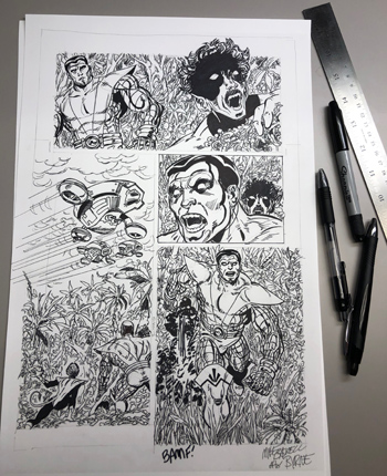
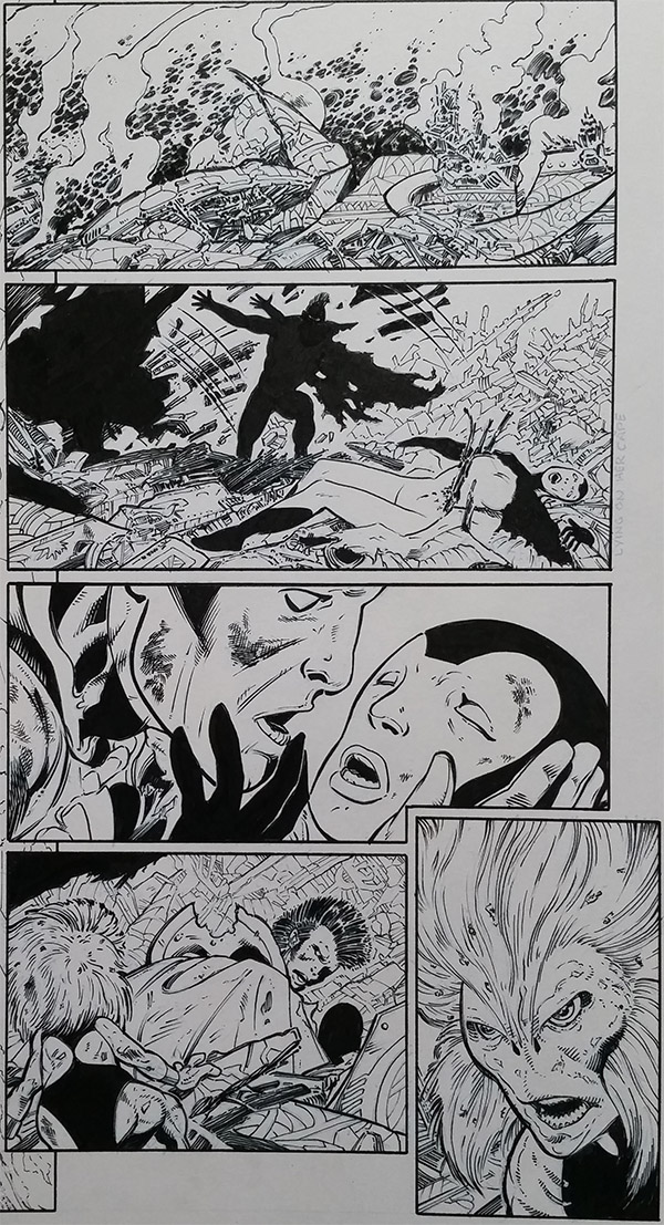
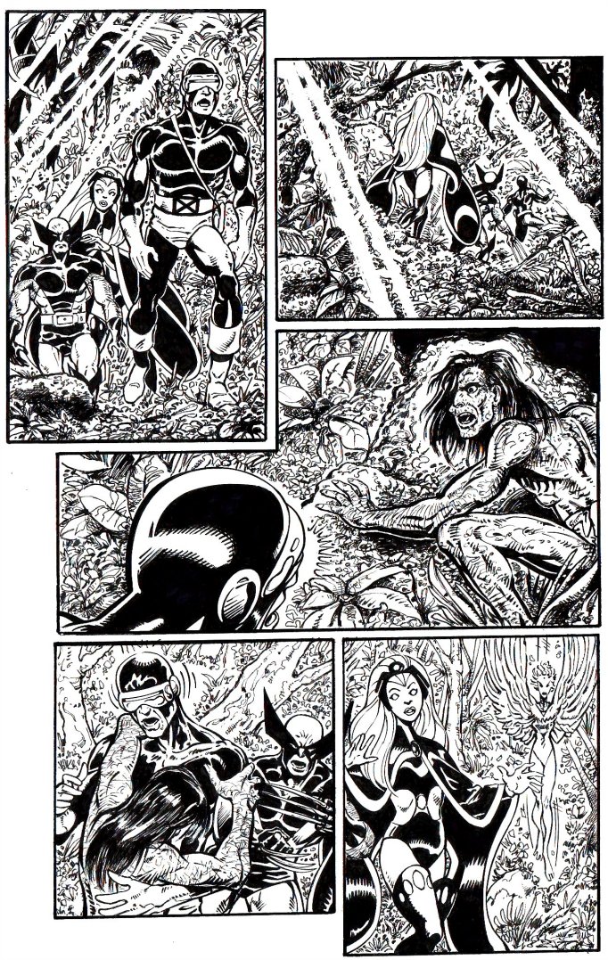
First off, take everything with a grain of salt because 600 pixels wide reduces lots of detail and I'm also not a pro. I think your page looks good and there is lots of improvement month over month. I suggest you keep working on the line weights that define your figures. Panel one has a huge challenge to make Wolverine look like he is in front of Storm. The foliage in panel one at the top is nice. It is well defined, but as you move down the panel the foliage gets flat. JB drew lots of indications of plant life, but also suggested that his "argle bargle" needs to be interpreted by the inker. Make the plant life more definite.

Panel two is better at showing depth with the foliage, but try to determine what is close and what is far away and use line weights to add more depth in that panel. No other panel has a longer field of depth on the page so you can make that panel stand out if the viewer's eye has the chance to travel "into" the panel.

Panel three gives you some depth with the different line weights between Cyclops, the jungle and Sauron, but you need a different texture on the rocks and plants to trick the viewer into seeing the jungle. The feathering on Cyclops also will work better if you can get sharper points on those lines.

Panels four and five seem like your strongest and I wonder if you worked down the page. Again, I suggest you go ahead and interpret the foliage in both panels. That will help separate the winged figure in panel five. Take a look at how well Storm pops off the page in panel five because of the different directions and density of the lines for her hair surrounded by the foliage.

I'm not trying to tear you down and see lots of good stuff here, but I think your frequency of posts to this thread means you don't need me to just tell you what I like. I'm looking forward to your next page!
Back to Top profile | search
 

<< Prev Page of 95 Next >>
  Post ReplyPost New Topic
Printable version Printable version

Forum Jump
You cannot post new topics in this forum
You cannot reply to topics in this forum
You cannot delete your posts in this forum
You cannot edit your posts in this forum
You cannot create polls in this forum
You cannot vote in polls in this forum

 Active Topics | Member List | Search | Help | Register | Login