| Posted: 23 February 2010 at 7:23am | IP Logged | 8
|
post reply
|
|
Sergio,
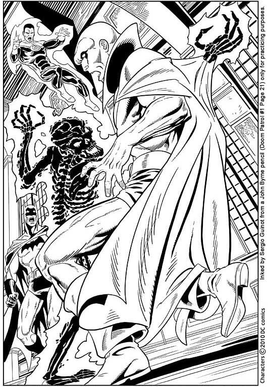
As others have noted, it's pretty good. Line weights is really the only thing that needs to be watched.
The line weight itself has three different functions, one as it has been mentioned, is to do with light/dark - a thicker line is the beginning of shadow (got that from Klaus Janson's book in inking, get it, it's good) For this picture you would need to consider if the bad guy is the sole source of light, or are there others as well? This is where is could get really complicated. Does GL generate a light source? If so, that would effect Batman. There are windows there, is it day or night outside. Does the room have any lights? Are they electrical or natural? Lots of things to consider so it's always best to keep it simple, and if in doubt, consult the penciler.
The second function, also mentioned, is to separate the different planes (back, mid and foreground) A good way to work through this is to start at the back and work forward. Until you're really confident and know what you're doing, if you start at the front (which most people do as it's most exciting part and you want to get to it straight away) then you might find that you've reached a certain point where you can't go thinner, (remember that ultimately this piece would be for reproduction so that needs to be taken into consideration. Too thin and the lines would break up, or merge when printed) and it would mean that you either have the same line weight, or you have to go over what's already been done. Potentially this picture could have five different planes, one for each character (if GL is at a different distance from us as Batman) and the background. But keeping it simple is always best, so I would put them on the same plane.
The third thing is that it adds mass and weight to what's being drawn. If you think about it, the little finger is not as big as the bicep, so why would they have the same line thickness? This is the same for hair, cloth, fur, whatever. Using JB for example, look at the Demon commission (in the commissions section) that he did early last year. See how the thickness of the lines gives you a sense that the muscles are not only pretty big, but they're solid as well. A lot of his Wolverine pics are a good example of that. These people look mean and solid. Notice how one line can go from thin to extremely thick in one swish, again this adds to the feeling of mass. Having a contrast between thick and thin lines also helps with the dynamics of the art as well, keeps the drawing alive.
Using Adam Hughes/Alfonse Mucha as an example notice how there are thick outlines, and then thin lines inside. But within this, there are a variety of lines. Adam Hughes is very good at this, but notice how all his pictures look still? If he varied the lines up a bit more, the images would have a lot more dynamics, but still keep that slickness. Like Alan Davis.
Hope this has been helpful, and not coming off like a lecture. It's just that inking isn't a easy to sum up.
One thing I would advise though, is to practise a lot with the tools in real life, even if you only want to work digitally, at least that way you can get a feel for how they're supposed to react in the real world and it can help you get better at this. It will help you get that smoothness and fluidity that all the really good inkers have. (even the rough looking ones) Brian Bolland and Dave Gibbons now pretty much work digitally, but their stuff wouldn't look as good if they couldn't've done it in the real world. Take a look at Killing Joke, if you haven't already, that was inked 100% with a brush. I find that depressing and inspiring at the same time.
Look forward to seeing some more.
|