| Author |
|
Ian Carroll
Byrne Robotics Member

King Of Pain
Joined: 01 May 2004
Location: United States
Posts: 526
|
| Posted: 02 June 2007 at 5:48am | IP Logged | 1
|
post reply
|
|
As for Romita Jr, while I believe he is one of the best ever, I think
his peak was Daredevil. After that, I think there has been some
decline. His Spider-Man started looking more like a stick figure than
an actual person as he progressed in his ASM run.
I understand what you're saying, Thanos. JRJR is one of my all-time favorites, but I think something happened behind the scenes that caused him to change the way he drew Spider-Man that was NOT an improvement over the way he drew the character previously. Some thoughts on that:
1. JRJR's Peter Parker/Spider-Man of the 1980s was the nerd grown up, filled out and pretty darn cool. (JB's PP/SM in MTU was similar in approach, I thought.) Romita's interpretation was derived more from his father's relatively "hunky" version of the character than from Steve Ditko's. (For a more Ditko-esque 1980s version, see Ron Frenz's run on Amazing Spider-Man.)
One thing I really loved about JRJR's 1980s Spider-Man was how he really seemed no taller than 5'10" (as he is supposed to be), and that JRJR's poses made the character seem spring-loaded -- he was always doing interesting stuff with SM's feet. He also did a better job than his dad at making PP and SM the same build (see Amazing #249), so it was more believable that PP was in the suit.
2. When JRJR returned to PP/SM during the Clone Saga, he was still drawing "his" version, but in his blockier post-DAREDEVIL style. It seems that a short while after the "Revelations" storyline concluded, for some reason* JRJR made a conscious, progressive effort to "slim down" his version of PP/SM (perhaps to make him like JB's now more Ditko-esque version in Chapter One, and in the companion regular title to JRJR's Spider-book?). I think this was an unfortunate evolution, as by the time of Straczynski's run, JRJR's PP/SM was often depicted as much too lean and boney -- the Amazing Skinny-Man.
I won't say "his old stuff was better," because JRJR is today one of the best superhero artists alive -- budget permitting, I'll buy anything he draws -- but I do wish he hadn't so often made PP/SM look anorexic!
*I believe I read somewhat that JRJR was told to make PP/SM skinnier because after JRJR had been doing books like PUNISHER and THOR, the editor felt he was making PP/SM "too big."
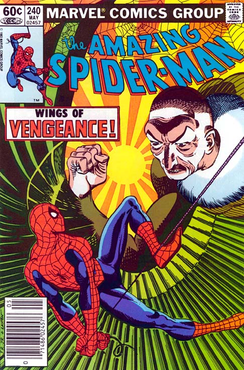
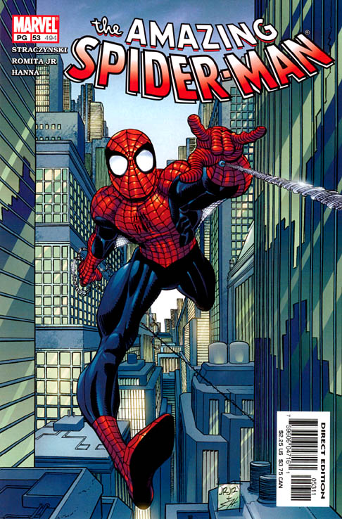
He still drew neat feet though (I felt this cover was really close to being the JRJR's 1980s model Spidey, but in his current penciling style):
Edited by Ian Carroll on 02 June 2007 at 6:44am
|
| Back to Top |
profile
| search
|
| |
Ted Pugliese
Byrne Robotics Member

Joined: 05 December 2005
Location: United States
Posts: 7982
|
| Posted: 02 June 2007 at 6:11am | IP Logged | 2
|
post reply
|
|
I'm pretty sure Williamson inked Man Without Fear as well. I think there are plenty of talented guys, such as Williamson and Dan Green, that do well inking Romita Jr. I just think the stuff with Klaus is the best.
He did, Paul, and I agree with you (again) about John & Klaus.
|
| Back to Top |
profile
| search
| www
|
| |
Paulo Pereira
Byrne Robotics Member

Joined: 24 April 2006
Posts: 15539
|
| Posted: 02 June 2007 at 9:09am | IP Logged | 3
|
post reply
|
|
I don't think that that Spider-Man is skinny, so much as wiry.
|
| Back to Top |
profile
| search
|
| |
Matt Reed
Byrne Robotics Security
Robotmod
Joined: 16 April 2004
Posts: 36482
|
| Posted: 02 June 2007 at 11:37am | IP Logged | 4
|
post reply
|
|
Stephen Robinson wrote:
| I would prefer personally if people just said that the finished product didn't suit them but saying it's "rushed" implies something that can't be proven. |
|
|
Seconded. That page from ETERNALS posted one page back does not, in any way, look "rushed". It may not suit a particular consumer's taste, but said consumer can't in all honesty say it looks "rushed" unless they were sitting down at the drawing table with JRjr.
Personally, I think JRjr has only gotten better with age and this is written by a fan who has followed his work for almost his entire career. As much as I love his "old stuff", I'll take what he's currently drawing any day o' the week and three times on new release Wednesday.
|
| Back to Top |
profile
| search
|
| |
John Byrne
Grumpy Old Guy
Joined: 11 May 2005
Posts: 135846
|
| Posted: 02 June 2007 at 11:45am | IP Logged | 5
|
post reply
|
|
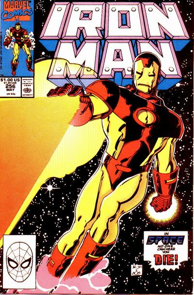
Perhaps he needs a better inker like Bob Layton.*** Okay, I cannot and will not let this statement stand. Layton butchered JR's pencils. That IRON MAN cover is a typical example. The grotesque anatomical distortions come not from Romita, but Layton, who had a very, very bad habit of fixing things he did not understand or know how to draw properly himself.Compared to what Layton did to JR's pencils, "Nelson" faithfully traced every line I drew on ACTION COMICS.
|
| Back to Top |
profile
| search
|
| |
Paul Greer
Byrne Robotics Security

Joined: 18 August 2004
Posts: 14203
|
| Posted: 02 June 2007 at 11:53am | IP Logged | 6
|
post reply
|
|
I think it has been said a million times. But I'll say it again. If you only liked JRJr when Bob Layton was inking him, you are really a Bob Layton fan not a John Romita Jr. fan.
Edited by Paul Greer on 02 June 2007 at 11:53am
|
| Back to Top |
profile
| search
|
| |
Paulo Pereira
Byrne Robotics Member
Joined: 24 April 2006
Posts: 15539
|
| Posted: 02 June 2007 at 2:11pm | IP Logged | 7
|
post reply
|
|
The cover of Iron Man #126 looks weird, but Layton did a much better job
for the cover of #256.
Edited by Paulo Pereira on 02 June 2007 at 2:12pm
|
| Back to Top |
profile
| search
|
| |
Michael Arndt
Byrne Robotics Member

Joined: 26 April 2004
Posts: 8593
|
| Posted: 02 June 2007 at 2:15pm | IP Logged | 8
|
post reply
|
|
Looking forward to seeing his work on the Fantastic Four.
|
| Back to Top |
profile
| search
e-mail
|
| |
John Byrne
Grumpy Old Guy
Joined: 11 May 2005
Posts: 135846
|
| Posted: 02 June 2007 at 2:39pm | IP Logged | 9
|
post reply
|
|
Hey, it is all opinion.� They said it looked rushed to them.*** It is impossible for a piece of artwork to look "rushed". It can look rough. It can look sketchy. It can look unfinished. It can look like an absolute piece of shit, but it cannot possibly, under any circumstances short of standing by the artists shoulder and watching the piece being drawn, look "rushed".
|
| Back to Top |
profile
| search
|
| |
John Byrne
Grumpy Old Guy
Joined: 11 May 2005
Posts: 135846
|
| Posted: 02 June 2007 at 2:42pm | IP Logged | 10
|
post reply
|
|
Yes it is my opinion that Romita's latest stuff looks rushed and not as detailed as his earlier work.*** Then you should shove that opinion back up your ass where it came from. "Not as detailed" does not in any way indicate the amount of time an artist has spent working on a piece. There are artists who can cram wall to wall detail into their work and take almost no time at all. There are others who labor to produce minimalist works. There are those who rush, and there are those who take painstaking effort -- but who is who can never be recognized solely from the work.
|
| Back to Top |
profile
| search
|
| |
Michael Kane
Byrne Robotics Member

Joined: 05 July 2005
Location: United States
Posts: 481
|
| Posted: 02 June 2007 at 3:15pm | IP Logged | 11
|
post reply
|
|
a key not to keep in mind as stated in the interview , is that the reason JRjr is
known to be a fast artist is because back in the early eithties they actualy
had stringent deadlines. you could find yourself out of a job if you could
not finish your work on time.
as far as his art is concerned what I find enjoyable is the he is able to employ
such movement and animation in his characters without the use of motion
or speed lines.
|
| Back to Top |
profile
| search
| www
|
| |
Brian Floyd
Byrne Robotics Member

Joined: 07 July 2006
Location: United States
Posts: 8825
|
| Posted: 02 June 2007 at 3:23pm | IP Logged | 12
|
post reply
|
|
I just got back from the convention, and I pretty much agree with JB's two responses above.
I watched JRJr at work on several sketches, and I can most definitely tell you he does not rush, and the sketches came out looking just as good his published work because he was actually taking the time to make them look good instead of rushing his work and he was extremely funny and gracious. One fan I saw in line in front of me and later talked to at another artist's booth was getting sketches of James Bond from various artists at the convention, and JRJr's version really blew me away. (I was close enough to see JRJr working on it)
As I've said before, Layton is good at designing tech and costumes and armor, but JB hit the nail on the head when he said Layton had a habit of fixing things that didn't need to be fixed when he inked JRJr's work
(For the record, I got a classic Iron Man sketch from JRJr, which I'll probably get around to scanning and posting a picture of sometime tomorrow. I'm wiped out right now. My best friend was with me and he got a Mary Jane sketch from him that I thought looked really great)
|
| Back to Top |
profile
| search
e-mail
|
| |


