| Posted: 21 July 2013 at 7:45am | IP Logged | 6
|
post reply
|
|
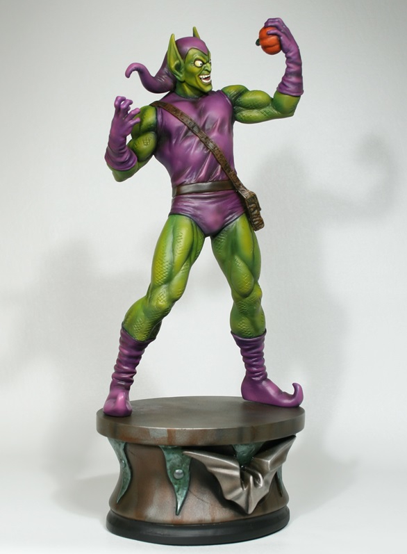
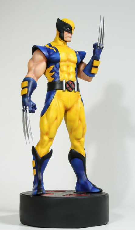
That "Astonishing Wolverine" statue points up something I have noted occurring with increasing frequency as the actual creators move further and further back into the Mists of Time.Designs -- superhero costumes, the starship Enterprise, comicbook corportate logos, etc -- start our pretty simple and straightforward. Then, over the years, they become more designy -- and often not in a good way. They start to be less and less representative of what they are, and more and more about some Art Department geek's idea of COOL. Wolverine's original blue and yellow costume design made no sense from a practical viewpoint (A blue and yellow wolverine? Sure, if he belongs to a Michigan football team!) but at least is was SIMPLE. It was EASY TO DRAW. Not so the one posted above, which has the basic elements of the original sort of inside out, with extra STUFF tacked on for no apparent reason. Except, of course, to be COOOOOOL.....!!
|