| Author |
|
Ed Deans.
Byrne Robotics Member

Joined: 28 November 2004
Location: United States
Posts: 857
|
| Posted: 22 April 2005 at 2:45am | IP Logged | 1
|
|
|
Shaun Crowell wrote:
| What color is the cape? It looks like it is dark red or maroon. |
|
|
From the USA Today article...
QUOTE:
| Costume designer Louise Mingenbach preserved
the blue, red and yellow motif, but the shades are slightly darker than
the bright primary colors of the comics. Superman's yellow belt is more
golden, and his cape is a deep scarlet. |
|
|
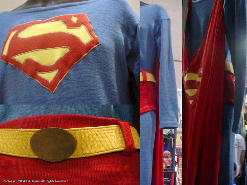
EDIT: Here's a constrast with George Reeves' "The Adventures of Superman" costume.
Edited by Ed Deans. on 22 April 2005 at 4:00am
|
| Back to Top |
profile
| search
|
| |
John Staton
Byrne Robotics Member

Joined: 04 May 2004
Location: United States
Posts: 655
|
| Posted: 22 April 2005 at 4:52am | IP Logged | 2
|
|
|
imho
Damned if you and damned if you don't.
Some people out there wanted to see a material close to Spider-Man's... check!
I could only imagine the outcry, if the old Reeve costume was used.
I can live with the belt, looks a helluva lot better than Batman's (movie) mask.
*Whew* it could've been a lot worse.
|
| Back to Top |
profile
| search
e-mail
|
| |
John Byrne

Robot Wrangler
Joined: 16 April 2004
Location: United States
Posts: 102266
|
| Posted: 22 April 2005 at 4:57am | IP Logged | 3
|
|
|
The "S" on the belt is really not necessary.
******
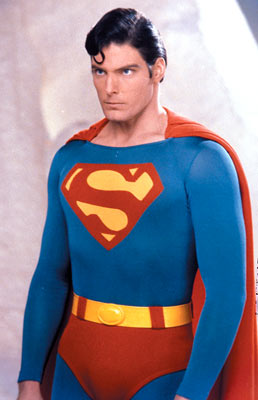
The version used in the Christopher Reeve movie
originally had the S emblem on the belt buckle. After
a visit to the DC offices, Reeve learned this was not
how it looked and insisted it be changed. He wanted
the costume to be as seen in the current comics --
you know, accurate
The one seen above reminds me of those cheesy
old Hallowe'en costumes I used to loathe as a kid,
where Batman would have "Batman" written on his
forehead.
This movie remains on my "Must Miss" list.
|
| Back to Top |
profile
| search
| www
|
| |
Mike Norris
Byrne Robotics Member

Joined: 16 April 2004
Location: United States
Posts: 4272
|
| Posted: 22 April 2005 at 4:59am | IP Logged | 4
|
|
|
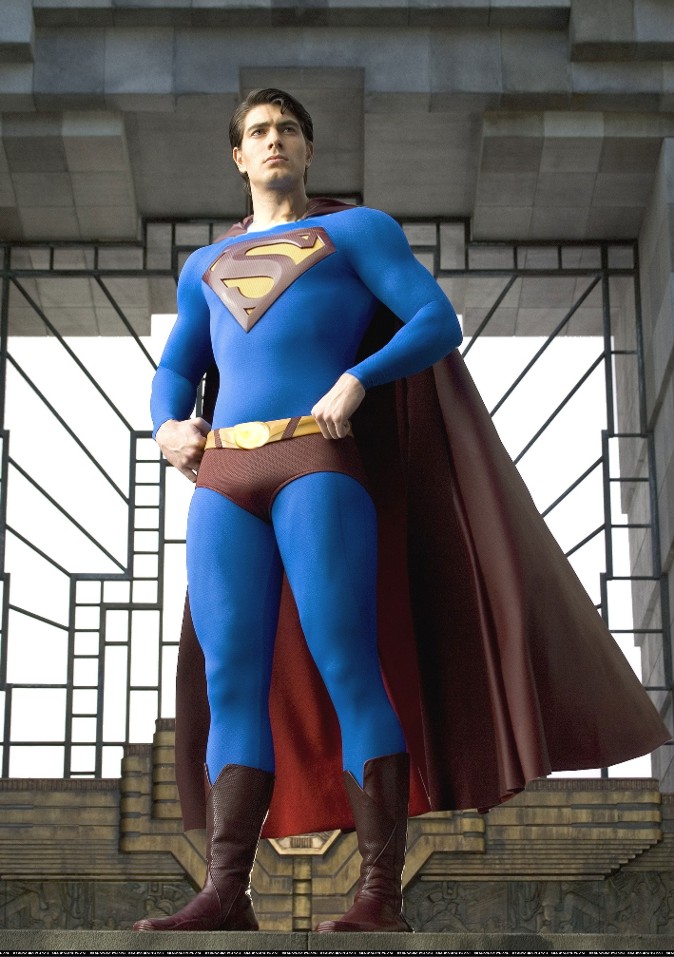
My alterations:
|
| Back to Top |
profile
| search
e-mail
|
| |
John Byrne

Robot Wrangler
Joined: 16 April 2004
Location: United States
Posts: 102266
|
| Posted: 22 April 2005 at 5:00am | IP Logged | 5
|
|
|
There's something not right about the shorts or the
wasteline.� I can't put my finger on it.� Maybe the
smaller emblem is what makes it look strange.
*****
The trunks are too short. Their tops -- the belt line --
should circle his waist. These look look like hip
huggers -- like they're going for Speedos.
Also note that the spit curl is backwards. Superman
was originally drawn with a backward-S shaped curl
of hair above his forehead, but that reversed to the
familiar S shape decades ago.
|
| Back to Top |
profile
| search
| www
|
| |
Joe Hollon
Byrne Robotics Member

Joined: 08 May 2004
Location: United States
Posts: 13739
|
| Posted: 22 April 2005 at 5:12am | IP Logged | 6
|
|
|
My thoughts:
This Superman has brown hair.
Why can't they make his cape red? Is that so difficult?
If you just look at that dude from the neck up, even WITH the
curl there is no way you would say, "That's Superman!"
|
| Back to Top |
profile
| search
| www
e-mail
|
| |
John Byrne

Robot Wrangler
Joined: 16 April 2004
Location: United States
Posts: 102266
|
| Posted: 22 April 2005 at 5:31am | IP Logged | 7
|
|
|
I wonder how that chest emblem will work when he
moves his arms? I was grousing recently about how
Alex Ross painted Superman's costume for the
cover of the "DC Enclyclopedia", covering the chesk
with the wrinkles that would, indeed, be formed by
someone folding his arms when wearing the suit --
and thus turning Superman into just a guy in a
homemade costume. I can't imagine how this 3D,
rubbery thing will work. (I also suspect the picture
has been airbrushed within an inch of its life, as
there are no wrinkles in the fabric.)
Points for them not making it shiny, tho. . . .
|
| Back to Top |
profile
| search
| www
|
| |
John Byrne

Robot Wrangler
Joined: 16 April 2004
Location: United States
Posts: 102266
|
| Posted: 22 April 2005 at 5:41am | IP Logged | 8
|
|
|
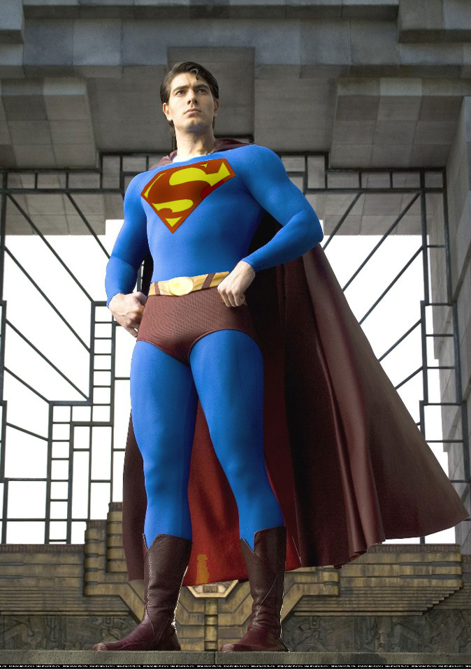
Further tweaking. . .
|
| Back to Top |
profile
| search
| www
|
| |
James Wright
Byrne Robotics Member

Joined: 16 April 2004
Location: United States
Posts: 1062
|
| Posted: 22 April 2005 at 5:46am | IP Logged | 9
|
|
|
The trunks are too short. Their tops -- the belt line --
should circle his waist. These look look like hip
huggers -- like they're going for Speedos.
===
That's it! Speedos bug me even if they aren't on Superman. Tell that fella to put a real S on his chest and pull his shorts up!
Edited by James Wright on 22 April 2005 at 5:47am
|
| Back to Top |
profile
| search
|
| |
Gerry Turnbull
Byrne Robotics Member

Joined: 16 April 2004
Location: Scotland
Posts: 8766
|
| Posted: 22 April 2005 at 5:52am | IP Logged | 10
|
|
|
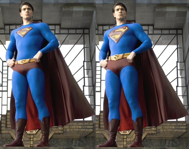
with just a couple of changes, the emblem and the trunks, this would have worked.
|
| Back to Top |
profile
| search
| www
e-mail
|
| |
Ed Deans.
Byrne Robotics Member

Joined: 28 November 2004
Location: United States
Posts: 857
|
| Posted: 22 April 2005 at 5:57am | IP Logged | 11
|
|
|
The "gold standard" around here, shown for comparison purposes:
|
| Back to Top |
profile
| search
|
| |
Mark Cookson
Byrne Robotics Member

Joined: 16 April 2004
Location: United Kingdom
Posts: 108
|
| Posted: 22 April 2005 at 6:09am | IP Logged | 12
|
|
|
I don't like it!
Although it is faintly reminiscent of a 'golden age' outfit with the high neck and the small symbol.
I like the proposed changes in respect of the trunk height and size of the 'S'. But, it's far too late now.....
Still - we all knew that it wasn't gonna beat Reeves' outfit.
|
| Back to Top |
profile
| search
| www
e-mail
|
| |


