| Author |
|
Shaun Crowell
Byrne Robotics Member

Joined: 16 April 2004
Location: United States
Posts: 874
|
| Posted: 23 February 2008 at 1:00pm | IP Logged | 1
|
|
|
You could have just left them out like the bottom panel JB. Since you don't do backgrounds anyways...
Edited by Shaun Crowell on 23 February 2008 at 1:04pm
|
| Back to Top |
profile
| search
e-mail
|
| |
Jason Schulman
Byrne Robotics Member

Joined: 08 July 2004
Location: United States
Posts: 2473
|
| Posted: 23 February 2008 at 1:04pm | IP Logged | 2
|
|
|
Somehow I never noticed that McFarlane was swiping JB back when I bought those Hulk issues -- both the JB issues and the McFarlane issues! I shoulda paid more attention!
|
| Back to Top |
profile
| search
|
| |
Avi Bastermagian
Byrne Robotics Member

Joined: 19 February 2008
Location: United States
Posts: 27
|
| Posted: 23 February 2008 at 1:04pm | IP Logged | 3
|
|
|
Wow, these McFarlane swipes are appalling. How did the editor in charge at the time miss these? Actually, would that be something that an editor would even keep an eye out for?
|
| Back to Top |
profile
| search
|
| |
Shaun Crowell
Byrne Robotics Member

Joined: 16 April 2004
Location: United States
Posts: 874
|
| Posted: 23 February 2008 at 1:09pm | IP Logged | 4
|
|
|
It is interesting too that the artwork on the swipes is inferior (in my opinion) to the originals.
|
| Back to Top |
profile
| search
e-mail
|
| |
Greg Reeves
Byrne Robotics Member

Joined: 06 February 2006
Location: United States
Posts: 1396
|
| Posted: 23 February 2008 at 1:13pm | IP Logged | 5
|
|
|
QUOTE:
| You extolled Quesada for his linework in his homage cover and criticized McFarlane for his weak linework. Well, where are the lines in McNiven's work? |
|
|
Oh, I much prefer the thick lines and shadow of both the Quesada piece and the Miller piece, when it comes to faces; but we were talking about the hair in the McNiven piece (even so, the thin lines in McNiven's faces are, to me, so much more accurate and precise to what a face conveyed with pen and ink should look like than the haphazard scratchings of McFarlane). Yes, as JB stated, Wolverine's hair had been portrayed mostly in the way Miller had done it then, (which was fine and great) but isn't staying too "on-model" risky as every entertainment medium evolves with talent and technology? I believe anyone new to comics (not trained to "understand" older comic art) might see that Miller headshot as Logan wearing a solid immovable headpiece (or at least look very dated).
Edited by Greg Reeves on 23 February 2008 at 1:15pm
|
| Back to Top |
profile
| search
|
| |
Paulo Pereira
Byrne Robotics Member

Joined: 24 April 2006
Posts: 15539
|
| Posted: 23 February 2008 at 1:31pm | IP Logged | 6
|
|
|
QUOTE:
| (even so, the thin lines in McNiven's faces are, to me, so much more accurate and precise to what a face conveyed with pen and ink should look like than the haphazard scratchings of McFarlane). |
|
|
You can hardly tell pen and ink was used in the McNiven piece, if it was used at all.
QUOTE:
| Yes, as JB stated, Wolverine's hair had been portrayed mostly in the way Miller had done it then, (which was fine and great) but isn't staying too "on-model" risky as every entertainment medium evolves with talent and technology? |
|
|
I would say no. Not that I think McNiven should have drawn Logan's hair like Miller did; I understand the effect McNiven was going for. I just think it looks like a rat's nest.
QUOTE:
| I believe anyone new to comics (not trained to "understand" older comic art) might see that Miller headshot as Logan wearing a solid immovable headpiece (or at least look very dated). |
|
|
I disagree.
|
| Back to Top |
profile
| search
|
| |
Joie Simmons
Byrne Robotics Member

Joined: 31 July 2007
Location: United States
Posts: 288
|
| Posted: 23 February 2008 at 1:34pm | IP Logged | 7
|
|
|
Homage: Taking a style, or an image to get the same kind of "Mood" the
original artist wanted in the original, and at the same time have the
people who recognize it say "Hey! That's the same thing such-and-such
did when the same thing happened years ago!" That makes it kind of
cool. The Mole Man attacking the FF, maybe the first time a new artist on
the book does it, hell yeah, you almost HAVE to pay homage to FF #1. It's
the same mood and feeling from the original (not a copy) and it's a pat
on the back to yourself for being in the same league as the original artist.
Swipe: Drawing a comic, let's use the Samson vs. Hulk above and saying
to yourself, "Shit, I don't know how to draw this, I'll copy this guy and no
one will notice."
Within the past year or so, there was a Lee Weeks Hulk cover that was
done after Frazetta. That was an homage, and it was pretty cool. (Nice
inking on that one.) And in the first I don't know how many issues that
Michael Lark drew of Daredevil there was at least one panel in each book
that was pretty much a trace job of panels from Mazzucchelli in "Born
Again." I see that as a swipe because it didn't really move the story
forward.
|
| Back to Top |
profile
| search
| www
e-mail
|
| |
Ande Parks
Byrne Robotics Member

Joined: 16 April 2004
Location: United States
Posts: 56
|
| Posted: 23 February 2008 at 1:35pm | IP Logged | 8
|
|
|
I'm surprised anyone can say Logan's hair looks silly in the second pic compared to Miller's. In Miller's, it appears as a single solid form with a bit of a ragged edge;
**
It's called cartooning! I think it's what we used to be concerned with, as comic artists.
Anj
|
| Back to Top |
profile
| search
|
| |
Robert Bradley
Byrne Robotics Member

Joined: 20 September 2006
Location: United States
Posts: 4954
|
| Posted: 23 February 2008 at 1:37pm | IP Logged | 9
|
|
|
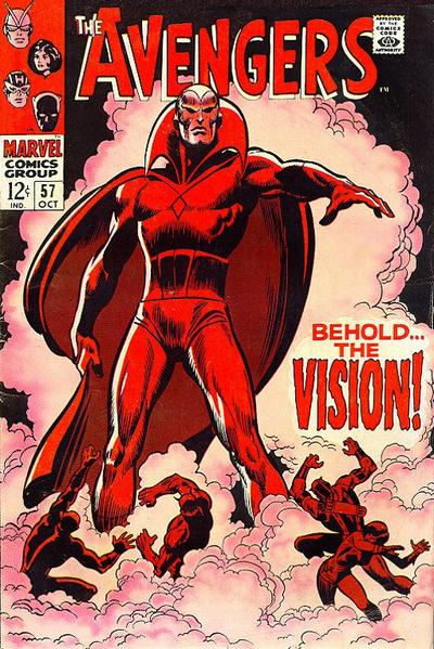
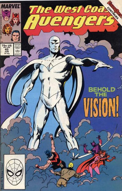
This of course is an homage mainly because it's -
1. A reimagining of a classic cover, it's meant to draw upon your familiarity with the original work.
2. It doesn't slavishly trace or reproduce the lines of the original work, it's more of an artistic interpretation,
3. JB acknowledges that it's based on the work of John Buscema and George Kleine. A lot of what you see as swipes are artists [Liefeld, McFarlane, Land, Mayhew, etc.] who closely copy other art or photo reference.


|
| Back to Top |
profile
| search
| www
|
| |
Joe Smith
Byrne Robotics Member

Joined: 29 August 2004
Location: United States
Posts: 6738
|
| Posted: 23 February 2008 at 1:46pm | IP Logged | 10
|
|
|
I love how JB knows to NOT put art behing the indicia box.
Not rocket science, just like it 's'all.
|
| Back to Top |
profile
| search
| www
e-mail
|
| |
Robert Bradley
Byrne Robotics Member

Joined: 20 September 2006
Location: United States
Posts: 4954
|
| Posted: 23 February 2008 at 1:50pm | IP Logged | 11
|
|
|
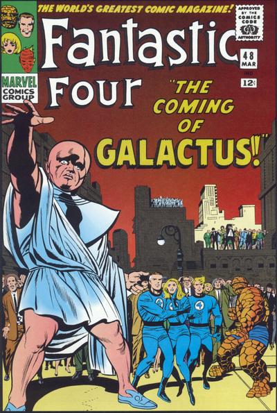
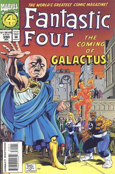
Another example. By Paul Ryan after the classic cover by Kirby & Sinnott.


|
| Back to Top |
profile
| search
| www
|
| |
Paulo Pereira
Byrne Robotics Member

Joined: 24 April 2006
Posts: 15539
|
| Posted: 23 February 2008 at 1:53pm | IP Logged | 12
|
|
|
What does the sig mean by "via Macchio?"
|
| Back to Top |
profile
| search
|
| |


