| Posted: 14 March 2023 at 3:48pm | IP Logged | 7
|
post reply
|
|
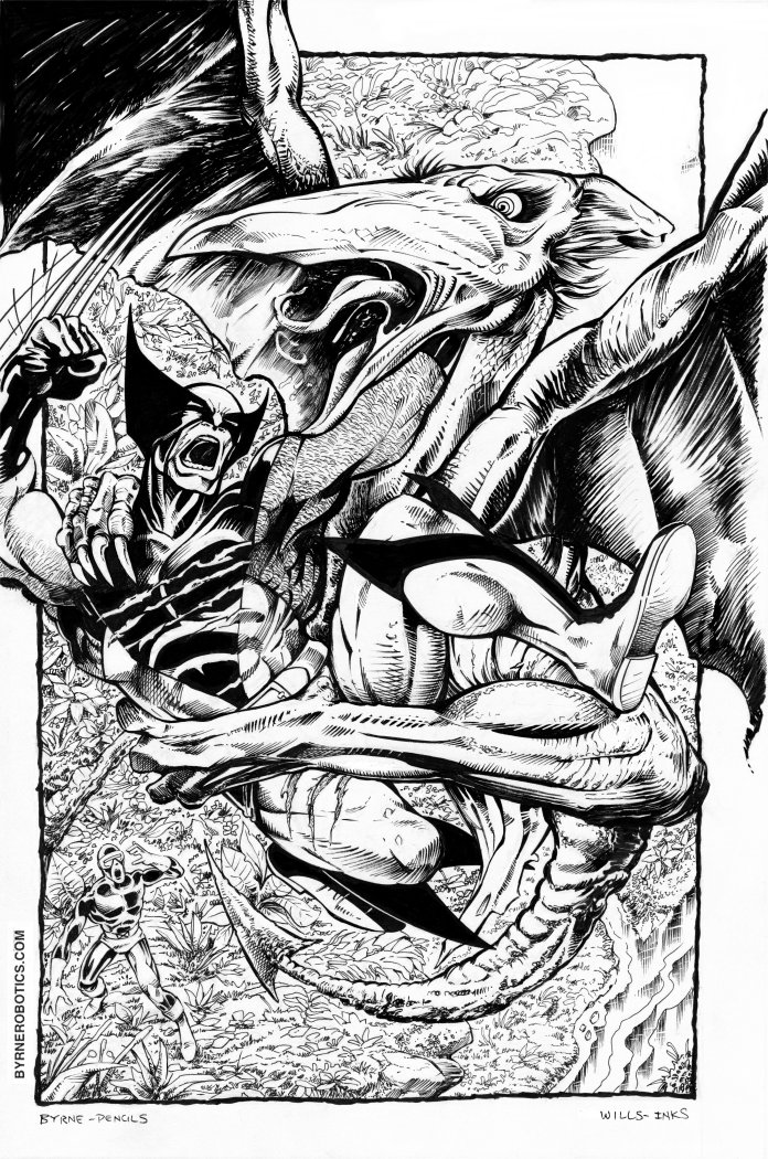
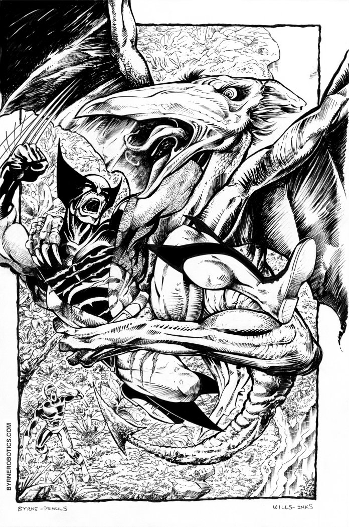
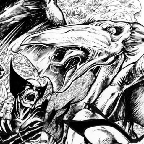
Paul, your line technique here is really excellent. You've come a long way. The brush work in the wings is my favorite bit.
But to go out on a limb a bit, what's stopping me from absolutely LOVING this print is a lack of focus. There's so much going on that's given equal weight. Does that make sense?
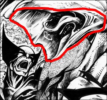
In B&W, I think it's really important to have contrasting regions of dark and light. The background needs to fade a bit, and the periphery needs to have "less" so that it leads your eye to a focal point.
Finally, I don't get a strong read on lighting. Where is the dominate light source and are the shadows consistent? Do the line-weights/vanishing-edges support the light? Cooking up dramatic lighting is a piece of the art puzzle, I think. What's the rule-of-thumb? 1/3 lit, 1/3 half-tone, 1/3 shadow?
Somehow you need to do all that and yet remain true to Mr. Byrne's original. I still needs to look like his work, because that's what we all love. Maybe that's an impossible task, I don't know.
But seriously...who am I to say what great inking should be. I'm just playing at know-it-all-art-critic and can't execute anything close to what I'm preaching. You are miles beyond my level of skill.
Edited by Steven Queen on 14 March 2023 at 3:55pm
|