| Posted: 04 October 2005 at 8:39am | IP Logged | 11
|
|
|
QUOTE:
| That's the best Kordey picture I have ever seen in my entire life. Very pretty and very detailed. But I've got some X-treme X-Men books sitting around that look so much worse than that it is not even funny. |
|
|
It's well-known that Kordey was brought in to knock out a lot of X-Men material in a pinch because he's fast, and even he's acknowledged the hurried look on some of them. Personally, I could still see all his strengths beneath the rough veneer and immediately recognized a strong draftsman. And in fact, I liked the rough veneer. Thought it fit some of the darker beats Morrison was writing and even on a basic aesthetic level...I just thought it looked good. YMMV.
I've mentioned Bill Sienkiwicz in this thread, and I'll mention him again here because time has elevated his stature among fans, even those who don't like his more exaggerrated moments. And yet I've got a friend who actually thinks he's a poor artist, says it looks like his stuff was "drawn with a rake." Guy's a lifelong comic reader and there's no accounting for taste, but he's also a guy who's never formally studied art, so he misses a lot of what makes Sienkiewicz great, evaluating him purely on a surface level ("Why's Cannonball's head look so weird?"). I feel that Kordey's been the victim of similar assessments, judged even more harshly because he had the bad luck to be called to pinch-hit in the middle of the most high-profile X-Men run in a decade.
I take some solace in the fact that lots of folks still don't get Kirby, either.
QUOTE:
| I still think Quitely and 98% of what I've seen of Kordey is poor art. |
|
|
I'd let that kind of assessment stand if it was more specific ("poor superhero art" at least) or if it laid down some specifics (is the anatomy bad? the perspective? the storytelling? anything beyond the fact that these artists have quirks of style that don't glamorize their characters?)
QUOTE:
| As far as as storytelling goes, what the heck is going on in those two pages you posted? |
|
|
The Quitely image I think is pretty clear, though I've never read that story. Looks like Batman glides into some place, pokes around for clues, gets spotted, throws a batarang into the spotter's flashlight, and then confronts him.
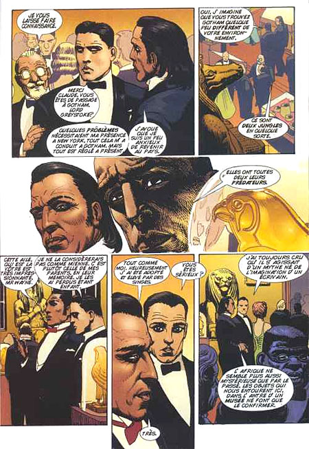
The Kordey image I picked probably wasn't the best when it comes to championing his storytelling, though. It's from his recent series for IDW - SMOKE - and appears to be a montage of overlapping scenes with no moment-to-moment storytelling to gauge. My bad, there. Great draftsmanship, but not a lot to go on for evaluating storytelling. Here's a more traditional page from a BATMAN/TARZAN book he did some ways back (the dialogue's in French, but it seems like a clearcut scene).
Here's a page, too, from a painted STAR TREK graphic novel Kordey did. No dialogue, but the storytelling looks clear, the craft excellent:

Interestingly, that image is cribbed from the site of Jim Warden, who also reps JB for original art. And Steve Rude, Mike Zeck, Paul Chadwick, Alan Davis, Carlos Pacheco, and many more.
With clients like that, y'think Jim would just take on any schmuck artist in the biz? Or maybe he's just been fooled like Neil Gaiman and the Eisner judges...
|


