Active Topics | Member List | Search | Help | Register | Login
Commissioned Artwork
Byrne Robotics > Commissioned Artwork << Prev Page of 6 Next >>
Topic: Psyche!! - 09.25.11 (Topic Closed Topic Closed) Post ReplyPost New Topic
Author
Message
Colin Fawcett
Byrne Robotics Member
Avatar

Joined: 19 July 2011
Location: United Kingdom
Posts: 94
Posted: 26 September 2011 at 1:52am | IP Logged | 1  

That's really great! Congratulations to it's new owner.
Back to Top profile | search
 
Trevor Smith
Byrne Robotics Member
Avatar

Joined: 21 September 2006
Location: Canada
Posts: 3577
Posted: 26 September 2011 at 3:27am | IP Logged | 2  

I agree with William - you just don't see enough Moondragon
these days!
Back to Top profile | search e-mail
 
federico mazzoncini
Byrne Robotics Member
Avatar

Joined: 13 May 2008
Location: Italy
Posts: 69
Posted: 26 September 2011 at 4:16am | IP Logged | 3  

Just astounding, Mr. Byrne...

This feels like it was drawn exactly around the time the commissioner asked you about. Looks like you slightly bent your current style to fit the request.
Terrific.

One minor flaw, IMHO, is the texturing under Psycho Man's left arm, it looks a bit scaly... But, you're absolutely right... The Condo o' Concepts is the fake!
Back to Top profile | search e-mail
 
Tony Midyett
Byrne Robotics Member
Avatar

Joined: 25 January 2010
Location: United States
Posts: 2834
Posted: 26 September 2011 at 4:42am | IP Logged | 4  

Absolutely beautiful, JB!  I've always loved the "villain looms over the heroes" thing---makes for exciting covers.

And I've always loved Moondragon!
Back to Top profile | search
 
John Byrne
Avatar
Grumpy Old Guy

Joined: 11 May 2005
Posts: 134127
Posted: 26 September 2011 at 4:50am | IP Logged | 5  

… the texturing under Psycho Man's left arm, it looks a bit scaly…

••

I have no idea what this means!!

Back to Top profile | search
 
Vinny Valenti
Byrne Robotics Member
Avatar

Joined: 17 April 2004
Location: United States
Posts: 8233
Posted: 26 September 2011 at 5:21am | IP Logged | 6  

"Just as the Coca-Cola bottle was designed to be recognizable even when broken, comicbook covers used to be designed to be instantly recognizable when mostly covered up."---

Clearly, someone at Marvel disagreed with you in the late-60's early 70's! I didn't care for the corner naming myself, but I have to admit that I never knew until now what the reason for them was.I never understood why this cover:

caused enough of a stir at Marvel to force Neal Adams to redraw it - even with the logo still pretty much recognizable, the title is still shown plain as day in the corner!

Edited by Vinny Valenti on 26 September 2011 at 5:23am
Back to Top profile | search
 
federico mazzoncini
Byrne Robotics Member
Avatar

Joined: 13 May 2008
Location: Italy
Posts: 69
Posted: 26 September 2011 at 5:31am | IP Logged | 7  

Uh-oh... Sorry, I guess my english is a lot worse than expected...

What I mean is that the glove of Psycho Man looks as if it was covered in black scales, as if it was made of crocodile skin...
Back to Top profile | search e-mail
 
John Byrne
Avatar
Grumpy Old Guy

Joined: 11 May 2005
Posts: 134127
Posted: 26 September 2011 at 5:41am | IP Logged | 8  

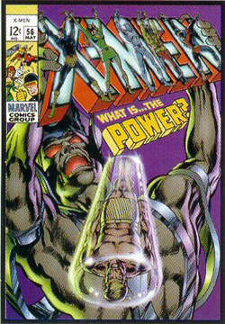
I have often said that the best comicbook logo of all time was ROM. I base this on having found myself walking home to my brownstone in Brooklyn Heights one day, and looking ahead down the street seeing a spinner rack thru the door of the Mom&Pop on the corner. The latest issue of ROM was displayed, and the logo was not only recognizable from two blocks away, it was READABLE!

Two things have traditionally guided the design of logos. They must be easily readable from across the room (where they might be expected to be first seen, walking into a store), or they must be immediately recognizable.

Logos containing longer words, like "Fantastic" or "Sub-Mariner" or even "Superman" depend much upon the latter aspect. The FANTASTIC FOUR logo, as originally designed, was not easy to read at a distance, but it was instantly recognizable. There was no mistaking that funky lettering.

The problem with Neal's cover, above (which I think you should be able to see in the reduced image you posted) is that is makes the logo not only hard to read but, at a distance, hard even to recognize. Remember, in the days of the spinner rack, when that book was published, from across the room a potential buyer would often see only this:

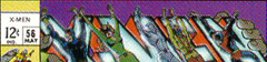
Compare that to the cover as published:
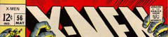
Back to Top profile | search
 
John Byrne
Avatar
Grumpy Old Guy

Joined: 11 May 2005
Posts: 134127
Posted: 26 September 2011 at 5:42am | IP Logged | 9  

…the glove of Psycho Man looks as if it was covered in black scales, as if it was made of crocodile skin...

••

Really not seeing this.

Back to Top profile | search
 
Greg Woronchak
Byrne Robotics Member
Avatar

Joined: 04 September 2007
Location: Canada
Posts: 1631
Posted: 26 September 2011 at 6:02am | IP Logged | 10  

Great cover, looks like it was fun to tackle! I've always liked Psycho-Man and his 'bulky' design.
Back to Top profile | search | www e-mail
 
Bill Catellier
Byrne Robotics Member
Avatar

Joined: 19 September 2007
Location: United States
Posts: 3225
Posted: 26 September 2011 at 6:45am | IP Logged | 11  

Wonderful cover.  Leaves me longing for those Avengers.
Back to Top profile | search e-mail
 
Shawn Kane
Byrne Robotics Member
Avatar

Joined: 04 November 2010
Location: United States
Posts: 3239
Posted: 26 September 2011 at 7:00am | IP Logged | 12  

What the Avengers should look like!

Back to Top profile | search
 

<< Prev Page of 6 Next >>
  Post ReplyPost New Topic
Printable version Printable version

Forum Jump
You cannot post new topics in this forum
You cannot reply to topics in this forum
You cannot delete your posts in this forum
You cannot edit your posts in this forum
You cannot create polls in this forum
You cannot vote in polls in this forum

 Active Topics | Member List | Search | Help | Register | Login