| Author |
|
Jim Muir
Byrne Robotics Member

Joined: 26 June 2007
Location: United Kingdom
Posts: 1390
|
| Posted: 08 August 2010 at 3:31pm | IP Logged | 1
|
|
|
Lovely examples, Tim.
|
| Back to Top |
profile
| search
|
| |
Johan Vikberg
Byrne Robotics Member

Joined: 08 August 2009
Location: Sweden
Posts: 188
|
| Posted: 08 August 2010 at 3:37pm | IP Logged | 2
|
|
|
I grabbed a few modern images I liked from Dave Stewart's recent work on BPRD and some Darwyn Cooke stuff.
Those are nice because they�re done in the �old style�, aren�t they?
|
| Back to Top |
profile
| search
|
| |
Tim Farnsworth
Byrne Robotics Member

Joined: 01 July 2010
Posts: 817
|
| Posted: 08 August 2010 at 3:39pm | IP Logged | 3
|
|
|
Stewart might have "old style" sensibilities - which is to say, I believe he's got real knowledge of art theory - but I believe he uses computer coloring, same as the guys who make it look like crap :)
Edited by Tim Farnsworth on 08 August 2010 at 3:46pm
|
| Back to Top |
profile
| search
|
| |
Tim Farnsworth
Byrne Robotics Member

Joined: 01 July 2010
Posts: 817
|
| Posted: 08 August 2010 at 3:43pm | IP Logged | 4
|
|
|
Glad to see someone mention Richmond Lewis's work on Year One, one of my all-time favorites. I noticed that the collected edition was completely recolored by him, but I like the original single issues just as well. That story just exudes 70s urban decay in its visuals. It's like Taxi Driver on paper.
|
| Back to Top |
profile
| search
|
| |
Knut Robert Knutsen
Byrne Robotics Member

Joined: 22 September 2006
Posts: 7369
|
| Posted: 08 August 2010 at 3:46pm | IP Logged | 5
|
|
|
Dave Stewart's work has some old fashioned sensibilities in the blocking of the colours, hues and saturation. It's directed towards clarity and storytelling. But he also clearly uses gradations and texturing of colours, he seems to be trying to emulate the look of blueline+paint colouring of European albums (as introduced in american high quality graphic novels og the late 80s early 90s) and combine it with 4 colour percentage separations.
|
| Back to Top |
profile
| search
|
| |
Johan Vikberg
Byrne Robotics Member

Joined: 08 August 2009
Location: Sweden
Posts: 188
|
| Posted: 08 August 2010 at 3:50pm | IP Logged | 6
|
|
|
Yes I�m sure he�s using a computer, as he is a contemporary artist, but the computer is not the �style� ... He�s using a limited number of shades of each colour, etc, the way it used to be done because there were limitations. That�s what I mean by the �old style�.
When I say �computer colours�, I mean the colouring jobs that are done on computers these days that make full use of the new possibilities and couldn�t have been done with older methods. I mean, as a reader I care about what the art looks like a lot more than about how it�s produced. |
| Back to Top |
profile
| search
|
| |
Tim Farnsworth
Byrne Robotics Member

Joined: 01 July 2010
Posts: 817
|
| Posted: 08 August 2010 at 3:51pm | IP Logged | 7
|
|
|
Just to confirm: Stewart's a Photoshop guy. Googling turned up a page on Apple's site that talks about process on modern comics and uses Hellboy as an example:
http://www.apple.com/pro/profiles/darkhorse/
And here's the relevant snippet:
QUOTE:
| The approved final line art with lettering in place is sent to colorist Dave Stewart. He talks over the color placement with Mignola and colors the pages in Photoshop, then posts the pages on a private Web site where Allie, Mignola, and Fegredo can view and approve them. |
|
|
|
| Back to Top |
profile
| search
|
| |
Tim Farnsworth
Byrne Robotics Member

Joined: 01 July 2010
Posts: 817
|
| Posted: 08 August 2010 at 4:00pm | IP Logged | 8
|
|
|
Gotcha, Johan. I think Knut caught onto what you were saying quicker than I did :)
|
| Back to Top |
profile
| search
|
| |
Chad Carter
Byrne Robotics Member

Joined: 16 June 2005
Posts: 9584
|
| Posted: 08 August 2010 at 4:54pm | IP Logged | 9
|
|
|
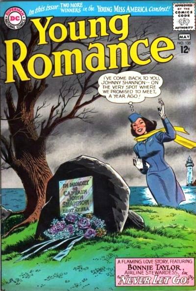
Just as this thread is going on, I ran into this cover (no indication of artist/inker on the Grand Comics Database; is this Infantino? Andru/Esposito?) 
That's an amazing use of color, to me.
|
| Back to Top |
profile
| search
|
| |
Matt Hawes
Byrne Robotics Member

Joined: 16 April 2004
Location: United States
Posts: 16655
|
| Posted: 08 August 2010 at 4:57pm | IP Logged | 10
|
|
|
Chad, that looks like a John Romita, Sr. face on that woman.
My other guess would be Gil Kane.
Edited to add: Romita worked on many DC Romance comics before going to Marvel.
Edited by Matt Hawes on 08 August 2010 at 5:04pm
|
| Back to Top |
profile
| search
| www
|
| |
Wallace Sellars
Byrne Robotics Member

Joined: 01 May 2004
Location: United States
Posts: 17819
|
| Posted: 09 August 2010 at 6:20am | IP Logged | 11
|
|
|
Ti'm's post on the last page makes me want to pull out those issues of NEW FRONTIER and read them again. Is the paper on the Absolute Edition the same as that used in the individual issues? If not, how does the art look on that different stock?
|
| Back to Top |
profile
| search
| www
|
| |
St�phane Garrelie
Byrne Robotics Member

Joined: 05 August 2005
Location: France
Posts: 4283
|
| Posted: 09 August 2010 at 7:00am | IP Logged | 12
|
|
|
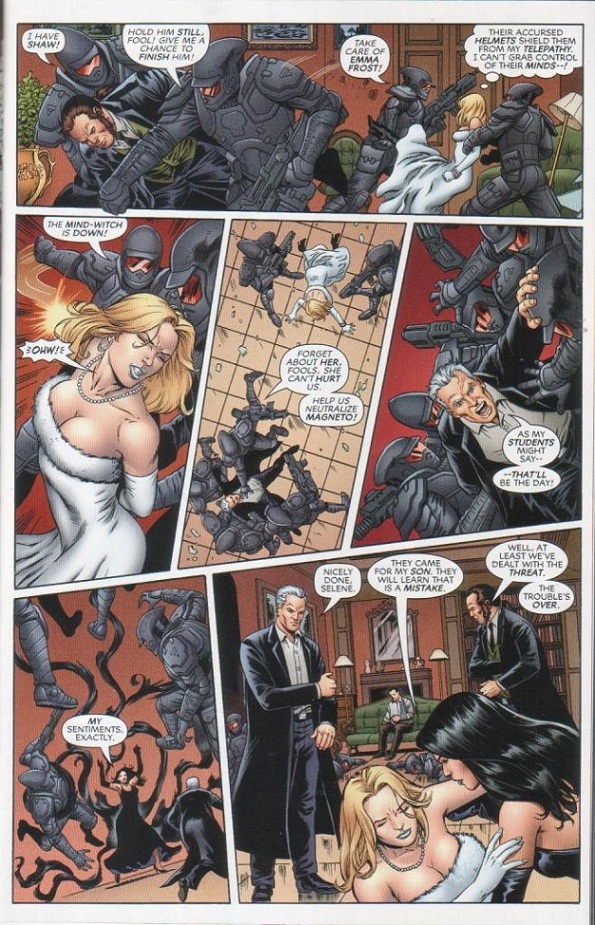
I like the colors in this one (From New Mutants Forever #1): 
|
| Back to Top |
profile
| search
|
| |


