| Author |
|
St�phane Garrelie
Byrne Robotics Member

Joined: 05 August 2005
Location: France
Posts: 4283
|
| Posted: 02 August 2010 at 11:42am | IP Logged | 1
|
|
|
This, that comes from the same issue, i find more problematic: What is the matter of Spider-Man's mask (and of the whole costume, while we're at it?) Why does it shine? 
Edited by St�phane Garrelie on 02 August 2010 at 11:44am
|
| Back to Top |
profile
| search
|
| |
Wallace Sellars
Byrne Robotics Member

Joined: 01 May 2004
Location: United States
Posts: 17819
|
| Posted: 02 August 2010 at 12:31pm | IP Logged | 2
|
|
|
Some colorists like Dave Stewart still produce some amazing work (DC: The New Frontier and BPRD spring to mind), but in general, too much realism in coloring, as in line art, is a drag for me.
---
Dave Stewart is easily my favorite comic book colorist. His BPRD work is superb!
|
| Back to Top |
profile
| search
| www
|
| |
Eric Russ
Byrne Robotics Member

Joined: 13 March 2006
Location: United States
Posts: 2022
|
| Posted: 02 August 2010 at 1:08pm | IP Logged | 3
|
|
|
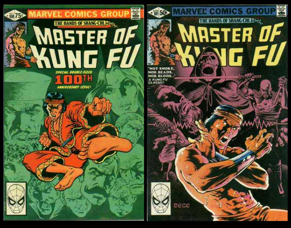
I like Dave Stewart's work as well. His work remind me of Bob Sharen's on Master Of Kung Fu.
Working with a limited palette, Bob made the work "pop" as well as setting a mood. Not realistic, in terms of rendering but effective for the senses.
Ultimately, I think it depends on the "job" and how it is Illustrated. I like a balance really but favoring less rendered if I had to make a choice.
Some Bob Sharen samples -

|
| Back to Top |
profile
| search
|
| |
Larry Gil
Byrne Robotics Member

Joined: 09 November 2005
Location: Canada
Posts: 783
|
| Posted: 02 August 2010 at 1:50pm | IP Logged | 4
|
|
|
A lilttle off topic...but still about coloring...whatever happened to Gerry Turnbull on this forum...I really enjoyed his coloring renditions and he was also a really nice guy. I hope he is ok.
|
| Back to Top |
profile
| search
|
| |
Keith Thomas
Byrne Robotics Member

Joined: 06 April 2009
Location: United States
Posts: 3081
|
| Posted: 02 August 2010 at 1:59pm | IP Logged | 5
|
|
|
Do not like modern coloring, too often than not it overwhelms the pencils IMHO, and you're right I liked the unique look the old way gave to comics.
|
| Back to Top |
profile
| search
|
| |
Eric White
Byrne Robotics Member

Joined: 17 October 2006
Location: United States
Posts: 1086
|
| Posted: 02 August 2010 at 2:06pm | IP Logged | 6
|
|
|
I never really liked the old coloring unless it was done by Neal Adams, Tom Palmer, Glynis Wein or Klaus Janson. I don't like all the new coloring "tricks" that are being done but I do prefer full colors to the old style coloring.
|
| Back to Top |
profile
| search
|
| |
Mike Norris
Byrne Robotics Member

Joined: 16 April 2004
Location: United States
Posts: 4272
|
| Posted: 02 August 2010 at 2:39pm | IP Logged | 7
|
|
|
That pic of Mystique bugs me. The head doesn't seem to be part of the body because of the coloring. The colorist has taken the trouble to model and shade the head to give it an illlusion of three dimensionality, yet did not follow through on the rest of the body. So that combined with the bold black of the inks gives a muddy unfinished look to the page. I'm willing to bet the page would look better in black and white or with less painterly colors. Could be my own prejudices. As an art student I liked dry media like charcoal and pastels or working in black and white with ink. Wet color media was never my thing and I dont like shiney looking paintings. Unless the object in them is shiney. Who are the penciller and inker? From what I can see I like their work.
Edited by Mike Norris on 02 August 2010 at 2:44pm
|
| Back to Top |
profile
| search
e-mail
|
| |
Brian Miller
Byrne Robotics Member

Joined: 28 July 2004
Location: United States
Posts: 31943
|
| Posted: 02 August 2010 at 2:43pm | IP Logged | 8
|
|
|
Obviously of good coloring. **************** Why was it "obvious?"
|
| Back to Top |
profile
| search
|
| |
Brian Miller
Byrne Robotics Member

Joined: 28 July 2004
Location: United States
Posts: 31943
|
| Posted: 02 August 2010 at 2:44pm | IP Logged | 9
|
|
|
Looks like Grummett pencils, Mike.
|
| Back to Top |
profile
| search
|
| |
Mike Norris
Byrne Robotics Member

Joined: 16 April 2004
Location: United States
Posts: 4272
|
| Posted: 02 August 2010 at 3:00pm | IP Logged | 10
|
|
|
I can see that now. Solid "old school" style.
|
| Back to Top |
profile
| search
e-mail
|
| |
John Byrne

Grumpy Old Guy
Joined: 11 May 2005
Posts: 135960
|
| Posted: 02 August 2010 at 3:04pm | IP Logged | 11
|
|
|
"�the barest HINT of the PHOENIX!"Troll sat alone on his seat of stone,And munched and mumbled a bare old bone; For many a year he had gnawed it near, For meat was hard to come by. -- J.R.R. Tolkien
|
| Back to Top |
profile
| search
|
| |
Joe Hollon
Byrne Robotics Member

Joined: 08 May 2004
Location: United States
Posts: 13739
|
| Posted: 02 August 2010 at 3:11pm | IP Logged | 12
|
|
|
 
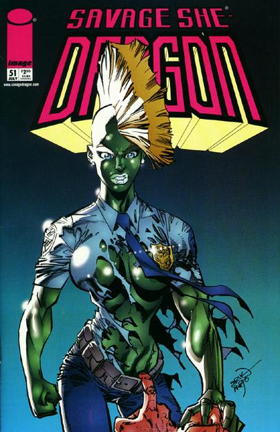
Several years ago Erik Larsen released the two versions of SAVAGE DRAGON #51 that I have posted above. This was right around the time modern coloring started going crazy and I guess he did this as an experiment to see what folks buying his comic preferred. It's interesting to compare the two.
|
| Back to Top |
profile
| search
| www
e-mail
|
| |


