| Author |
|
Robert White
Byrne Robotics Member

Joined: 16 April 2004
Location: United States
Posts: 4560
|
| Posted: 02 August 2010 at 10:31am | IP Logged | 1
|
|
|
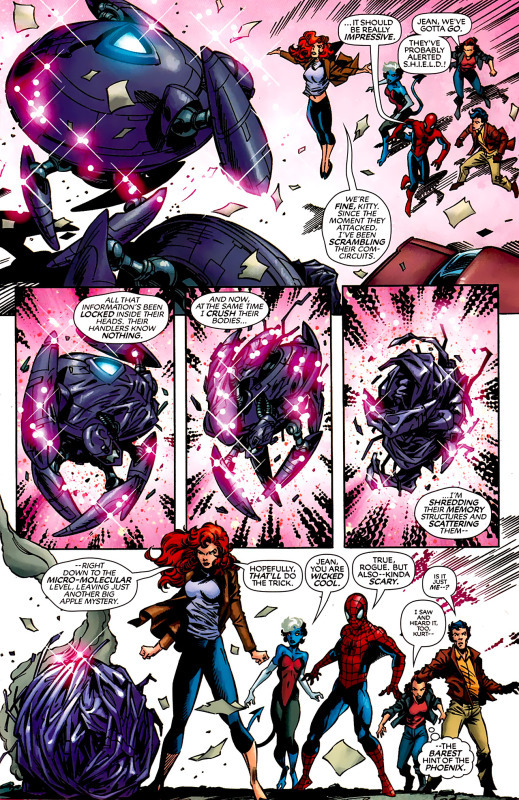
While there is a part of me that likes the fact that comics can now be colored in a away that looks more "realistic", another part of me thinks that the technical limitations of the old four-color comics palette brought a stylization that was unique to the comic format, and in losing that stylization, I feel that it has robbed comics of much of their visual individuality. One of the main trends that I see with modern coloring is a penchant to make the comics overly dark and "noirish" to a point that it doesn't fit the subject matter. I'm torn on this issue as a fan of the art-form. Thoughts?
Edited by Robert White on 02 August 2010 at 10:31am
|
| Back to Top |
profile
| search
|
| |
Tim Farnsworth
Byrne Robotics Member

Joined: 01 July 2010
Posts: 817
|
| Posted: 02 August 2010 at 10:42am | IP Logged | 2
|
|
|
I really miss the more subjective palettes of old. Some colorists like Dave Stewart still produce some amazing work (DC: The New Frontier and BPRD spring to mind), but in general, too much realism in coloring, as in line art, is a drag for me.
Not to get hung up on a hot-button creator like Alan Moore, but they recolored The Killing Joke a few years back and it was all murky tones and realism. Say what you will about the content of the original's story, but all those acidic color tones really contributed to the uneasiness of the story. When it became all realistic grays and browns it just looked like a sea of poop to me.
I recognize this is what some people have always seen it as ;)
|
| Back to Top |
profile
| search
|
| |
Mike Farley
Byrne Robotics Member

Joined: 16 April 2004
Location: United States
Posts: 2701
|
| Posted: 02 August 2010 at 10:57am | IP Logged | 3
|
|
|
The recoloring was the main reason I didn't pick up the KILLING JOKE hardcover. That and actually changing the art so that the yellow oval bat-symbol became the modern/classic oval-lass symbol.
|
| Back to Top |
profile
| search
|
| |
Petter Myhr Ness
Byrne Robotics Member

Joined: 02 July 2009
Location: Norway
Posts: 4213
|
| Posted: 02 August 2010 at 11:04am | IP Logged | 4
|
|
|
You mean they actually pulled a George Lucas on the KILLING JOKE hardcover?
|
| Back to Top |
profile
| search
|
| |
Tim Farnsworth
Byrne Robotics Member

Joined: 01 July 2010
Posts: 817
|
| Posted: 02 August 2010 at 11:07am | IP Logged | 5
|
|
|
Heh, something like that, Peter. I believe Bolland supervised, maybe even said it was how he'd wanted it to look had the coloring tech been available in the 80s. So, yes, very "Lucas."
|
| Back to Top |
profile
| search
|
| |
Craig Bogart
Byrne Robotics Member

Joined: 18 June 2008
Posts: 407
|
| Posted: 02 August 2010 at 11:10am | IP Logged | 6
|
|
|
Don't like the modern computer coloring. I think that overly-rendered coloring is used to carry weak line art, or sometimes overwhelms an artist with a simple style.
|
| Back to Top |
profile
| search
e-mail
|
| |
St�phane Garrelie
Byrne Robotics Member

Joined: 05 August 2005
Location: France
Posts: 4283
|
| Posted: 02 August 2010 at 11:12am | IP Logged | 7
|
|
|


|
| Back to Top |
profile
| search
|
| |
Tim Farnsworth
Byrne Robotics Member

Joined: 01 July 2010
Posts: 817
|
| Posted: 02 August 2010 at 11:15am | IP Logged | 8
|
|
|
I think that example looks....okay. Not my favorite, but not too shiny either. They let the white space breathe a bit, didn't get too crazy with color gradations.
|
| Back to Top |
profile
| search
|
| |
Matt Reed
Byrne Robotics Security

Robotmod
Joined: 16 April 2004
Posts: 36483
|
| Posted: 02 August 2010 at 11:16am | IP Logged | 9
|
|
|
What point are you making, Stephane? Simply posting pages with no comment seems like a waste.
|
| Back to Top |
profile
| search
|
| |
St�phane Garrelie
Byrne Robotics Member

Joined: 05 August 2005
Location: France
Posts: 4283
|
| Posted: 02 August 2010 at 11:17am | IP Logged | 10
|
|
|
When we are talking of coloring, Matt? Your eyes are better than my words. And for the questions of taste, only you knows if you like what i show.
|
| Back to Top |
profile
| search
|
| |
Matt Reed
Byrne Robotics Security

Robotmod
Joined: 16 April 2004
Posts: 36483
|
| Posted: 02 August 2010 at 11:23am | IP Logged | 11
|
|
|
But with no context, it has no meaning. Are you offering them up as examples of bad or good computer coloring? Why did you choose those specific pages and not others? You must have thoughts on them, otherwise you wouldn't have chosen to post them.
|
| Back to Top |
profile
| search
|
| |
St�phane Garrelie
Byrne Robotics Member

Joined: 05 August 2005
Location: France
Posts: 4283
|
| Posted: 02 August 2010 at 11:32am | IP Logged | 12
|
|
|
Obviously of good coloring. Why those pages? Because i like them and think that the colors add to the emotion, to the sense of beauty given by the art, and also contribute to tell the story. They serve the art and the story. Beside those points, i'ld say that they are not this far away from classic coloring, at least in the first of the two pages i posted. The colorist has a powerfull tool, but he knows how to use it at the service of the story and of the art. He doesn't just try to impress the public with flashy colors.
Edited by St�phane Garrelie on 02 August 2010 at 11:32am
|
| Back to Top |
profile
| search
|
| |


