| Author |
|
Chad Carter
Byrne Robotics Member

Joined: 16 June 2005
Posts: 9584
|
| Posted: 30 March 2009 at 5:44pm | IP Logged | 1
|
|
|
I don't know, Brad, I feel like there's too much neck-stretching for Reed nowadays. Every time I see him, he's either stretching the neck, or something's hitting him in the neck to stretch it, and so on.
You know, I wonder about that: did Lee/Kirby intend for Reed's body to be pliable, even if he's not consciously stretching? Because nowadays, every time Reed gets whomped hard enough unexpectedly, he "loses his bowels" so to speak and turns into limp spaghetti-man. Which is a sure way to make him appear stupid.
|
| Back to Top |
profile
| search
|
| |
Michael Kane
Byrne Robotics Member

Joined: 05 July 2005
Location: United States
Posts: 481
|
| Posted: 30 March 2009 at 5:54pm | IP Logged | 2
|
|
|
I wonder if Captain marvel and Superman switched positions, would it have made just as powerful an image?
|
| Back to Top |
profile
| search
| www
|
| |
Brad Brickley
Byrne Robotics Member

Joined: 29 April 2004
Location: United States
Posts: 8301
|
| Posted: 30 March 2009 at 6:36pm | IP Logged | 3
|
|
|
Chad, You're right. I guess I've been too influenced by JB and his style of depicting Reed Richards. Right after I wrote that, I was looking on Newsarama and saw a preview for Amazing Spider-Man with guest stars, the Fantastic Four. Guess what I saw?
That's right, Reed Richards stretched neck all over the pages! So much for that.
|
| Back to Top |
profile
| search
| www
|
| |
Alex Prewitt
Byrne Robotics Member

Joined: 05 September 2006
Posts: 1446
|
| Posted: 30 March 2009 at 6:39pm | IP Logged | 4
|
|
|
Look at the size of Superman's S for the Legends poster. Sheer Perfection.
|
| Back to Top |
profile
| search
|
| |
Brad Brickley
Byrne Robotics Member

Joined: 29 April 2004
Location: United States
Posts: 8301
|
| Posted: 31 March 2009 at 9:55am | IP Logged | 5
|
|
|
Look at the size of Superman's S for the Legends poster. Sheer Perfection.
*****************
Having grown up with Curt Swan's Superman, it still takes me a bit to think that the S isn't too big.
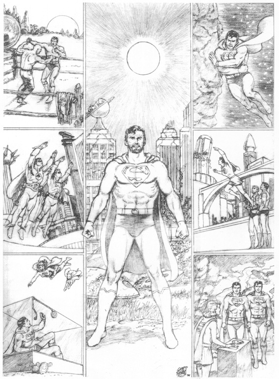
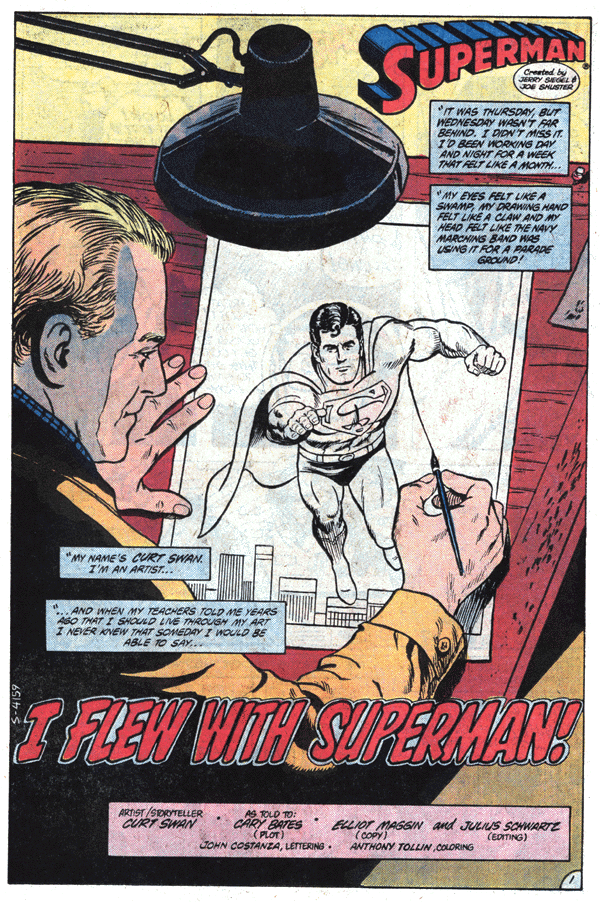
Sorry for the graphics, but the guy was just too good to pick one image.
Edited by Brad Brickley on 31 March 2009 at 10:00am
|
| Back to Top |
profile
| search
| www
|
| |
Chad Carter
Byrne Robotics Member

Joined: 16 June 2005
Posts: 9584
|
| Posted: 31 March 2009 at 5:11pm | IP Logged | 6
|
|
|
Man, I never noticed how huge JB's S-shield is, comparitively.
I'm not an artist, so I can't figure out exactly how the shield is different though. Is it more wide than long in JB's? JB's east-west points run nearly to the armpits, and north-south to midsection. Swann's is more compact or something, yet situated about the same. That's wild. Now I have to look at other renditions to see how the shield is situated.
|
| Back to Top |
profile
| search
|
| |
Eric Russ
Byrne Robotics Member

Joined: 13 March 2006
Location: United States
Posts: 2020
|
| Posted: 31 March 2009 at 11:32pm | IP Logged | 7
|
|
|
So many. Issue #276 of the FF that Brad posted really stands out!
Edit -
*As well as Alpha Flight #3. Something about those high contrast covers.
Edited by Eric Russ on 31 March 2009 at 11:34pm
|
| Back to Top |
profile
| search
|
| |
Regan Tyndall
Byrne Robotics Member

Joined: 12 November 2008
Location: Taiwan
Posts: 293
|
| Posted: 01 April 2009 at 8:40am | IP Logged | 8
|
|
|
My thread really went on...
So, am I the only one who thinks that Chapter One #5 cover is, like, totally amazing? (see first page of thread)
Mr. Byrne, are you out there? Tell me that's not a 5-star classic cover...?
|
| Back to Top |
profile
| search
|
| |
Clint Ludwick
Byrne Robotics Member

Joined: 17 April 2007
Location: United States
Posts: 1952
|
| Posted: 01 April 2009 at 8:49am | IP Logged | 9
|
|
|
This is my favorite of JB's more recent Spider-man runs....
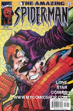
|
| Back to Top |
profile
| search
e-mail
|
| |
Clint Ludwick
Byrne Robotics Member

Joined: 17 April 2007
Location: United States
Posts: 1952
|
| Posted: 01 April 2009 at 8:51am | IP Logged | 10
|
|
|
I'll also add...he had a good inker on that issue....JOHN ROMITA.
|
| Back to Top |
profile
| search
e-mail
|
| |
Alex Prewitt
Byrne Robotics Member

Joined: 05 September 2006
Posts: 1446
|
| Posted: 01 April 2009 at 9:22am | IP Logged | 11
|
|
|
Having grown up with Curt Swan's Superman, it still takes me a bit to think that the S isn't too big.
++++++++++++++++++++++++++++++++++++
For me, I grew up (noticed in 86 anyway) with JB's version. It just seemed perfect to me. I think he draws it slightly smaller now. I don't think he realizes it though! : ) I totally respect his body of work, but I was never a Curt Swan fan. His rendition didn't look "Super" to me. Just a guy in a costume.
|
| Back to Top |
profile
| search
|
| |
Nathan Greno
Byrne Robotics Member

Joined: 20 April 2006
Location: United States
Posts: 9154
|
| Posted: 01 April 2009 at 10:52am | IP Logged | 12
|
|
|
Regan: So, am I the only one who thinks that Chapter One #5 cover is, like, totally amazing? (see first page of thread)
----
It's a strong cover, no doubt! Honestly, the one thing that throws me a bit on that one are those black bars on the top and side...
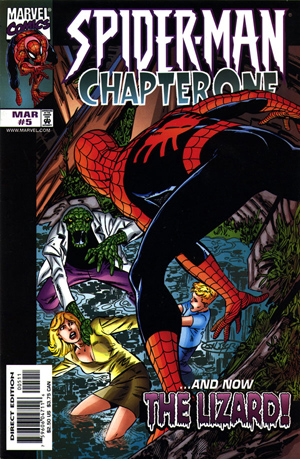
Not sure why those were used? Did the cover art have to be resized to fit in the logo? If the other Chapter One covers had the same bars I would think it was a design choice...but they don't. When I see the bar on the side of the JBNM covers, I know it's a design choice...the first dozen+ issues all have them...
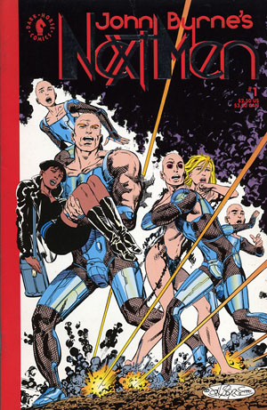
Like I said, it throws me a bit -- but I still like the cover a lot!
|
| Back to Top |
profile
| search
|
| |


