| Author |
|
Joe Hollon
Byrne Robotics Member

Joined: May 08 2004
Location: United States
Posts: 13743
|
| Posted: January 25 2008 at 9:16pm | IP Logged | 1
|
post reply
|
|
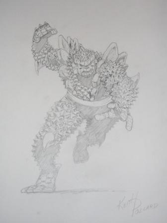
Ladies and Gentlemen, I give you the infamous "Pine Cone" Thing by Keith Pollard!
|
| Back to Top |
profile
| search
| www
e-mail
|
| |
Paul Greer
Byrne Robotics Security

Joined: August 18 2004
Posts: 14203
|
| Posted: January 25 2008 at 9:25pm | IP Logged | 2
|
post reply
|
|
Awesome piece, Joe. I think Pollard's pencil work looks great. An inspired choice for the Thing.
|
| Back to Top |
profile
| search
|
| |
David Ferguson
Byrne Robotics Member

Joined: March 17 2007
Location: Ireland
Posts: 6782
|
| Posted: January 26 2008 at 6:05am | IP Logged | 3
|
post reply
|
|
�Barry Kitson�
��
Yoiks! I got "Pammy Kiroy" out of that signature!
*****
Er... now that you mention it...
|
| Back to Top |
profile
| search
|
| |
Philippe Negrin
Byrne Robotics Member

Joined: August 01 2007
Location: France
Posts: 2643
|
| Posted: January 26 2008 at 6:31am | IP Logged | 4
|
post reply
|
|
I received this today. I know Greg Land is not a favourite on this
board but I like this page. And for a rathe recent page, it has the
lettering...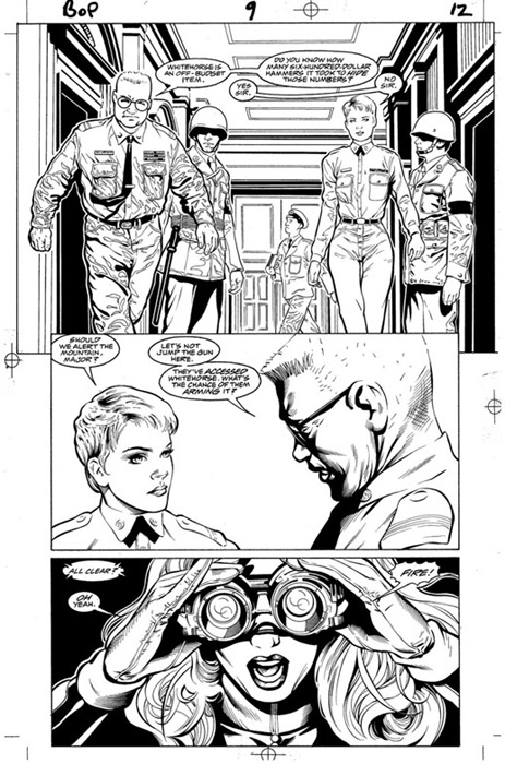
|
| Back to Top |
profile
| search
|
| |
Robert Cosgrove
Byrne Robotics Member

Joined: January 16 2005
Location: United States
Posts: 1710
|
| Posted: January 26 2008 at 9:07am | IP Logged | 5
|
post reply
|
|
It is a nice page. Two comments that could be taken as mild critcism,
neither of which relate to the artist's drawing ability. In the top panel, the
perspective sends your eye right to the figure in the rear. Is he important to
the story? Second comment. In the top panel, there's a white line going
around each end figure. The same is true on the bottom panel close-up.
There doesn't seem to be any reason for this beyond a desire to show off the
brush lines (which are, indeed, attractive).
|
| Back to Top |
profile
| search
|
| |
Michael Huber
Byrne Robotics Member

Joined: August 27 2007
Location: United States
Posts: 3337
|
| Posted: January 26 2008 at 9:33am | IP Logged | 6
|
post reply
|
|
I wasn't drawn to the whistler in the rear, but I can see by the way the panel is laid out in such a way that it should do that. I was drawn to the female on the right in spite of the design layout.
anyway, the art is nice to look at, nice style, but the mechanics are a bit off.
|
| Back to Top |
profile
| search
|
| |
Philippe Negrin
Byrne Robotics Member
Joined: August 01 2007
Location: France
Posts: 2643
|
| Posted: January 26 2008 at 9:43am | IP Logged | 7
|
post reply
|
|
This outline line is a new trend and common to this new generation of artists : Coipel, Hughes also use it a lot. It sure can get annoying.
|
| Back to Top |
profile
| search
|
| |
Joe Hollon
Byrne Robotics Member
Joined: May 08 2004
Location: United States
Posts: 13743
|
| Posted: January 26 2008 at 9:48am | IP Logged | 8
|
post reply
|
|
The "white line" you guys are talking about just looks like the halo effect that separates the figures from the background. I don't think this is anything new or distracting.
|
| Back to Top |
profile
| search
| www
e-mail
|
| |
Thanos Kollias
Byrne Robotics Member

Joined: June 19 2004
Location: Greece
Posts: 5009
|
| Posted: January 26 2008 at 9:51am | IP Logged | 9
|
post reply
|
|
Joe is right about the halo line, but I think in the last panel it's quite unnecessary.
|
| Back to Top |
profile
| search
| www
e-mail
|
| |
John Byrne
Grumpy Old Guy
Joined: May 11 2005
Posts: 136396
|
| Posted: January 26 2008 at 9:54am | IP Logged | 10
|
post reply
|
|
I know Greg Land is not a favourite on this board�
��
Oh? Why not?
++
The "white line" you guys are talking about just looks like the halo effect
that separates the figures from the background. I don't think this is
anything new or distracting.
��
I first noticed it in SUPERMAN vs THE AMAZING SPIDER-MAN. I have been
using it here and there ever since.
|
| Back to Top |
profile
| search
|
| |
Pat Ditton
Byrne Robotics Member
Joined: June 19 2007
Posts: 925
|
| Posted: January 26 2008 at 12:03pm | IP Logged | 11
|
post reply
|
|
I love Greg Land --- I don't think his story-telling is as good as some, his characters always seem posed, not fluid (in motion) and not always in sync with the other characters, like he draws each character individually and not as part of the same frame -- I loved the SOJOURN series he did, didn't mind the "pose" thing there - it seemed to suit the style of the book.
|
| Back to Top |
profile
| search
|
| |
Peter Svensson
Byrne Robotics Member

Joined: January 30 2005
Location: United States
Posts: 1470
|
| Posted: January 26 2008 at 12:06pm | IP Logged | 12
|
post reply
|
|
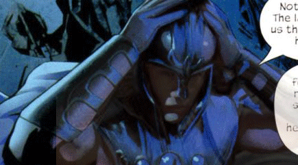
Greg Land started off as a decent artist, but has since descended into being a total and complete slave to the lightbox, blatantly stealing most of his work from photo reference. A lot of the reference he uses appears to be pornographic in nature.
Here's an example of his recent work.
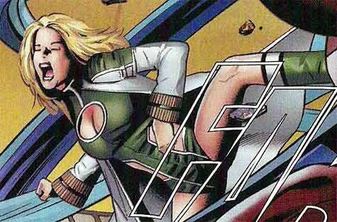
And here's his drawing of what I think is Ultimate Crystal...
Edited by Peter Svensson on January 26 2008 at 12:11pm
|
| Back to Top |
profile
| search
e-mail
|
| |


