| Author |
|
Gerry Turnbull
Byrne Robotics Member

Joined: 16 April 2004
Location: Scotland
Posts: 8766
|
| Posted: 11 April 2005 at 4:25pm | IP Logged | 1
|
|
|
Superherohype has the following item
http://superherohype.com/news/featuresnews.php?id=2836

|
| Back to Top |
profile
| search
| www
e-mail
|
| |
Al Flores
Byrne Robotics Member

Joined: 25 December 2004
Location: United States
Posts: 511
|
| Posted: 11 April 2005 at 4:36pm | IP Logged | 2
|
|
|
I'm thinking this need's some color, other then that it's not to bad.
|
| Back to Top |
profile
| search
e-mail
|
| |
John Byrne

Robot Wrangler
Joined: 16 April 2004
Location: United States
Posts: 102266
|
| Posted: 11 April 2005 at 4:53pm | IP Logged | 3
|
|
|

|
| Back to Top |
profile
| search
| www
|
| |
Zaki Hasan
Byrne Robotics Member

Joined: 20 April 2004
Location: United States
Posts: 8105
|
| Posted: 11 April 2005 at 5:04pm | IP Logged | 4
|
|
|
I like it. It's different, but not too different. Certainly not like the revamped version they planned to use in Tim Burton's aborted Superman flick.
|
| Back to Top |
profile
| search
e-mail
|
| |
Jason Schulman
Byrne Robotics Member

Joined: 08 July 2004
Location: United States
Posts: 2473
|
| Posted: 11 April 2005 at 5:06pm | IP Logged | 5
|
|
|
Well, they didn't use the trademarked/copyrighted/whatever version of
the "S" the first four times...why expect them to do it this time
around? At least they're not using the screwed up Lois & Clark version...
|
| Back to Top |
profile
| search
|
| |
Ian Carroll
Byrne Robotics Member

King Of Pain
Joined: 01 May 2004
Location: United States
Posts: 526
|
| Posted: 11 April 2005 at 5:42pm | IP Logged | 6
|
|
|
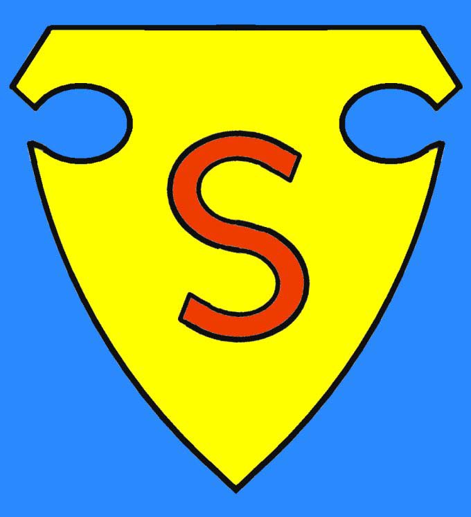
Something seems wrong with the bottom "fish" -- that they cut the
"tail" too much, perhaps?
Also, the 3-D effect within the swooping areas doesn't seem to flow
very well.
Despite my nitpicking on the logo, I'm really excited about the new
movie anyway. The nods to the Donner film(s) I've seen so far
suggest they are going in the right direction.
It could have been soooo much worse! (I think Bryan Singer ordered
Jon Peters locked up until the premiere.)
|
| Back to Top |
profile
| search
|
| |
Al Flores
Byrne Robotics Member
Joined: 25 December 2004
Location: United States
Posts: 511
|
| Posted: 11 April 2005 at 5:47pm | IP Logged | 7
|
|
|
OK the second one is mucho mass mejor...much better...original's always are.
Thank you Mr.Byrne.
|
| Back to Top |
profile
| search
e-mail
|
| |
Justin Wasson
Byrne Robotics Member

Joined: 16 April 2004
Location: United States
Posts: 809
|
| Posted: 11 April 2005 at 8:23pm | IP Logged | 8
|
|
|
Al Flores wrote:
OK the second one is mucho mass mejor...much better...original's always are.
Thank you Mr.Byrne.
|
|
|
This is closer to the original.
Justin Wasson
|
| Back to Top |
profile
| search
| www
e-mail
|
| |
Emery Calame
Byrne Robotics Member

Joined: 16 April 2004
Location: United States
Posts: 5773
|
| Posted: 11 April 2005 at 8:39pm | IP Logged | 9
|
|
|


As long as there is a Luthiac or a giant spider involved I'm there!
Seriously though they seem wishy washy about the chest emblem even in the 1st issue. For the most part they avoid drawing the darn thing clearly!
I hope that we won't have to deal with the yellow shapes in negative space from the logo being Kryptonian letters that happen spell out El or pictograms for House of El or anything complicated like that. "S is for Superman" is good enough for me.
Edited by Emery Calame on 11 April 2005 at 8:45pm
|
| Back to Top |
profile
| search
e-mail
|
| |
Al Flores
Byrne Robotics Member
Joined: 25 December 2004
Location: United States
Posts: 511
|
| Posted: 11 April 2005 at 8:53pm | IP Logged | 10
|
|
|
If draw right that very first one could and does look cool.
|
| Back to Top |
profile
| search
e-mail
|
| |
Jason Schulman
Byrne Robotics Member
Joined: 08 July 2004
Location: United States
Posts: 2473
|
| Posted: 11 April 2005 at 10:21pm | IP Logged | 11
|
|
|
|
| Back to Top |
profile
| search
|
| |
Steve Lyons
Byrne Robotics Member

Joined: 02 September 2004
Location: United States
Posts: 2171
|
| Posted: 11 April 2005 at 10:39pm | IP Logged | 12
|
|
|
Looks like we'll be getting used to another variation on the "S". Personally, I don't see what's wrong with the one used in DC's marketing and licensing.
|
| Back to Top |
profile
| search
|
| |


