| Posted: 15 April 2016 at 2:19pm | IP Logged | 5
|
|
|
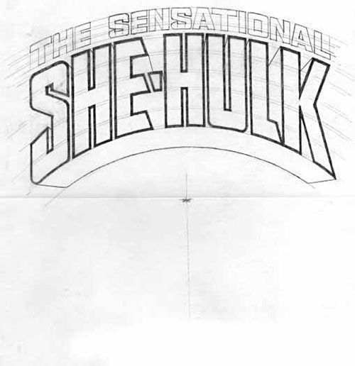
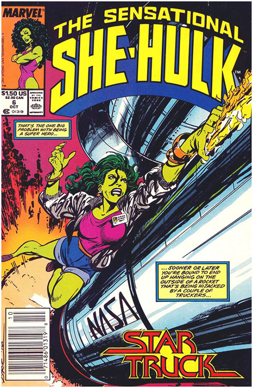
In contrast, Todd Klein designed the logo for JB's Sensational She-Hulk -
Here's a final, tight pencilled version which was approved by editor Bobby Chase, and I assume JB. Klein states that his approach was very much in the style of letterer extraordinaire Gaspar Saladino, using "wide, tightly-spaced block letters with angled stroke ends, and in a symmetrical arc, with THE SENSATIONAL top line in smaller open letters of the same style", which works well in the final product -
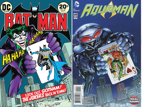
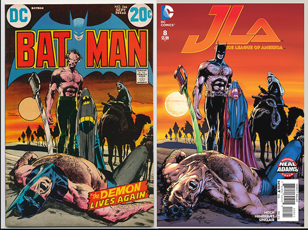
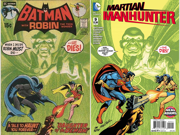
They just don't do 'em like this anymore�. sadly.
-C!
Edited by Charles Valderrama on 15 April 2016 at 2:20pm
|