| Author |
|
John Byrne

Grumpy Old Guy
Joined: 11 May 2005
Posts: 135904
|
| Posted: 26 March 2016 at 8:02am | IP Logged | 1
|
|
|
The colorist totally negated the whole purpose of the drawing!�� Very often they do that. Don't get me wrong. There are some fine colorists out there, and I have been privileged to work with several of them. But there are also colorists who just slather on the hues, paying little or no attention to the actual intent of the drawing. (Walt Simonson has commented on one particular colorist of a few decades back who, in Walt's words "seemed to charge his brush with one color, and just go thru the pages until the brush went dry, then repeat with another color.") This has become increasingly a problem in the Computer Age, where in many cases actual artists have been replaced by technicians, and too many colorists are fascinated by their toys, and not by the job they are actually supposed to be doing. These are the ones who typically knock out blacks with color, not because it actually serves the art, but because they CAN.
|
| Back to Top |
profile
| search
|
| |
Wallace Sellars
Byrne Robotics Member

Joined: 01 May 2004
Location: United States
Posts: 17819
|
| Posted: 26 March 2016 at 8:46am | IP Logged | 2
|
|
|
Wow! The colorist totally negated the whole purpose of the drawing!
�
That black and white inked drawing is much stronger to me.
|
| Back to Top |
profile
| search
| www
|
| |
John Byrne
Grumpy Old Guy
Joined: 11 May 2005
Posts: 135904
|
| Posted: 26 March 2016 at 10:06am | IP Logged | 3
|
|
|
Many colorists and editors simply do not understand BLACK. Black is stronger than any other color. Steve Ditko taught me that there was no better way to make something look BRIGHT than to lay a thick black around it. Today, colorists routinely knock out those blacks (sometimes with yellow!!) and the effect is lost. JR understands BLACK!!
|
| Back to Top |
profile
| search
|
| |
Philippe Cordier
Byrne Robotics Member

Joined: 07 September 2006
Location: France
Posts: 175
|
| Posted: 26 March 2016 at 10:18am | IP Logged | 4
|
|
|
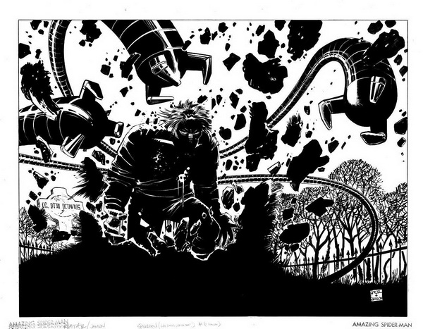
Yes. The black (buildings) against black (Spider-Man)was so Great looking. Lost in the final pi�ce.
|
| Back to Top |
profile
| search
|
| |
Brian Miller
Byrne Robotics Member

Joined: 28 July 2004
Location: United States
Posts: 31933
|
| Posted: 26 March 2016 at 10:48am | IP Logged | 5
|
|
|
And the worst part is he specifically says he wanted to do that stark, solid black on the cover because he's never done it on a cover before. Then, ignoring his intentions, the colorist totally botched it. He/she even took the black out of the buildings in the background. Epic fail.
|
| Back to Top |
profile
| search
|
| |
Philippe Cordier
Byrne Robotics Member
Joined: 07 September 2006
Location: France
Posts: 175
|
| Posted: 26 March 2016 at 10:53am | IP Logged | 6
|
|
|
Speaking about understanding black, I wonder if this artwork ever was colored? I sure hope not
|
| Back to Top |
profile
| search
|
| |
Eric Ladd
Byrne Robotics Member

Joined: 16 August 2004
Location: Canada
Posts: 4480
|
| Posted: 26 March 2016 at 1:38pm | IP Logged | 7
|
|
|
I don't think I would ever want to see that Doc Ock image colored. It is quite stunning in black and white even at such a reduced size for this thread.
|
| Back to Top |
profile
| search
|
| |
Philippe Cordier
Byrne Robotics Member
Joined: 07 September 2006
Location: France
Posts: 175
|
| Posted: 26 March 2016 at 2:29pm | IP Logged | 8
|
|
|
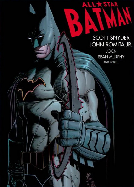
For those of you who want to know what John is working on : he's hard at work on the Dark Knight Returns prequel (inked by Bill Sienkiewicz) and something else's just been announced :
|
| Back to Top |
profile
| search
|
| |
Ian David
Byrne Robotics Member
Joined: 25 June 2012
Location: United Kingdom
Posts: 48
|
| Posted: 26 March 2016 at 9:14pm | IP Logged | 9
|
|
|
I'll admit, I'm one of those who, of you'd have asked me at the time I started in comics I would have criticised JRjr. When I first started with American comics I'd had a few old issues from a second hand seller. This was mid-eighties and I'd managed to get hold of some old issues. My favourite was x-men - no continuity, just the occasional back issue. These tended to be drawn by JB or Paul Smith, or if they were British reprints - older issues by Neil Adams (Rampage?). When a local news agent started to stock 'current' American comics, one of the first issues to grab me was x-men 199. I really enjoyed it, but I couldn't help but compare the art to the JB or Neil Adams I had read previously. This wasn't favourable (but nor was it fair). I don't know if it was the inking or the colouring but it seemed a lot more simplistic. This didn't stop me loving his more detailed art - I must have ruined my copies of X-men 202, 207 and 210 from tracing over the covers to copy them - I loved them. However the internal art did not endear me and I would always wish that my favourite artists (JB, or BWS) would take over.
I'd been back into comics a few years by the time Kick-Ass came out. This was my first exposure to his work for many years, but it struck me how different and more detailed his work was. I really liked it. I don't mind strong stylisation - I'd grown up with UK artists who were quite distinct stylistically. JRjr's style seemed to be more detailed and have changed for the better. But in any case - considering his style back then or now he is a true legend of the media and I can't understand how people can't see his influence to the medium even if they aren't into that style. I can understand comparisons to Kirby. Not in terms of AMOUNT of characters or content created but in terms of dramatization and style, definitely.He's definitely worth a thread of appreciation. I'll raise a glass to him (not that I need an excuse!) as he's given me many an enjoyable moment as a youth and an adult. Thank you sir!
Edited by Ian David on 26 March 2016 at 9:22pm
|
| Back to Top |
profile
| search
|
| |
Philippe Cordier
Byrne Robotics Member
Joined: 07 September 2006
Location: France
Posts: 175
|
| Posted: 27 March 2016 at 1:44am | IP Logged | 10
|
|
|
Kick Ass is the only art of him that I'm not that crazy about. Now that JB mentions his understanding of black I think that may be part of the problem : John chooses to have a distinctive style with KA : he draw with a line that did not have a single black area.
 That, plus the script that I did not like that much In the same time he did some Avengers comics with wonderful pages 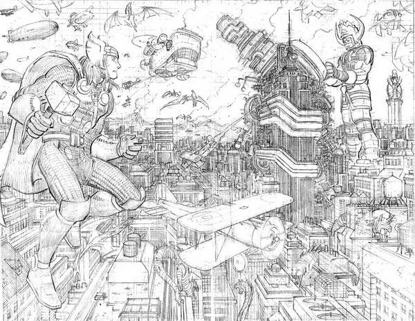 Then his last Marvel book, Captain America, had some powerful pages John is not the "next Kirby". He has some Kirby influence + John Buscema...and in the end he has HIS style. Humble as he is John says he has no style, only a "deadline style"; That's not true. He really has a very distinctive style
|
| Back to Top |
profile
| search
|
| |
Matt Reed
Byrne Robotics Security
Robotmod
Joined: 16 April 2004
Posts: 36482
|
| Posted: 27 March 2016 at 2:16am | IP Logged | 11
|
|
|
Robert Ingrao wrote:
| NO ONE goes toe to toe with Kirby! NOBODY! He is at the top! that statement is more BS than anything i said. |
|
|
Soooo...no one can ever, from now to infinity, be the same as (toe-to-toe) or better than Kirby.
No one.
Ever.
It's a mountain no one can climb and one no one should ever even try.
Seriously?
I love Kirby as much as the next Kirby fan, but to deify him is ludicrous. He deserved much more praise than he got in the 70s & 80s and doesn't deserve the sainthood people want to hoist upon him after his death. In short, his influence can be felt far and wide but that doesn't preclude others from lifting the gauntlet and taking that mantle. Sacrilege, I know, but perspective people...perspective.
|
| Back to Top |
profile
| search
|
| |
John Byrne
Grumpy Old Guy
Joined: 11 May 2005
Posts: 135904
|
| Posted: 27 March 2016 at 5:42am | IP Logged | 12
|
|
|
Not a comment on JR's art, but a question: that spread with Galactus in the background. Has Thor learned to fly?
|
| Back to Top |
profile
| search
|
| |