| Author |
|
Peter Hicks
Byrne Robotics Member

Joined: 30 April 2004
Location: Canada
Posts: 1969
|
| Posted: 03 March 2014 at 10:28am | IP Logged | 1
|
|
|
The motorcyclist being hit by the shield in panel 3 really needs to be reimagined after reading How to Draw Comics the Marvel Way. It looks like the crappy "before" version in Lee/Buscema's book. The cyclist and the bike should both be airborne, travelling in different directions, neither of them upright.
|
| Back to Top |
profile
| search
|
| |
Craig Markley
Byrne Robotics Member

Joined: 16 April 2004
Location: United States
Posts: 3969
|
| Posted: 03 March 2014 at 10:32am | IP Logged | 2
|
|
|
I think it may be the angle of the shield when Captain America catches it. The shield is open (star upright) as it heads back but it is closed (facing downward) when he catches it.
|
| Back to Top |
profile
| search
|
| |
Bill Sandefur
Byrne Robotics Member

Joined: 21 August 2013
Location: United States
Posts: 118
|
| Posted: 03 March 2014 at 11:23am | IP Logged | 3
|
|
|
I was just having this discussion with someone the other day. He works at a comic store and asked why I don't buy new comics anymore, and I told him, "because they don't make comics anymore". I said that today's comics are so radically different in tone, and look from what they were, that they really can't be defined as "comicbooks" anymore. I said they should call them something else. He disagreed. I explained that "comic books" aren't just pictures with word balloons presented in a sequential order. Comic art is a specific art-form. And that it has a specific look, style, and feel to it that makes it what it is (was). For example, if you ask anyone over the age of 30 to picture some comicbook art, they are most likely going to think of brightly colored, dynamic (exaggerated) artwork, that is outlined in black ink. That's not what today's comics look like at all. Comparing the comic art of today, with classic comic art is like comparing Hip Hop to Country music. Yeah, they are both considered a form of music, but they are not the same. And they have a totally different fan-base. To demonstrate my point - on the left is a page from a recent issue of the X-Men, and on the right is a page of real comicbook art from a classic issue of the X-Men. Nuff said. 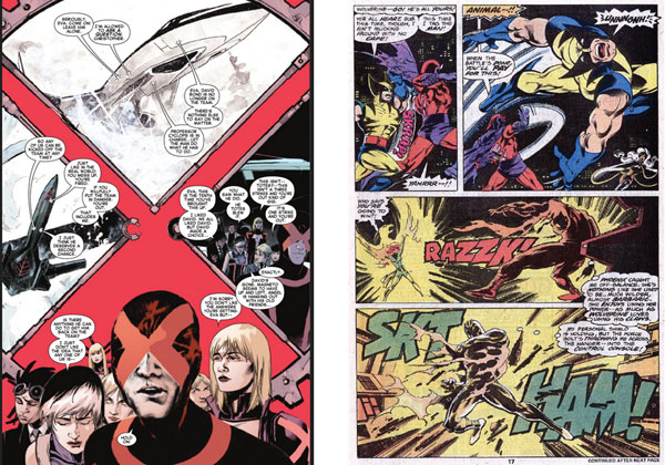
|
| Back to Top |
profile
| search
| www
|
| |
John Byrne
Grumpy Old Guy
Joined: 11 May 2005
Posts: 133325
|
| Posted: 03 March 2014 at 11:23am | IP Logged | 4
|
|
|
As Stan Lee says, in a Marvel comic, people don't reach for the phone, they REACH for the phone. A bit of advice that has served me well.
|
| Back to Top |
profile
| search
|
| |
John Byrne
Grumpy Old Guy
Joined: 11 May 2005
Posts: 133325
|
| Posted: 03 March 2014 at 11:28am | IP Logged | 5
|
|
|
On a different note, tho, look at the two last thought balloons from Magneto. Try reading them out loud. How long did it take him to fly back into that instrument panel?This is another kind of problem, when the artist does the best s/he can to make the action go POP-POP-POP! and the writer shovels in buckets of superfluous copy and slows... everything... down...
|
| Back to Top |
profile
| search
|
| |
Greg Kirkman
Byrne Robotics Member

Joined: 12 May 2006
Location: United States
Posts: 15775
|
| Posted: 03 March 2014 at 11:44am | IP Logged | 6
|
|
|
It's a tricky balancing act, isn't it?
Total realism would feature minimal thought or dialogue balloons in that
scene, and the result is something like today's comics, which you can
read in five minutes.
I think that classic comics have a sort of unspoken agreement with the
audience--"We know that all of these thought and dialogue balloons
aren't realistic, but they're needed in order to convey exposition, or
subtleties of plot and character. Just go with it.".
That said, there are times where all of those balloons cross the line,
like when they really slow down an action scene.
As I've been reading Lee and Kirby's FF recently, one thing that jumps
out at me again and again is how Stan's scripts are tailored so as to
make all of the physical action as clear as possible for the reader, no
matter how obvious the action may be.
Sometimes this scripting is redundant, sometimes it even directly
contradicts the art, and sometimes it adds immensely to the story. It's a
fine line to tread!
Edited by Greg Kirkman on 03 March 2014 at 11:47am
|
| Back to Top |
profile
| search
e-mail
|
| |
Bill Sandefur
Byrne Robotics Member
Joined: 21 August 2013
Location: United States
Posts: 118
|
| Posted: 03 March 2014 at 1:35pm | IP Logged | 7
|
|
|
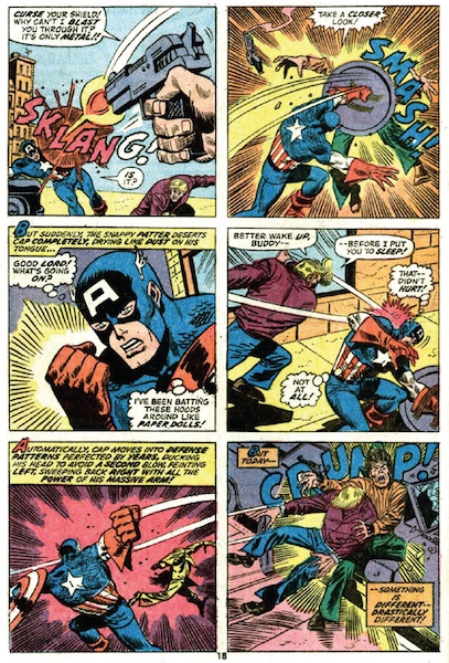
Here is a good example of what I consider to be "comicbook" art.
There are several panels on this page that employee traditional comic art techniques. Such as bright colors, exaggerated action, speed lines, and crazy sound effects. These are the kinds of things that I miss about today's art. Modern comics look so static, muted, and dull compared to classic stuff like this. |
| Back to Top |
profile
| search
| www
|
| |
Bill Sandefur
Byrne Robotics Member
Joined: 21 August 2013
Location: United States
Posts: 118
|
| Posted: 03 March 2014 at 1:47pm | IP Logged | 8
|
|
|
I feel that if the above page doesn't at all appeal to you, then you don't really like comics that much. Because that's what superhero comics have always been since the beginning. So, when these new guys come along and completely change them, they are in effect destroying what it is they purport to "love" so much. After all, why would you go into a field like comicbooks, unless you had a passion for it?
That's why it confuses me as to why these new "creators" seem so embarrassed by past comics that they want to completely change them into something entirely different. As far as I'm concerned, as a result, they've basically destroyed a true American art-form. Comics as we knew them are all but extinct. Sad.
|
| Back to Top |
profile
| search
| www
|
| |
Doug Centers
Byrne Robotics Member

Joined: 17 February 2014
Location: United States
Posts: 5598
|
| Posted: 03 March 2014 at 6:21pm | IP Logged | 9
|
|
|
I do not buy any current "comics" but my son is into Deadpool because of a video game. So recently I took him to a comic book store, this is my intro to the new world of comic books. There is no draw at all to these books, if I squint my eyes and look at the rack everything looks the same. Subdued colors which seems to tone the action down and maybe 2 or 3 panels per page. I feel bad for the modern kids who never got to experience "real" comic mania. I'll stick to reclaiming some comics I used to own pre 1981.
|
| Back to Top |
profile
| search
|
| |
Robert White
Byrne Robotics Member

Joined: 16 April 2004
Location: United States
Posts: 4560
|
| Posted: 03 March 2014 at 6:29pm | IP Logged | 10
|
|
|
Brilliant example with that page from the current issue of X-Men. That's not a comic page...that's a poster! Not to mention that all the character's look look unheroic slackers.
The problem is that too much of the indie and alternative styles have bleed over into mainstream comics to the point that the specific language of superhero comics has been lost (unless JB, Alan Davis, Walt, etc, does something). I'm open to all kinds of art, even the art depicted above, but I'm a strong proponent of staying within basic traditions when it comes to genre comics. (Creator owned? You make the rules and I'll follow along. But, please, please, don't bring your emotional baggage and idiosyncrasies to Batman and Spider-Man. Is this so wrong?)
|
| Back to Top |
profile
| search
|
| |
Brian O'Neill
Byrne Robotics Member
Joined: 13 November 2013
Location: United States
Posts: 1964
|
| Posted: 03 March 2014 at 6:51pm | IP Logged | 11
|
|
|
Bill, what issue does that CA page come from?
|
| Back to Top |
profile
| search
|
| |
Mike Norris
Byrne Robotics Member

Joined: 16 April 2004
Location: United States
Posts: 4274
|
| Posted: 03 March 2014 at 8:25pm | IP Logged | 12
|
|
|
I love the fact that the artist slipped (up?) and elements of Cap's classic costume are present in that drawing,
|
| Back to Top |
profile
| search
e-mail
|
| |