| Author |
|
Robert White
Byrne Robotics Member

Joined: 16 April 2004
Location: United States
Posts: 4560
|
| Posted: 07 February 2014 at 11:49am | IP Logged | 1
|
|
|
That Conan series is an abomination. Words can't express how glad I am to have collected the Roy Thomas run over the years so I have the original issues as they're supposed to look. It's much worse than the Neal Adams Batman trades, which by comparison, aren't heavy handed at all.
|
| Back to Top |
profile
| search
|
| |
Greg Kirkman
Byrne Robotics Member

Joined: 12 May 2006
Location: United States
Posts: 15775
|
| Posted: 07 February 2014 at 12:08pm | IP Logged | 2
|
|
|
I'm enjoying the heck out of the softcover Masterworks, which are
meticulously recolored and restored to fully match the original issues,
warts and all.
While I appreciate past reprints which have tried to present stories in
the best way possible by eliminating errors ("Peter Palmer", etc.) and
such, I prefer to see the stories as originally printed.
I've been wanting to read all of Neal Adams' Batman stuff for years and
years, but I can't bring myself to buy the recolored (and redrawn!)
reprint collections.
The FOURTH WORLD omnibus volumes, on the other hand, are
gorgeous.
|
| Back to Top |
profile
| search
e-mail
|
| |
Robert Bradley
Byrne Robotics Member

Joined: 20 September 2006
Location: United States
Posts: 4878
|
| Posted: 07 February 2014 at 12:19pm | IP Logged | 3
|
|
|
Greg - I would agree that if you're making a high-end collection like a Masterwork or an omnibus that they should be reprinted warts and all.
Correcting the obvious errors in a regular trade is fine by me. I am on the fence regarding changing the original stories like Neal Adams did - even when the original artist is involved in the changes. I don't think they're necessary, but apparently he did.
|
| Back to Top |
profile
| search
| www
|
| |
Peter Hicks
Byrne Robotics Member

Joined: 30 April 2004
Location: Canada
Posts: 1963
|
| Posted: 07 February 2014 at 12:21pm | IP Logged | 4
|
|
|
Speaking of colors, was there something special about the Sentinels that caused 3 out of their first 4 story lines to contain at least one issue where they were orange instead of purple? Only the Adams storyline escaped this disaster. Orange Sentinels showed up throughout X-Men 16(I think?), X-Men 99, and Avengers 104. What was the recurring problem?
|
| Back to Top |
profile
| search
|
| |
Jason Czeskleba
Byrne Robotics Member

Joined: 30 April 2004
Posts: 4617
|
| Posted: 07 February 2014 at 12:55pm | IP Logged | 5
|
|
|
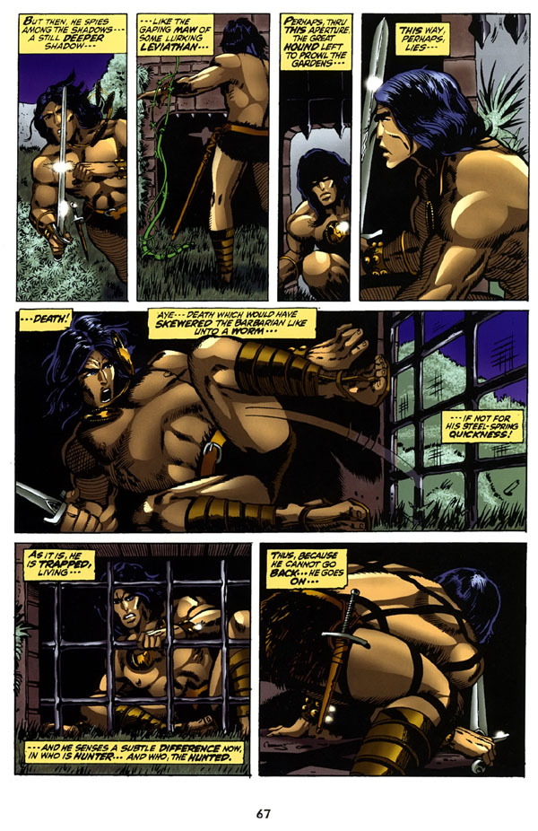
Larry Gil wrote:
Matt , do you have a link to that thread..I was just about to order Barry Windsor Smith's Vol.1 and 2 Hardcovers from Darkhorse.
Is it that bad? |
|
|
Sadly, yes. The worst modern recoloring of an old comic I've ever seen. This is taken from the Chronicles of Conan Volume 2 trade paperback, but my understanding is that this same coloring is used in the Barry Smith hardcover books:
|
| Back to Top |
profile
| search
|
| |
Roy Johnson
Byrne Robotics Member

Joined: 19 May 2013
Location: Canada
Posts: 1323
|
| Posted: 07 February 2014 at 1:22pm | IP Logged | 6
|
|
|
Jason:
Jee-zus, was that done with MSPaint?
|
| Back to Top |
profile
| search
|
| |
Richard White
Byrne Robotics Member

Joined: 28 August 2009
Location: United Kingdom
Posts: 1058
|
| Posted: 07 February 2014 at 1:50pm | IP Logged | 7
|
|
|
Jason, I have the BWS dedicated collection and the
coloring isn't as bad as the image above...it isn't great
either!
|
| Back to Top |
profile
| search
| www
e-mail
|
| |
Stephen Churay
Byrne Robotics Member

Joined: 25 March 2009
Location: United States
Posts: 8369
|
| Posted: 07 February 2014 at 2:05pm | IP Logged | 8
|
|
|
As a rule, I agree with JB; NO!
I think because of a lot of older artists' rendering styles, there work
looks better with flatter color.
Secondly, if I buy a trade that reprints a collection of issues, I'm
wanting a reading experience that as close as I can get to reading the
original monthlies.
If I had a choice in paper stock for them, I'd want a matte or low gloss
stock. I think it better mimics newsprint.
BTW Robert, you might want to check your Kirby Fourth World
omnibus again. I know my hardbacks use a lower gloss or matte stock.
But I agree, they are the gold standard for reprint trades.
There are exceptions Walt Simonson's THOR Omnibus was recolored.
They are currently rereleasing the run as a series of trades using the
same colors as the omnibus. Those are so well done, that if all
collections of older material could look that good, I'd change my
position.
|
| Back to Top |
profile
| search
e-mail
|
| |
Brennan Voboril
Byrne Robotics Member
Joined: 15 January 2011
Posts: 1739
|
| Posted: 07 February 2014 at 2:55pm | IP Logged | 9
|
|
|
Laura Martin's work on the Rocketeer was great. If I remember Dave Stevens picked her to do it himself.
|
| Back to Top |
profile
| search
|
| |
Steven Myers
Byrne Robotics Member

Joined: 10 June 2004
Location: United States
Posts: 5677
|
| Posted: 07 February 2014 at 3:08pm | IP Logged | 10
|
|
|
No. I like the original colors. Or a attempt to duplicate them. I didn't even like that they colored the Hulk green in Origins of Marvel Comics. Robbed me of the chance to see the original gray Hulk!
|
| Back to Top |
profile
| search
| www
|
| |
Brad Krawchuk
Byrne Robotics Member

Joined: 19 June 2006
Location: Canada
Posts: 5819
|
| Posted: 07 February 2014 at 3:33pm | IP Logged | 11
|
|
|
I've never read JB's Spider-Man Chapter One. I picked up the trade recently at my LCS and flipped through it... then put it back. The colours were TERRIBLE. Whether that's how they were originally printed or not, I just couldn't bring myself to buy the book because the colours were so distracting.
That's something I'd buy in a heartbeat if they recoloured it. Get Ronda Pattison to do it, she was great with JB's work in Trio!
|
| Back to Top |
profile
| search
e-mail
|
| |
Richard White
Byrne Robotics Member
Joined: 28 August 2009
Location: United Kingdom
Posts: 1058
|
| Posted: 07 February 2014 at 4:16pm | IP Logged | 12
|
|
|
That Marvel purchase of Malibu back in the day really
seemed to produce some ugly colouring.
|
| Back to Top |
profile
| search
| www
e-mail
|
| |


