| Author |
|
Greg Kirkman
Byrne Robotics Member

Joined: 12 May 2006
Location: United States
Posts: 15772
|
| Posted: 11 January 2014 at 10:22pm | IP Logged | 1
|
|
|
I have that Treasury. It's gorgeous!
|
| Back to Top |
profile
| search
e-mail
|
| |
Lars Sandmark
Byrne Robotics Member

Joined: 05 October 2007
Location: Canada
Posts: 3138
|
| Posted: 11 January 2014 at 10:35pm | IP Logged | 2
|
|
|
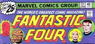
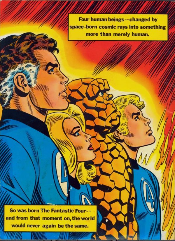
Makes me think of how much I love the the title logos.
I know JB prefers the original lettering and it adorns much of his run but I like the nostalgia factor.
My favourites! Y'gotta love the headshots of the team.
|
| Back to Top |
profile
| search
|
| |
Robert Bradley
Byrne Robotics Member

Joined: 20 September 2006
Location: United States
Posts: 4954
|
| Posted: 11 January 2014 at 10:38pm | IP Logged | 3
|
|
|
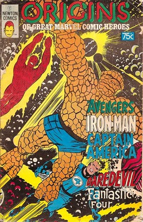
My first issue of Fantastic Four was FF #147 (in 1974), which was smack in the middle of the Conway/Buckler issues. Of course I was also reading MARVEL'S GREATEST COMICS at the time and got the FF Treasury Edition so I was familiar with the Lee/Kirby stories.
Those issues weren't terrible, but many of them were mediocre. As a kid I enjoyed the Kirbyish art, but as I got older and found out about the swipes and experienced some of Buckler's other work I eventually felt it was unfortunate that he didn't just draw them in his own style. (Apparently this was an editorial decision?)
Ben was also at the height of his "cute and cuddly" stage and Sue was on leave, so the regular title or Marvel Two-in-One were really upstaged by the classic reprints in MGC.
|
| Back to Top |
profile
| search
| www
|
| |
Perry Haslem
Byrne Robotics Member

Joined: 26 May 2013
Posts: 86
|
| Posted: 12 January 2014 at 1:15am | IP Logged | 4
|
|
|
I hadn't really thought about it before, but my first FF story was actually the first chapter of FF #1. It was in a b&w Australian reprint I bought in 1975.A good place to start, I suppose.
|
| Back to Top |
profile
| search
|
| |
Eric Jansen
Byrne Robotics Member

Joined: 27 October 2013
Location: United States
Posts: 2548
|
| Posted: 12 January 2014 at 8:43am | IP Logged | 5
|
|
|
I came in around issue #155 and enjoyed the (mostly) Roy Thomas/Rich Buckler run very much! After them came (and there's some staggering here) Len Wein/George Perez (great!), Marv Wolfman/Keith Pollard and some Byrne (good), Doug Moench/Bill Sienkiewicz (which I remember being... interesting), and then the wonderful John Byrne run (wonderful!)!
And all through those runs, I would catch some Stan Lee/Jack Kirby reprints and enjoyed those a lot too (especially the Treasury!).
I too just recently read the first six Marvel Masterworks editions and really fell in love with the early issues! My policy is to try to buy trade paperbacks at cons for no more than 50% of cover price, but I am seriously considering breaking that rule to get the rest of the Lee/Kirby run! (Not to put anybody else down, but I do believe I bought all the John Byrne collections at full price!)
Interestingly, I just realized that it was right after JB left FF that I drifted away from comics for a good while. (We all have a "quitting" story, don't we?) Coincidence? You tell me.
I just recently discovered that Steve Englehart started writing the book not too long after JB left and I wouldn't mind picking those up--and the Walt Simonson issues after that.
While things like AVENGERS really excited me, SPIDER-MAN and FANTASTIC FOUR really made me care about the characters. They're both extra-special.
|
| Back to Top |
profile
| search
|
| |
Richard Stevens
Byrne Robotics Member

Joined: 04 May 2004
Location: United States
Posts: 1986
|
| Posted: 12 January 2014 at 8:58am | IP Logged | 6
|
|
|
I'm generally all for some change, but no FF logo has ever topped the original. It's just so weird and distinctive!
|
| Back to Top |
profile
| search
| www
|
| |
Eric Jansen
Byrne Robotics Member
Joined: 27 October 2013
Location: United States
Posts: 2548
|
| Posted: 12 January 2014 at 8:59am | IP Logged | 7
|
|
|
I forgot to mention that, after reading the Masterworks and re-examining all the pre-Byrne issues, I really realized and now appreciate how important Joe Sinnott was to the whole "Fantastic Four look"!
I love the early issues and Kirby's inventiveness, energy, and layouts, but when Sinnott came on board, everything really took off!
And when I realized that the cover to SPIDER-WOMAN #1 (one of my all-time favorites!) was penciled AND inked by Sinnott (as were a bunch of other great covers I'm now discovering), my appreciation of his contribution to FF has grown by leaps and bounds!
Everybody makes a big deal about Lee and Kirby's 100+ issues (and they should!), but Sinnott stayed even longer! (Almost 200 issues!)
And I'm very much looking forward to reading (for the first time!) all those issues between #60 and #155 that I've missed!!
Edited by Eric Jansen on 12 January 2014 at 10:23am
|
| Back to Top |
profile
| search
|
| |
John Byrne

Grumpy Old Guy
Joined: 11 May 2005
Posts: 135935
|
| Posted: 12 January 2014 at 8:59am | IP Logged | 8
|
|
|
My favourites! Y'gotta love the headshots of the team. �� Headshots, sure. But that formalized lettering stripped all the character out of the logo. Hated 'em. Which is why I was happy to have the original back for my run.
|
| Back to Top |
profile
| search
|
| |
John Byrne
Grumpy Old Guy
Joined: 11 May 2005
Posts: 135935
|
| Posted: 12 January 2014 at 9:06am | IP Logged | 9
|
|
|
 �� That piece really points up the way the Thing had changed over the years, doesn't it? And not, in my opinion, in a good way (the changes, not that drawing). Three realistically drawn humans and. . . Fozzie Bear. Here's the history lesson again: 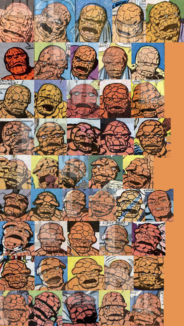
Note that even as Kirby "evolved" the Thing, he still managed to keep him (mostly) from being "cute". That came later. The nadir, of course, as I have mentioned before, came a short while before I came on the book, when the FF were attacked by "monstrous" versions of themselves. A "monstrous" version of the Thing? Hello??
|
| Back to Top |
profile
| search
|
| |
Michael Penn
Byrne Robotics Member

Joined: 12 April 2006
Location: United States
Posts: 13148
|
| Posted: 12 January 2014 at 9:25am | IP Logged | 10
|
|
|
That original, first-issue Thing is just plain... scary! He looked different, he talked different, so much more intimidating than what came later. Nothing fuzzy or "Fozzie" about him.
|
| Back to Top |
profile
| search
|
| |
Robert Bradley
Byrne Robotics Member
Joined: 20 September 2006
Location: United States
Posts: 4954
|
| Posted: 12 January 2014 at 9:47am | IP Logged | 11
|
|
|
Unfortunately, by the time I was introduced to him the Thing had already gone from a tragic misshapen creature to Uncle Ben taking Wundarr to the zoo.
|
| Back to Top |
profile
| search
| www
|
| |
Greg Kirkman
Byrne Robotics Member
Joined: 12 May 2006
Location: United States
Posts: 15772
|
| Posted: 12 January 2014 at 11:47am | IP Logged | 12
|
|
|
I'm generally all for some change, but no FF logo has ever topped the
original. It's just so weird and distinctive!
++++++++++
Interestingly, Sol Brodsky created it simply by using the same quirky
font as he did for the original AMAZING ADULT FANTASY logo.
|
| Back to Top |
profile
| search
e-mail
|
| |