Active Topics | Member List | Search | Help | Register | Login
The John Byrne Forum
Byrne Robotics > The John Byrne Forum << Prev Page of 7 Next >>
Topic: Rejected Cover Question (Ditko vs Kirby!) (Topic Closed Topic Closed) Post ReplyPost New Topic
Author
Message
Greg Kirkman
Byrne Robotics Member
Avatar

Joined: 12 May 2006
Location: United States
Posts: 15775
Posted: 04 January 2013 at 3:02pm | IP Logged | 1  

Paul Greer echoed my opinion - Kirby for AF#15, Ditko for ASM#10 - by a long shot.

+++++++++

Same, here.


Ditko's AF # 15 cover is great, but it feels too crowded to me. The final cover (which, of course, Ditko still had a hand in) makes Spider-Man the central focus, and really grabs the eye.

Spider-Man is a character that Kirby never quite seemed to get a grasp on--I get the feeling that, without Ditko's inks, the final version of the cover wouldn't have been so classic.

Back to Top profile | search e-mail
 
Paul Reis
Byrne Robotics Member
Avatar

Joined: 16 April 2004
Location: Canada
Posts: 923
Posted: 04 January 2013 at 4:55pm | IP Logged | 2  

as cover, i prefer Kirby's. as a splash page, Ditko's
Back to Top profile | search
 
Shaun Barry
Byrne Robotics Member
Avatar

Joined: 08 December 2008
Location: United States
Posts: 6854
Posted: 04 January 2013 at 6:21pm | IP Logged | 3  

I was long under the assumption that the AMAZING #10 cover was replaced due to possible sensitivity to President Kennedy's shooting?  With a March 1964 cover date, it would have been hitting the stands sometime in December 1963... would that issue have been going to print right around 11/22/63?

Of course, if true, why not just white-out the gun (instead of replacing the entire cover), but the timing does seem rather close.


Back to Top profile | search
 
Joe Hollon
Byrne Robotics Member
Avatar

Joined: 08 May 2004
Location: United States
Posts: 13683
Posted: 04 January 2013 at 9:29pm | IP Logged | 4  

Spider-Man is a character that Kirby never quite seemed to get a grasp on--I get the feeling that, without Ditko's inks, the final version of the cover wouldn't have been so classic.

***********

I like this "all Kirby" recreation.  It's got that later Kirby...um...Kirby-ness to it!


Back to Top profile | search | www e-mail
 
Benny Hasa
Byrne Robotics Member
Avatar

Joined: 12 January 2011
Posts: 724
Posted: 04 January 2013 at 10:26pm | IP Logged | 5  

For Amazing Fantasy 15, I prefer the Kirby one.

For ASM 10, I enjoy the Ditko one more.

Back to Top profile | search
 
Brian Hague
Byrne Robotics Member
Avatar

Joined: 14 November 2006
Posts: 8515
Posted: 05 January 2013 at 11:05am | IP Logged | 6  

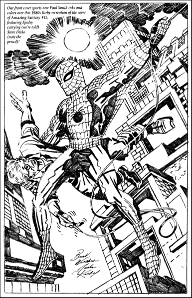
Reasons to prefer the Kirby covers for both ASM #10 and AF #1 include:

Coloring. Ditko's covers are busy, with figures and detail everywhere, a potential problem when dealing with Marvel's generally muddier printing back in the day. We're looking at modern recolorings of what those covers would have looked like. Back in day itself, however, the standard Marvel palette of dark greens, grays, browns, etc. would have made the "read" more difficult. Yes, they could have patiently gone through and differentiated this element or that, but why would they need to when Lee can more easily fix the problem by going with a different, cleaner composition altogether?

Composition. In both examples, the focus in the Kirby cover is squarely upon the hero. In Ditko's ASM #10, Spidey is just one of four more-or-less equally sized characters in a tangle. The primary focus of the cover is on the mystery of the Big Man. While Spidey is clearly the central figure of the Ditko's AF #1, he is still partially blocked by the man he's carrying. Why does that guy get to be in front? Also, he is somewhat smaller than Kirby's thug, making Spidey look bigger in comparision to him. Much of Spidey's appeal comes from the fact that he's not a big guy, but rather a smaller, more acrobatic figure. Ditko's initial layout does not put this across.

Pose. Ditko's Spider-Man reads very much to us, the modern reader, as web-swinging. We've all see Spidey do it a hundred thousand times at this point. What it looks like objectively, however, is Spidey running on the air, much like the Flash's foe, the Trickster. Again, the debut cover needs to emphasize what is different about our hero, and one of those elements is that he doesn't fly. He doesn't run from place to place. He swings. Kirby's conveys this without question or confusion. Ditko's, buried in downward-looking street detail and holding a runner's pose, does not.

Lee apparently often had Kirby "ghost" compositions for other artists to help then convey that sweeping sense of motion Lee sought, the focus upon dynamic figurework, and the ability to tell a moment's worth of story with complete clarity.

I agree with others that Ditko's covers would have been fine and are excellent pieces in and of themselves, but they weren't the impactful, dynamic pieces Lee was looking for to sell his books. Kirby and Lee were far more sympatico in this regard. Clearly, Ditko was still needed to add that special, street-level element to the inking and to fine-tune Kirby's more open, less picayune approach to individual character detail.

I like the Ditko ASM #10 quite a bit, especially in comparision to the more sparse Kirby layout, but Spidey himself is lost in a muddle of figures. The Kirby cover leaves no question as to who the star of the book is. Our boy Peter may be the modest, unassuming type who hides his Spider-Signal under a bushel, but there's no reason why his editors and publishers, who do have families to feed after all, need do the same!


Edited by Brian Hague on 05 January 2013 at 11:08am
Back to Top profile | search e-mail
 
John Byrne
Avatar
Grumpy Old Guy

Joined: 11 May 2005
Posts: 132673
Posted: 05 January 2013 at 11:38am | IP Logged | 7  

It's a safe bet both covers were redone at Stan's order, to make Spider-Man more dominant in the shot.
Back to Top profile | search
 
Jason Czeskleba
Byrne Robotics Member
Avatar

Joined: 30 April 2004
Posts: 4566
Posted: 05 January 2013 at 12:47pm | IP Logged | 8  

I wonder what the reason is for the published cover of #10 being a Kirby/Ditko collaboration.  How did that come about?  Did Ditko draw a complete second cover and then Stan pasted over a Kirby Spider-Man for some reason?  Or did Kirby draw the Spider-Man first, and then Ditko added the Enforcers to the background?  I wonder why Stan didn't simply have Ditko redraw the cover?  
Back to Top profile | search
 
John Byrne
Avatar
Grumpy Old Guy

Joined: 11 May 2005
Posts: 132673
Posted: 05 January 2013 at 12:55pm | IP Logged | 9  

I wonder what the reason is for the published cover of #10 being a Kirby/Ditko collaboration. How did that come about? Did Ditko draw a complete second cover and then Stan pasted over a Kirby Spider-Man for some reason? Or did Kirby draw the Spider-Man first, and then Ditko added the Enforcers to the background? I wonder why Stan didn't simply have Ditko redraw the cover?

••

If we trust Ditko's own descriptions of his Process -- and why shouldn't we? –– we can see that he was much more, well, fastidious than Kirby. Kirby was all about big, broad strokes (literally), while Ditko was the god who lived in the details.

Getting a cover redrawn, even with the long lead times of those days of yore, would be something that had to get turned around fairly quickly, and Kirby was, as we know, FAST. Especially given that, a that period. he would not likely have been producing what we would today consider full pencils.

Back to Top profile | search
 
Brennan Voboril
Byrne Robotics Member
Avatar

Joined: 15 January 2011
Posts: 1736
Posted: 05 January 2013 at 1:48pm | IP Logged | 10  

Amazing Fantasy #15 poses by each artist is something I keep coming back to over and over: somehow Ditko's looks like he is running in the air.  Anyone else see that?  Maybe it is just me but Kirby's looks more natural for a human doing with Spider-Man is doing.  You can kind of feel a certain power to it.
Back to Top profile | search
 
Joe Hollon
Byrne Robotics Member
Avatar

Joined: 08 May 2004
Location: United States
Posts: 13683
Posted: 05 January 2013 at 2:06pm | IP Logged | 11  

I don't doubt the purpose of the redrawn #10 cover to to make Spider-Man the centralized character but it's a disappointing decision and doesn't really mesh with the rest of Ditko's covers!  Take a look at them!  Lots of them where Spidey is similarly sized and emphasis.  Too bad.
Back to Top profile | search | www e-mail
 
Pascal LISE
Byrne Robotics Member
Avatar

Joined: 29 July 2006
Location: France
Posts: 1111
Posted: 05 January 2013 at 2:22pm | IP Logged | 12  

John said:
"he would not likely have been producing what we would today consider full pencils".

---

But Kirby likely drew what was expected from all artists of his days and considered fully rendered pencils.

As a matter of fact, I happen to own some of Kirby's photocopies and the sheer quality of his pencils never ceases to strike me as way above what most of his pairs could ever dream to produce, past or present.
Back to Top profile | search
 

<< Prev Page of 7 Next >>
  Post ReplyPost New Topic
Printable version Printable version

Forum Jump
You cannot post new topics in this forum
You cannot reply to topics in this forum
You cannot delete your posts in this forum
You cannot edit your posts in this forum
You cannot create polls in this forum
You cannot vote in polls in this forum

 Active Topics | Member List | Search | Help | Register | Login