| Author |
|
Richard White
Byrne Robotics Member

Joined: 28 August 2009
Location: United Kingdom
Posts: 1058
|
| Posted: 19 December 2012 at 9:25am | IP Logged | 1
|
|
|
I really hate the fact, that new DC logo is on my otherwise very swanky looking second Kamandi omnibus.
|
| Back to Top |
profile
| search
| www
e-mail
|
| |
Shawn Kane
Byrne Robotics Member

Joined: 04 November 2010
Location: United States
Posts: 3239
|
| Posted: 19 December 2012 at 10:29am | IP Logged | 2
|
|
|
I miss the Marvel bar across the top of the comic.
|
| Back to Top |
profile
| search
|
| |
Peter Martin
Byrne Robotics Member

Joined: 17 March 2008
Location: Canada
Posts: 15935
|
| Posted: 19 December 2012 at 11:20am | IP Logged | 3
|
|
|
I still think the new DC logo stinks, but I don't hate it quite as much as I thought. When it appears at the end of 'Arrow' each week I don't find it all that displeasing, for example.
I don't think Marvel have ever had a strong logo.
|
| Back to Top |
profile
| search
|
| |
Joel Tesch
Byrne Robotics Member

Joined: 19 May 2006
Posts: 2830
|
| Posted: 19 December 2012 at 11:32am | IP Logged | 4
|
|
|
Greg, I like all of those you posted. Especially the DC Bullet and the Marvel Comics "M" logo.
|
| Back to Top |
profile
| search
|
| |
Phil Kreisel
Byrne Robotics Member

Joined: 03 February 2006
Location: Canada
Posts: 1911
|
| Posted: 19 December 2012 at 1:50pm | IP Logged | 5
|
|
|
Remember this one? If you blinked, you missed it, but I always liked it. 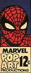
|
| Back to Top |
profile
| search
|
| |
Sam Karns
Byrne Robotics Member

Joined: 26 December 2004
Location: United States
Posts: 7624
|
| Posted: 20 December 2012 at 1:51am | IP Logged | 6
|
|
|
Why did the company called it POP ART Productions?
|
| Back to Top |
profile
| search
|
| |
Robert White
Byrne Robotics Member

Joined: 16 April 2004
Location: United States
Posts: 4560
|
| Posted: 20 December 2012 at 2:23am | IP Logged | 7
|
|
|
Marvel was riding the wave of popularity of pop art in general. The most visiable proponent was probably Andy Warhol. I suppose the general concept was that popular culture concepts, like comic books, could be seen as real "art."
|
| Back to Top |
profile
| search
|
| |
Robert White
Byrne Robotics Member
Joined: 16 April 2004
Location: United States
Posts: 4560
|
| Posted: 20 December 2012 at 2:27am | IP Logged | 8
|
|
|
I still don't understand the concept behind the new DC logo. I can't recall reading that anyone really likes it or much cares about it, so I have to wonder what the point was? Does stuff like this affect sales or consumer perception in the slightest when it comes to a comic book audience? Perhaps the underused logo design team at DC needed a reason to justify their existence? Maybe they're all big The Velvet Underground & Nico fans?
|
| Back to Top |
profile
| search
|
| |
Thomas Moudry
Byrne Robotics Member

Joined: 16 April 2004
Location: United States
Posts: 5060
|
| Posted: 20 December 2012 at 11:05am | IP Logged | 9
|
|
|
I'm not sure why DC change logos so soon after switching to the "spin" logo.
|
| Back to Top |
profile
| search
|
| |
Bill Catellier
Byrne Robotics Member

Joined: 19 September 2007
Location: United States
Posts: 3225
|
| Posted: 20 December 2012 at 12:20pm | IP Logged | 10
|
|
|
Preferred the DC bullet. I also like the Marvel Comics box. Those were my favorites.
|
| Back to Top |
profile
| search
e-mail
|
| |
Aaron Smith
Byrne Robotics Member

Joined: 06 September 2006
Location: United States
Posts: 10461
|
| Posted: 20 December 2012 at 5:30pm | IP Logged | 11
|
|
|
I'll vote for the ones Thomas picked.
|
| Back to Top |
profile
| search
| www
e-mail
|
| |
Wallace Sellars
Byrne Robotics Member

Joined: 01 May 2004
Location: United States
Posts: 17698
|
| Posted: 20 December 2012 at 5:53pm | IP Logged | 12
|
|
|
Remember this one? If you blinked, you missed it, but I always liked it.
---
I have a framed cover (taken from a calendar) with that one on it.
|
| Back to Top |
profile
| search
| www
|
| |


