| Author |
|
David Plunkert
Byrne Robotics Member

Joined: 03 July 2012
Posts: 536
|
| Posted: 22 October 2012 at 9:04pm | IP Logged | 1
|
|
|
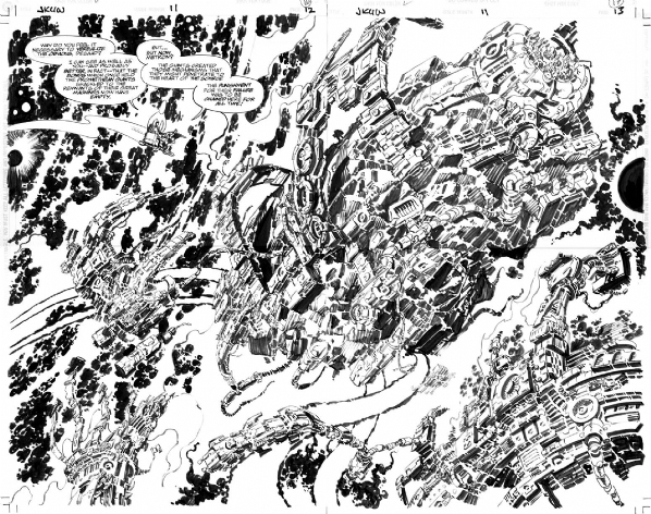
another from Kirby
Edited by David Plunkert on 22 October 2012 at 9:06pm
|
| Back to Top |
profile
| search
|
| |
Joel Biske
Byrne Robotics Member
Joined: 18 January 2007
Location: United States
Posts: 757
|
| Posted: 22 October 2012 at 9:18pm | IP Logged | 2
|
|
|
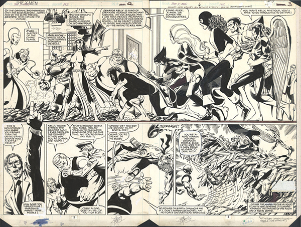
a couple last JB X-Men images.... these strike me as early versions of what JB is talking about above....
|
| Back to Top |
profile
| search
| www
e-mail
|
| |
David Plunkert
Byrne Robotics Member
Joined: 03 July 2012
Posts: 536
|
| Posted: 22 October 2012 at 9:42pm | IP Logged | 3
|
|
|
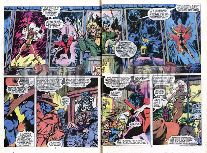
The ending of Xmen 111 is a great pay off but that opening where Beast clearly recognizes Banshee (who he has met) but not the other new X-men who he has seen in pictures (on the view screen: X-men 95?)....and then goes on to guess them ALL correctly is strangely careful for a 1970's superhero investigating a circus in the MU.
..as soon as you're a superhero at the circus you know there's a crime involving hypnotism right?
Edited by David Plunkert on 22 October 2012 at 9:44pm
|
| Back to Top |
profile
| search
|
| |
Stephen Churay
Byrne Robotics Member

Joined: 25 March 2009
Location: United States
Posts: 8369
|
| Posted: 22 October 2012 at 10:10pm | IP Logged | 4
|
|
|
As a comic book reader, I feel a double page spread doesn't have to
have a ton of extra story. I enjoy an occasional, big, visual punch if it
works with the pacing. That's my opinion.
======
IMO, the main thing is not having a lot of wasted space. You can fill
that space but does it add to the story, and does that DPS give the
proper impact.
Does the statue on the left and the BG buildings add to the the story?
I don't think so. Despite establishing the setting, a lot of those
buildings are wasted space. I think you could add more pop to the
panel by changing the camera angle. You add movement by putting
those buildings on an angle as the artist has but having Nightwing's
body level with the camera negates that. I think the image would be
better served by a full splash page, ditching the widescreen aspect
and doing a slight birds eye view and set his body at an angle as well.
On the opposite end. You can have blank areas that could that
actually add to the story. JB had a DPS that was MOSTLY negative
space. Two very white pages. An editor who didn't seem to
understand negative space as a story element, deleted the all white
page from the collected trade.
|
| Back to Top |
profile
| search
e-mail
|
| |
Marcel Chenier
Byrne Robotics Member

Joined: 19 May 2006
Location: United States
Posts: 2723
|
| Posted: 22 October 2012 at 10:22pm | IP Logged | 5
|
|
|
As someone who's collection is in boxes stored away in another country,please feel free to past as many of the DPS's as you'd like.
Thanks. :)
|
| Back to Top |
profile
| search
|
| |
Joe Hollon
Byrne Robotics Member

Joined: 08 May 2004
Location: United States
Posts: 13744
|
| Posted: 23 October 2012 at 2:34am | IP Logged | 6
|
|
|
I own one two-page spread:
I think it definitely "works" in terms of impact on the reader, showing the size of the environment, etc. It sure as heck didn't work as published though! There was an advertisement right in the middle between the two pages! I feel I did a good deed for the art collecting community by buying it and properly framing/displaying it....finally!
|
| Back to Top |
profile
| search
| www
e-mail
|
| |
Gal Schwartz
Byrne Robotics Member
Joined: 02 November 2005
Location: Israel
Posts: 61
|
| Posted: 23 October 2012 at 2:49am | IP Logged | 7
|
|
|
I've posted it in the regular art thread, but since JB had made a comment
regarding the "waste" of the DPS format, I thought it was fitting to
repost it here, followed by JB's comment and my reply; The piece below is the final DPS of SUPERMAN #123
(larger scan and rotated and published versions are in the link):
http://qurls.com?i=51567
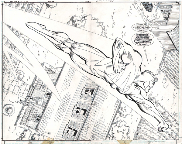
This piece pays a nice (fitting ?) homage to the final page of John Byrne's Man Of Steel #1 !
The background looks very similar to the original, but with a bit more detail
(thanks to the larger DPS format, while the original had the space of just one page).
As always, comments are welcome and appreciated.
Thanks,
Gal
Edited by Gal Schwartz on 23 October 2012 at 2:51am
|
| Back to Top |
profile
| search
| www
|
| |
Gal Schwartz
Byrne Robotics Member
Joined: 02 November 2005
Location: Israel
Posts: 61
|
| Posted: 23 October 2012 at 2:52am | IP Logged | 8
|
|
|
Here is JB's comment: JB: More detail, yes. But to swing back to the discussion of "wasted"
double page spreads, none of that detail adds to the story being told
by the picture, does it? In fact, I would argue that the double-page
format has a diminishing effect, since the "SUPERMAN" logo doesn't
POP against such an expansive background. (Why the letterer did
not make it LARGER is beyond me!) The piece is undeniably well drawn, just not worth two pages. **** And my take on it:
Obviously, it's not up to par with the original (what homage piece is ?),
but the original is the definitive Superman image for of generation,
so if this piece has even bits of the original's staying magic, than it's
more than worth it, IMO.
Regarding the added (excessive ?) detail -
I do feel that there is some added value in the contrast created between
the detailed farm, representing Clark's roots and humanity, and this
"new" Superman, with the ultra simplistic costume and more alien/
divine look.
The clean costume lines do pop out against the texture heavy BG. I do fully agree about the lettering - John Costanza is on of the greats,
so I'm surprised the logo is so small, as if he wasn't confident in this
new Superman logo (not to say ashamed of it).
Edited by Gal Schwartz on 23 October 2012 at 2:53am
|
| Back to Top |
profile
| search
| www
|
| |
John Byrne
Grumpy Old Guy
Joined: 11 May 2005
Posts: 136607
|
| Posted: 23 October 2012 at 4:21am | IP Logged | 9
|
|
|
Since a double page spread is most often a single image, and as such advances the story only ONE PANEL, it must have a greater purpose. "Impact" is the key word. IMPACT. IMPACT.Consider: there are few who would dispute the statement that the first hundred issues of FANTASTIC FOUR are among the most visually powerful American comics every published. There are images scattered thru those issues that leap off the page and smack the reader in the face. Johnny's (and our) first glimpse of Galactus' gigantic mechanical "home world". Doctor Doom on a rampage after stealing the power of the SIlver Surfer. Attilan. Him. Ben in the arena vs Torgo. The Negative Zone. Johnny and Wyatt discovering Prestor John. And what about that 100th issue! The FF vs just about every villain they'd battled up to that point! And in all those pages, all that action, all that spectacle, all that sprawling cosmic energy, the double page spreads number. . . none. In one hundred issues, those thousands of pages, no double page spreads. Even when Kirby "gave himself a raise" (as legend has it) by shifting more and more to full page splashes and four panel pages, in the FF's main title, there were no double page spreads. (I found one in FF ANNUAL 6 -- a largely black and white photo montage.) Later in his career, Kirby fell into a habit of devoting the second and third pages of each issue to a double page spread. Some were absolutely spectacular. Some were not. (I recall Jason Blood in a tavern. Big faces, intricate backgrounds -- but actually a visual step DOWN from the dynamism of the splash page.) And sometimes, he had to relinquish those spreads in favor of multiple panels, the part of the story being told just not being WORTH a spread. In comics, we lack some of the most important advantages of our closest cousin, film. Mostly, we lack MOVEMENT. Neither the characters nor the "camera" can move, and so we seek different ways to give the readers a close a approximation of the IMPACT that can be achieved with a motion picture camera. Different panel shapes are employed (tho Kirby, again, mostly restricted himself to the 9/6/4 grid). Wild angles within the panels. And, of course, using the full page, or the double page, to really throw an image at the reader. Just make sure it's one WORTH throwing! (And I mean that in all senses of the word "worth". Given the cost of comics today, as well as the diminished size of the overall package, we owe it to our readers to provide the maximum bang for the buck. A double page spread should be like one of those single-figure commission pieces I do, where I try to make maximum use of the space on the page. A spread should do the same. Not be, as I have said, just a big picture.)
|
| Back to Top |
profile
| search
|
| |
John Byrne
Grumpy Old Guy
Joined: 11 May 2005
Posts: 136607
|
| Posted: 23 October 2012 at 4:26am | IP Logged | 10
|
|
|
I think it definitely "works" in terms of impact on the reader, showing the size of the environment, etc. It sure as heck didn't work as published though! There was an advertisement right in the middle between the two pages! I feel I did a good deed for the art collecting community by buying it and properly framing/displaying it....finally!�� One of the distinct advantages of working with IDW, who put their ads in the back. When I do a spread, I don't have to worry about something getting between the pages. (When Marvel reprinted Neal Adams' X-MEN work the first time, they did exactly that -- dropping an ad in the middle of a double page spread!) In fact, in a recent issue of TRIO, I ASKED for an ad to be placed in the middle of a story (not a spread), so that a particular sequence, which had paced out as a right hand page, would get the turn-the-page benefit of being a left hand page.
|
| Back to Top |
profile
| search
|
| |
John Byrne
Grumpy Old Guy
Joined: 11 May 2005
Posts: 136607
|
| Posted: 23 October 2012 at 5:11am | IP Logged | 11
|
|
|
I see what JB is saying...my favorite example of a doulbe page "cinematic" shot is the one he did in his Jurassic Park mini...the last issue I believe. Man, if anyone has a scan of that, please post it (I can't find my copy right now!) The moment captured was amazingly rendered.�� And, if you really mean the last issue, A HUGE SPOILER!!!!! So please, nobody post it!
|
| Back to Top |
profile
| search
|
| |
Joie Simmons
Byrne Robotics Member

Joined: 31 July 2007
Location: United States
Posts: 288
|
| Posted: 23 October 2012 at 6:37am | IP Logged | 12
|
|
|
DAVE!
What is the Kirby spread from?
When I was a little kid, I had a drawer that had two old beat up comics in it that I looked at almost every day and pretty mush worshipped. They never left that drawer. One was an Emergency! comic, which was awesome, and another one didn't have a cover and a lot of pages and I think that was it!
And if it's not, it's pretty damned similar!
|
| Back to Top |
profile
| search
| www
e-mail
|
| |


