| Author |
|
Chad Carter
Byrne Robotics Member

Joined: 16 June 2005
Posts: 9584
|
| Posted: 25 October 2012 at 5:15pm | IP Logged | 1
|
|
|
|
| Back to Top |
profile
| search
|
| |
Chad Carter
Byrne Robotics Member
Joined: 16 June 2005
Posts: 9584
|
| Posted: 25 October 2012 at 5:16pm | IP Logged | 2
|
|
|
|
| Back to Top |
profile
| search
|
| |
Brian Rhodes
Byrne Robotics Member
Joined: 19 April 2004
Location: United States
Posts: 3411
|
| Posted: 25 October 2012 at 6:43pm | IP Logged | 3
|
|
|
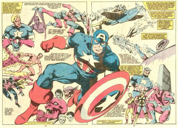
I've never noticed before how that Cap spread is broken into two panels, one representing his time during the war, the other focused on how he arrived in modern times.
|
| Back to Top |
profile
| search
e-mail
|
| |
Stephen Churay
Byrne Robotics Member

Joined: 25 March 2009
Location: United States
Posts: 8369
|
| Posted: 25 October 2012 at 8:36pm | IP Logged | 4
|
|
|
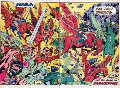
Chad, I love the devastation in the Hulk DPS, but I gotta say, seeing
the character half off the page like that is really awkward. I can
appreciate what's trying to be accomplished. I just don't think it's very
successful. Is that Sal's work? It looks like his.
|
| Back to Top |
profile
| search
e-mail
|
| |
Ghislain Wachowiak
Byrne Robotics Member

Joined: 16 April 2004
Location: France
Posts: 151
|
| Posted: 26 October 2012 at 1:50am | IP Logged | 5
|
|
|
|
| Back to Top |
profile
| search
|
| |
Greg Woronchak
Byrne Robotics Member

Joined: 04 September 2007
Location: Canada
Posts: 1631
|
| Posted: 26 October 2012 at 7:14am | IP Logged | 6
|
|
|
seeing
the character half off the page like that is really awkward
I dunno, it kinda works for me. It gives the creepy effect that he's walking off the page, almost crossing the line into 'reality'.
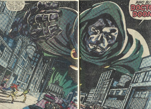
That beautiful Doom DPS is a good example of effective usage. It's the 'reveal' that the characters are tiny, so the giant Doom is incredibly startling.
It also includes a panel tilt, another comic tool that I love, carrying our eyes right (and making the reader feel off balance).
|
| Back to Top |
profile
| search
| www
e-mail
|
| |
John Byrne
Grumpy Old Guy
Joined: 11 May 2005
Posts: 136615
|
| Posted: 26 October 2012 at 7:27am | IP Logged | 7
|
|
|
That beautiful Doom DPS is a good example of effective usage. It's the 'reveal' that the characters are tiny, so the giant Doom is incredibly startling. �� Yet I can't shake the feeling Kirby would have done it in one panel out of six, and made it JUST as effective!! Consider this page, from FANTASTIC FOUR 5: 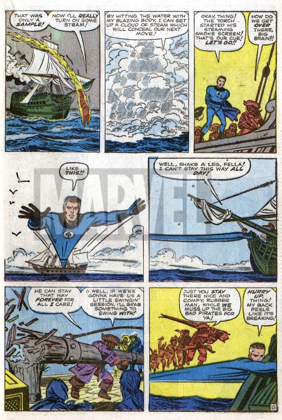
Last year, via Jim Warden, I was able to obtain the original art, and yesterday I found myself looking at this page in the light of the discussion in this thread. I had previously posted the page, in another thread, pointing out the amazing amount of energy Kirby packed into those normal sized panels. Yesterday, looking at it again, I found myself thinking that current artists (including myself, once upon a time) would be inclined to render any of the last four panels as double page spreads, and most especially the last two.
|
| Back to Top |
profile
| search
|
| |
David Plunkert
Byrne Robotics Member
Joined: 03 July 2012
Posts: 536
|
| Posted: 26 October 2012 at 8:07am | IP Logged | 8
|
|
|
Last year, via Jim Warden, I was able to obtain the original art, and yesterday I found myself looking at this page in the light of the discussion in this thread.
iii That's a very, very nice page. Love the rhythm of the action between Johnny, Reed and Ben. Its almost like music.
|
| Back to Top |
profile
| search
|
| |
Greg Woronchak
Byrne Robotics Member
Joined: 04 September 2007
Location: Canada
Posts: 1631
|
| Posted: 26 October 2012 at 8:46am | IP Logged | 9
|
|
|
would be inclined to render any of the last four panels as double page spreads, and most especially the last two.
Is it true that Kirby drew on larger than standard boards? With a 10 x 15 inch drawing space, a bunch of small panels must pose a challenge to get everything crammed in clearly!
I like how his action is designed to be easily 'read'.... great stuff.
|
| Back to Top |
profile
| search
| www
e-mail
|
| |
Ben Mcvay
Byrne Robotics Member
Joined: 18 June 2006
Posts: 1414
|
| Posted: 26 October 2012 at 8:50am | IP Logged | 10
|
|
|
Back then Kirby would have used the "Twice up" page sizes for his art.
|
| Back to Top |
profile
| search
|
| |
Matt Hawes
Byrne Robotics Member

Joined: 16 April 2004
Location: United States
Posts: 16661
|
| Posted: 26 October 2012 at 9:06am | IP Logged | 11
|
|
|
The double-page spread that Chad posted from "Captain America" is kinda a different sort of spread. All the multiple images surrounding the central figure of Captain America could have been made into individual panels had JB added borders to some of them. It definitely advances the story more than one panel at a time (or two, as the case may be).
|
| Back to Top |
profile
| search
| www
|
| |
Wallace Sellars
Byrne Robotics Member

Joined: 01 May 2004
Location: United States
Posts: 17838
|
| Posted: 26 October 2012 at 9:07am | IP Logged | 12
|
|
|
Now that you all know about THE HIGH WAYS, let me share an
example of me trying to use pages 2 and 3 to maximum advantage.
---
Those two pages look so good without color that I sort of wish THE
HIGH WAYS was going to be in B&W!
|
| Back to Top |
profile
| search
| www
|
| |