| Author |
|
David Plunkert
Byrne Robotics Member

Joined: 03 July 2012
Posts: 536
|
| Posted: 24 October 2012 at 9:11am | IP Logged | 1
|
|
|
A spread with gutters down the middle? When DID Marvel learn how to do full bleeds?
iii
There had to be special instructions to the printer on those pages given the halftone: which was probably shot and striped by the printer from Kirby's original collage art.
The split down the gutter is either a flub, an outright printing or binding limitation or a matter of budget and/or deadline. Safe to assume they could manage it on the center spread effortlessly compared to having art line up to kiss where the folios meet. In the example you posted the top and bottoms of the two sides of art don't even line up....we know they could manage that at least.
Marvel's were cheaply produced in terms of stock compared to DCs so I assume they avoided printing bells and whistles as well.
|
| Back to Top |
profile
| search
|
| |
John Byrne
Grumpy Old Guy
Joined: 11 May 2005
Posts: 136607
|
| Posted: 24 October 2012 at 9:41am | IP Logged | 2
|
|
|
There had to be special instructions to the printer on those pages given the halftone: which was probably shot and striped by the printer from Kirby's original collage art.�� The halftones come from the newspaper and magazine pictures from which Kirby built his collage. ++ The split down the gutter is either a flub, an outright printing or binding limitation or a matter of budget and/or deadline. �� None of the above. ++ In the example you posted the top and bottoms of the two sides of art don't even line up....we know they could manage that at least. �� Printers pay very little attention to what's actually on the page. The look at the borders, and they line up the artwork accordingly. If a page has gutters all around, there would seem no particular need to make sure two facing pages are on the "level".
|
| Back to Top |
profile
| search
|
| |
Terry Thielen
Byrne Robotics Member

Joined: 30 May 2012
Location: United States
Posts: 480
|
| Posted: 24 October 2012 at 10:01am | IP Logged | 3
|
|
|
I've been racking my brain to remember all those intense moments in comics that I remember there being a huge image to portray it, but I've found that nearly all those moments are NOT dps. Most times they are simply a panel that crossed the center, but not what I would consider a spread. Some of what I was thinking of were simply splash pages. Amazing, the amount of effect simple panels have given me more than any dps I seem to have seen.
|
| Back to Top |
profile
| search
|
| |
John Byrne
Grumpy Old Guy
Joined: 11 May 2005
Posts: 136607
|
| Posted: 24 October 2012 at 10:07am | IP Logged | 4
|
|
|
From my own work, often cited as the moment with the single greatest emotional impact is the death of Reed and Sue's baby, which is a single panel that does not even fill a whole page!
|
| Back to Top |
profile
| search
|
| |
Rick Senger
Byrne Robotics Member

Joined: 16 April 2004
Location: United States
Posts: 9824
|
| Posted: 24 October 2012 at 10:35am | IP Logged | 5
|
|
|
Interesting discussion. My main take on this is that the value of the DPS is clearly eye of the beholder stuff, and we're never going to resolve it. I understand JB's desire to keep the story moving forward and it's a consideration when you only have 20 pages plus or minus to tell your story. Two pages is about 10% of your "story real estate." The modern predilection for gigantic pin-ups has contributed greatly to decompressed storylines, which is one reason I don't buy comics much these days.
On the other hand, I consume all forms of entertainment media from TV to movies to various literature from books to comics for basically two reasons. One, to learn and experience new things. Two, to be moved. For me, they're related, but for me the second is a bigger consideration than the first. If I am honestly touched by something, I can forgive a lot more than I can if something is well crafted and competent but it doesn't get to my emotions. A lot of those two page spreads get to my emotions. A lot of those one-pagers do, too. But even if the plot isn't advanced that much, there is something special about many of those well-drawn DPS that pushes me further over the cliff than smaller images. For me there is a lot of value in that, too.
|
| Back to Top |
profile
| search
e-mail
|
| |
David Plunkert
Byrne Robotics Member
Joined: 03 July 2012
Posts: 536
|
| Posted: 24 October 2012 at 11:10am | IP Logged | 6
|
|
|
None of the above. iii We'll have to respectfully agree to disagree on the small point of how Kirby's collages were prepared for printing. The 4 color process and gravure printed stuff that Kirby used in his collages wouldn't have given the printer a sizable enough dot.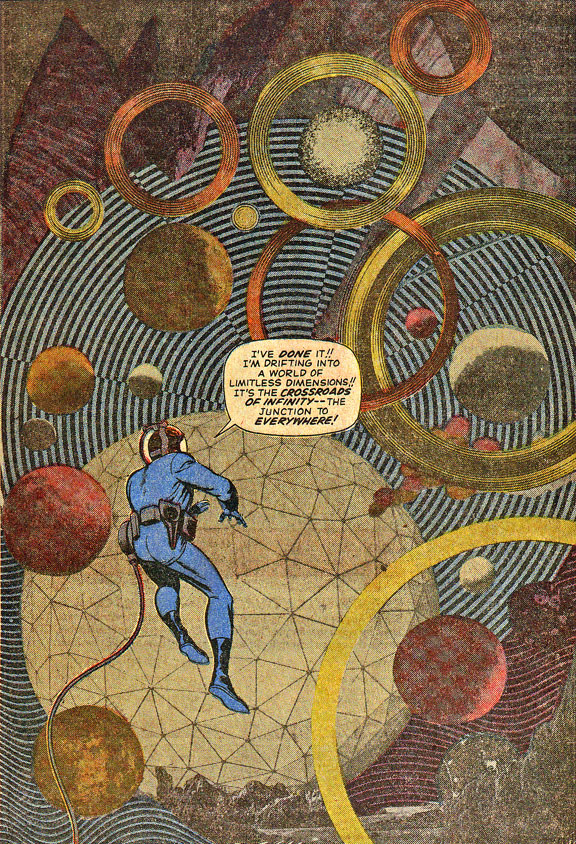 Based on this example ... a b+w halftone was shot and the printer added color screens. 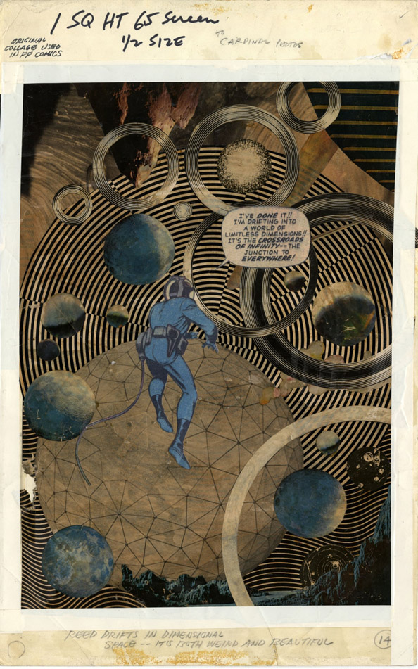
|
| Back to Top |
profile
| search
|
| |
Brennan Voboril
Byrne Robotics Member
Joined: 15 January 2011
Posts: 1735
|
| Posted: 24 October 2012 at 11:18am | IP Logged | 7
|
|
|
I don't feel cheated by Kirby's stuff about but when I hold the book I like the double-page spread more. Bigger the better!
|
| Back to Top |
profile
| search
|
| |
Steven Legge
Byrne Robotics Member

Joined: 28 July 2012
Location: Canada
Posts: 866
|
| Posted: 24 October 2012 at 11:23am | IP Logged | 8
|
|
|
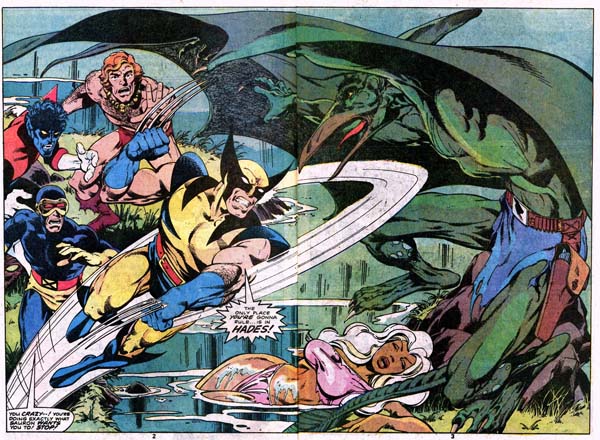
Technically not a double page spread, but Steranko's infamous four page spread! [LINK] (or as we say here in Canada, a double-double)
|
| Back to Top |
profile
| search
| www
e-mail
|
| |
Nathan Greno
Byrne Robotics Member

Joined: 20 April 2006
Location: United States
Posts: 9154
|
| Posted: 24 October 2012 at 11:48am | IP Logged | 9
|
|
|
Byrne: Do you feel "deprived" or "cheated" by any of those images?
--
Brennan: I don't feel cheated by Kirby's stuff about but when I hold the book I like the double-page spread more. Bigger the better!
--
I agree with you, Brennan!
Question for all...
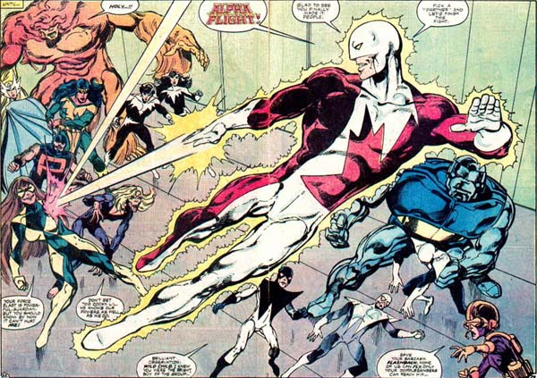
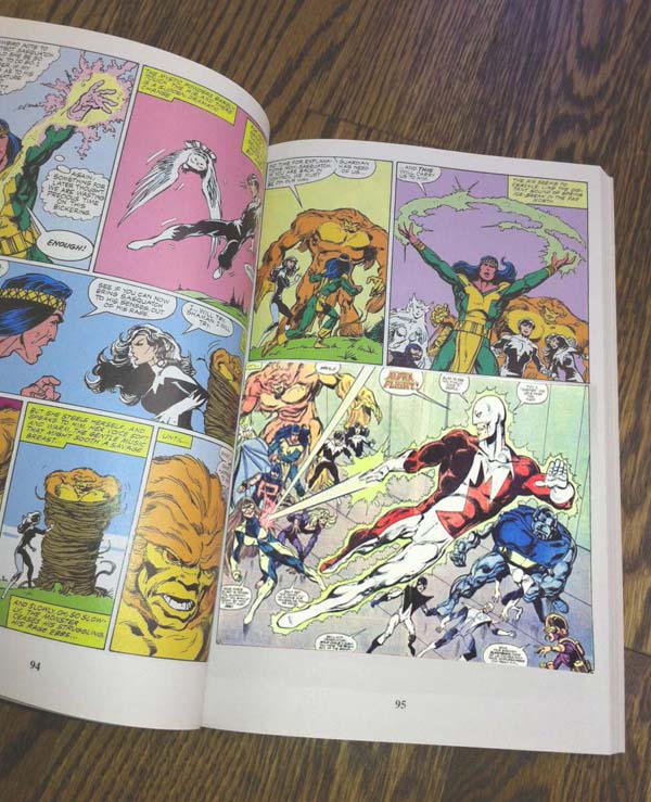
Would you rather read AF #12 like this...
...or something like this...?
|
| Back to Top |
profile
| search
|
| |
Flavio Sapha
Byrne Robotics Member

Joined: 16 April 2004
Location: Brazil
Posts: 12912
|
| Posted: 24 October 2012 at 11:57am | IP Logged | 10
|
|
|
That AF spread actually has a special meaning to the narrative, seeing as it was the first time that the team really got together since the start of the series!
|
| Back to Top |
profile
| search
|
| |
Nathan Greno
Byrne Robotics Member
Joined: 20 April 2006
Location: United States
Posts: 9154
|
| Posted: 24 October 2012 at 12:09pm | IP Logged | 11
|
|
|
Question for all:
Is this more FUN to read...
...or is this...?
Edited by Nathan Greno on 24 October 2012 at 12:13pm
|
| Back to Top |
profile
| search
|
| |
John Byrne
Grumpy Old Guy
Joined: 11 May 2005
Posts: 136607
|
| Posted: 24 October 2012 at 12:12pm | IP Logged | 12
|
|
|
How about THIS for a variant on that question:The double-page spread posted above was pages 2 and 3 of a 17 page story. The first page was also a splash. That means the first three pages of the book gave the reader TWO PANELS of story. With the second layout, there would have been a full additional page of story and art. So which is "more fun"? Big pictures, or MORE STORY?
|
| Back to Top |
profile
| search
|
| |