| Author |
|
John Peter Britton
Byrne Robotics Member

Joined: 17 May 2006
Location: United Kingdom
Posts: 9129
|
| Posted: 07 July 2006 at 8:45am | IP Logged | 1
|
post reply
|
|
yes you are right they are a bit gaudy. its just me mucking about with the colours. saying that even the inks i use on my art are bright. i start bright and usually town down.so yes anthony castrillo your right.they are nothing like my original drawing.most of the stuff i do now only exists in the computer. which i never keep i delete it.but your a very talented guy yourself.
|
| Back to Top |
profile
| search
e-mail
|
| |
John Peter Britton
Byrne Robotics Member
Joined: 17 May 2006
Location: United Kingdom
Posts: 9129
|
| Posted: 07 July 2006 at 9:11am | IP Logged | 2
|
post reply
|
|
here is a old superman and batman annual i did in the 70's.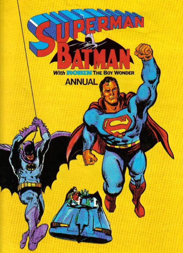
|
| Back to Top |
profile
| search
e-mail
|
| |
John Peter Britton
Byrne Robotics Member
Joined: 17 May 2006
Location: United Kingdom
Posts: 9129
|
| Posted: 07 July 2006 at 11:37am | IP Logged | 3
|
post reply
|
|
hi matthew,i hope you dont mind but i put some rough colour to that john byrne drawing of batman you inked over.i have probably done them the wrong colours but i did it quickly.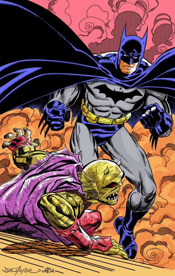
|
| Back to Top |
profile
| search
e-mail
|
| |
Anthony castrillo
Byrne Robotics Member

Joined: 17 February 2005
Location: United States
Posts: 781
|
| Posted: 07 July 2006 at 12:33pm | IP Logged | 4
|
post reply
|
|
COOL!!! Nice job JPB!
mac
|
| Back to Top |
profile
| search
|
| |
John Peter Britton
Byrne Robotics Member
Joined: 17 May 2006
Location: United Kingdom
Posts: 9129
|
| Posted: 07 July 2006 at 12:50pm | IP Logged | 5
|
post reply
|
|
thanks anthony. i see this as practice and practice makes perfect.
|
| Back to Top |
profile
| search
e-mail
|
| |
James Kilpatrick
Byrne Robotics Member
Joined: 08 October 2005
Location: United States
Posts: 99
|
| Posted: 07 July 2006 at 2:26pm | IP Logged | 6
|
post reply
|
|
jpb...that's sweet.
the color choices you make on your art sets it apart from almost
everything else i've ever seen.
if you had told me you were going to do that earlier batman piece in all
yellow i would've told you "thanks but no thanks..."
not only did it work, but it worked really, really well.
your color choices give your art a very pronounced jim steranko feel...and
that sir is most certainly meant as a compliment.
i can't wait to see what you share with us next...your art also makes me
think of the late 70's and early 80's comic era...that also is a compliment.
a lot of comic companies today have forgotten what made comics so
successful...you sir, have not.
awesome stuff...wow.
|
| Back to Top |
profile
| search
| www
e-mail
|
| |
Guest79877180
Byrne Robotics Member

Joined: 20 April 2005
Location: United States
Posts: 2386
|
| Posted: 07 July 2006 at 2:45pm | IP Logged | 7
|
post reply
|
|
JPB - don't mind at all. It is JB's stuff originally.
Have to say that I really enjoy the color pallet you use for your work. It takes getting use to, but the secret is, IMO, that we've gotten so used to over rendered coloring that we've lost some of the playfulness of a simpler color scheme. If one looks at the colors on, say (because I just finished reading it) The Dark Phonex saga, the colorist had a limited pallet to choose from, but look how creative they were with what they had!!
I welcome the colors you've got on that. They are fun, bright, and brings back a lot of the thoughts that James hit on the the post above me.
And they make my 80's Zip-a-tone effect look good!!
|
| Back to Top |
profile
| search
| www
e-mail
|
| |
John Peter Britton
Byrne Robotics Member
Joined: 17 May 2006
Location: United Kingdom
Posts: 9129
|
| Posted: 07 July 2006 at 2:45pm | IP Logged | 8
|
post reply
|
|
thanks james. and jim steranko was one of my favourites. i sort of mix all the styles together that are in my head. and you are right about comic companys i think they have forgotten.
|
| Back to Top |
profile
| search
e-mail
|
| |
John Peter Britton
Byrne Robotics Member
Joined: 17 May 2006
Location: United Kingdom
Posts: 9129
|
| Posted: 07 July 2006 at 2:51pm | IP Logged | 9
|
post reply
|
|
thanks matthew. i could have used a different approach with the colour and made a much darker job. but i just try to keep it simple. there are lots of ways i could have changed that piece of art, but i am glad you liked it.
|
| Back to Top |
profile
| search
e-mail
|
| |
Chris Yeoman
Byrne Robotics Member

Joined: 19 July 2005
Location: United Kingdom
Posts: 2371
|
| Posted: 07 July 2006 at 2:56pm | IP Logged | 10
|
post reply
|
|
John, that looks fantastic! Great job.
|
| Back to Top |
profile
| search
| www
|
| |
Anthony castrillo
Byrne Robotics Member
Joined: 17 February 2005
Location: United States
Posts: 781
|
| Posted: 07 July 2006 at 3:00pm | IP Logged | 11
|
post reply
|
|
It reminds me of the early Golden covers, Mike uses at most 5
color schemes.
Edited by Anthony castrillo on 07 July 2006 at 3:04pm
|
| Back to Top |
profile
| search
|
| |
John Peter Britton
Byrne Robotics Member
Joined: 17 May 2006
Location: United Kingdom
Posts: 9129
|
| Posted: 07 July 2006 at 3:18pm | IP Logged | 12
|
post reply
|
|
i used to know a artist called frank bellamy years ago. i remember asking him about his colouring. he only used a few colours to get the effects that he used on heros the spartan and his thunderbirds. he was a great guy to learn from. and so i think in keeping my colours simple. and yes anthony i do go a bit to bright at times. i hope this makes some sense.
|
| Back to Top |
profile
| search
e-mail
|
| |


