| Author |
|
Joe Alexander
Byrne Robotics Member

Joined: 18 November 2010
Location: United States
Posts: 572
|
| Posted: 10 November 2011 at 11:06am | IP Logged | 1
|
|
|
Wow...that is my first good look at the Superman suit---that is most discouraging.
Don't think I can add anything new to what everyone has mentioned but I always liked the look of Marvel's Stingray.
Edited by Joe Alexander on 10 November 2011 at 11:17am
|
| Back to Top |
profile
| search
|
| |
Thanos Kollias
Byrne Robotics Member

Joined: 19 June 2004
Location: Greece
Posts: 5009
|
| Posted: 10 November 2011 at 10:06pm | IP Logged | 2
|
|
|
It takes a lot of effort to come up with a costume worse than what Brandon Rout was wearing. Compared to this attrocity, the previous guys had got it right!!
|
| Back to Top |
profile
| search
| www
e-mail
|
| |
Paulo Pereira
Byrne Robotics Member
Joined: 24 April 2006
Posts: 15539
|
| Posted: 11 November 2011 at 7:06am | IP Logged | 3
|
|
|
The things the Routh costume got wrong (imo) were the colors (mainly the red, which looked more like a burgundy), the texture of the cape and the belt buckle 'S'.
|
| Back to Top |
profile
| search
|
| |
Thanos Kollias
Byrne Robotics Member
Joined: 19 June 2004
Location: Greece
Posts: 5009
|
| Posted: 11 November 2011 at 8:57am | IP Logged | 4
|
|
|
Well, on top of what you site, Paulo, they did mess up the "red" trunks, as they started too far down the belly, the costume had an unnecessary texture to it (tiny little Ss for crying out loud!) and they didn't include a shield on the cape and they offered that weird, 3D shield on the chest. And yet, despite those many stupid choices, THAT costume could easily be identified as a Superman costume. The new one can't...
|
| Back to Top |
profile
| search
| www
e-mail
|
| |
Valmor J. Pedretti
Byrne Robotics Member

Joined: 14 October 2011
Location: Brazil
Posts: 785
|
| Posted: 11 November 2011 at 10:24am | IP Logged | 5
|
|
|
Did you guys see the new Nova by Ed Mcguiness?
I digged the not so busy clothing, but the helmet strikes me as a bit too "birdy".
|
| Back to Top |
profile
| search
| www
|
| |
Victor Manuel Fernandez Pati�o
Byrne Robotics Member
Joined: 16 April 2004
Location: Mexico
Posts: 1615
|
| Posted: 14 November 2011 at 11:44am | IP Logged | 6
|
|
|
Mmmm... This is why you shouldn't mess with perfection.
|
| Back to Top |
profile
| search
| www
e-mail
|
| |
Mike Norris
Byrne Robotics Member

Joined: 16 April 2004
Location: United States
Posts: 4272
|
| Posted: 14 November 2011 at 7:45pm | IP Logged | 7
|
|
|
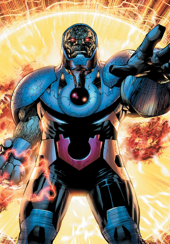
Darkseid! Now with Eggshell Armor!!!!
|
| Back to Top |
profile
| search
e-mail
|
| |
Aaron Smith
Byrne Robotics Member

Joined: 06 September 2006
Location: United States
Posts: 10461
|
| Posted: 14 November 2011 at 8:53pm | IP Logged | 8
|
|
|
Ugh! Darkseid looks awful. For so many reasons, storytelling for one and costume design too, today's artists and writers need to be chained to their chairs and forced to read Essentials and Showcases. Maybe they need to have the sleek elegance of Gil Kane's Green Lantern costume tattoed inside their eyelids so they can study it while they sleep!
|
| Back to Top |
profile
| search
| www
e-mail
|
| |
Paulo Pereira
Byrne Robotics Member
Joined: 24 April 2006
Posts: 15539
|
| Posted: 14 November 2011 at 9:59pm | IP Logged | 9
|
|
|
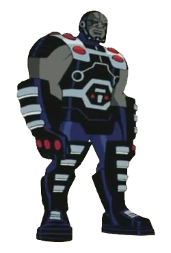
That is pretty ghastly. Here's a better redesign (from JLU), though I prefer the original.
|
| Back to Top |
profile
| search
|
| |
James Elliott
Byrne Robotics Member

Joined: 16 November 2010
Location: United States
Posts: 481
|
| Posted: 15 November 2011 at 12:58pm | IP Logged | 10
|
|
|
From Ask Yahoo!(Please proved links. Don't cut and paste long quotes. Check the Forum Decorum rules. JB)
Edited by JohnByrne2 on 15 November 2011 at 2:58pm
|
| Back to Top |
profile
| search
|
| |
John Byrne
Grumpy Old Guy
Joined: 11 May 2005
Posts: 135850
|
| Posted: 15 November 2011 at 2:58pm | IP Logged | 11
|
|
|
That is pretty ghastly. Here's a better redesign (from JLU), though I prefer the original.�� "Better" being strictly in the eye of the beholder. Both versions, I notice, get the chin wrong. Not a big surprise, I suppose. Even Jack did that, in his later visits to the Fourth World.
|
| Back to Top |
profile
| search
|
| |
Kip Lewis
Byrne Robotics Member
Joined: 01 March 2011
Posts: 2877
|
| Posted: 15 November 2011 at 3:51pm | IP Logged | 12
|
|
|
I kindof like it, but then I realized, it's Darkseid. He's one of those
villains that I could see in a double-breasted suit, his original, this or
many other variation and he'd still be "the man". His presence is just
that strong.
(Plus, I like Jim Lee's style.)
|
| Back to Top |
profile
| search
|
| |