| Author |
|
Tony Midyett
Byrne Robotics Member

Joined: 25 January 2010
Location: United States
Posts: 2834
|
| Posted: 17 October 2011 at 3:34pm | IP Logged | 1
|
|
|
I love how Ron Frenz channeled Steve Ditko when he was on the Spider-Man book, and then channeled Kirby when he was on Thor. That guy rocks. He really kicks it, old school.
|
| Back to Top |
profile
| search
|
| |
Ronald Joseph
Byrne Robotics Member

Joined: 18 April 2011
Location: United States
Posts: 1781
|
| Posted: 17 October 2011 at 4:04pm | IP Logged | 2
|
|
|
Always loved this one... 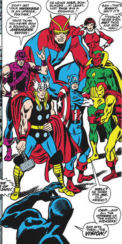
|
| Back to Top |
profile
| search
| www
e-mail
|
| |
Martin Redmond
Byrne Robotics Member
Joined: 27 June 2006
Posts: 3880
|
| Posted: 17 October 2011 at 4:41pm | IP Logged | 3
|
|
|
They're all better with the original coloring. Most recolors look like they have no clue what they're doing. Maybe the recolorists have no control, I might be unfair, idk, but it looks awful. All the mood from the original is gone. Even if the choices were limited, some colorists knew which hue and tone to choose for the right situation. edit: I love that X-Men vs Sentinels issue on XMas so much. As much as I dislike Storm's original costume, Cockrum makes me love it. Her cape is drawn so nice, it's untrue and there's just something about that issue as if every panel was the most important panel ever drawn.
Edited by Martin Redmond on 17 October 2011 at 4:44pm
|
| Back to Top |
profile
| search
|
| |
Tony Midyett
Byrne Robotics Member
Joined: 25 January 2010
Location: United States
Posts: 2834
|
| Posted: 17 October 2011 at 5:41pm | IP Logged | 4
|
|
|
I have come to dislike modern comics coloring so much that I wish they'd just print the damn things in black and white. They'd be cheaper, if nothing else. And some old school artists are such great drafstmen that they look better in b&w anyway...just check out the Showcase and Essentials books.
|
| Back to Top |
profile
| search
|
| |
Aaron Smith
Byrne Robotics Member

Joined: 06 September 2006
Location: United States
Posts: 10461
|
| Posted: 17 October 2011 at 6:11pm | IP Logged | 5
|
|
|
On the subject of coloring, since I've spent most of my comics reading time over the past few years catching up on old stuff through Essentials and Showcases, I'm seeing many of these panels in color for the first time.
|
| Back to Top |
profile
| search
| www
e-mail
|
| |
Valmor J. Pedretti
Byrne Robotics Member

Joined: 14 October 2011
Location: Brazil
Posts: 785
|
| Posted: 17 October 2011 at 7:26pm | IP Logged | 6
|
|
|
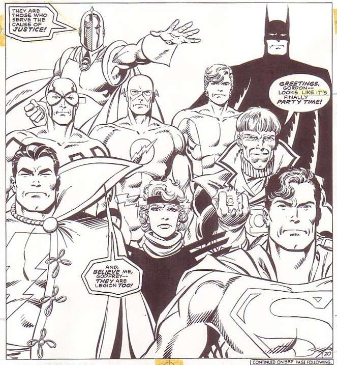
The Legends' version of Batman with the black cape/boots/gloves always struck me as one of the greatest! Huge impact on me as a kid!
Edited by Valmor J. Pedretti on 17 October 2011 at 7:28pm
|
| Back to Top |
profile
| search
| www
|
| |
Chad Carter
Byrne Robotics Member
Joined: 16 June 2005
Posts: 9584
|
| Posted: 17 October 2011 at 7:32pm | IP Logged | 7
|
|
|
Tony M: early in that Thor run, Frenz does a complete John Buscema imitation (as in that panel I posted.) Then, when Joe Sinnott jumps on the book, he goes into Kirby mode and blows the doors off everything that was coming out from Marvel in that time period. And I say this, not even a Thor fan. That comic run is overlooked and way underrated.
|
| Back to Top |
profile
| search
|
| |
Tony Midyett
Byrne Robotics Member
Joined: 25 January 2010
Location: United States
Posts: 2834
|
| Posted: 18 October 2011 at 6:41am | IP Logged | 8
|
|
|
^ Yeah, you're right---I hadn't thought about it, but pre-Sinnott, he was channeling J. Buscema! That run is really awesome. I am not generally a fan of Tom DeFalco's writing, but I like his work when he's teamed with Frenz....is it possible they had a Claremont/Byrne thing going on, with the artist essentially writing the book, and the writer just filling in word balloons?
|
| Back to Top |
profile
| search
|
| |
John Byrne
Grumpy Old Guy
Joined: 11 May 2005
Posts: 135834
|
| Posted: 18 October 2011 at 10:42am | IP Logged | 9
|
|
|
There's been another recent discussion of how the penchant of some colorists/separators to knock out blacks with color -- often LIGHT color! -- reduces the power of the image.I'll borrow that THOR double spread for a somewhat quick and dirty illustration of the point. . . 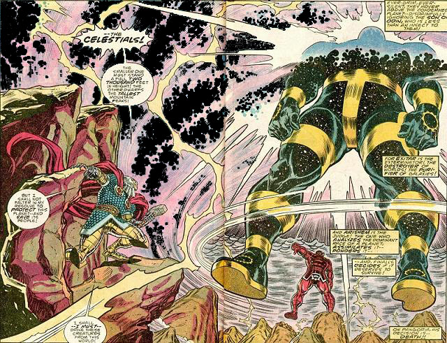
|
| Back to Top |
profile
| search
|
| |
Brennan Voboril
Byrne Robotics Member
Joined: 15 January 2011
Posts: 1735
|
| Posted: 18 October 2011 at 11:18am | IP Logged | 10
|
|
|
Again the example shows just how horrible this knocking out of the blacks is. Makes me wonder what the colorists who do it see that I don't. Black makes it POP and the knocking out of the black makes it seem dirty and washed out.
|
| Back to Top |
profile
| search
|
| |
Keith Thomas
Byrne Robotics Member

Joined: 06 April 2009
Location: United States
Posts: 3081
|
| Posted: 18 October 2011 at 6:50pm | IP Logged | 11
|
|
|
Always liked this Loki from New Mutants SE 1 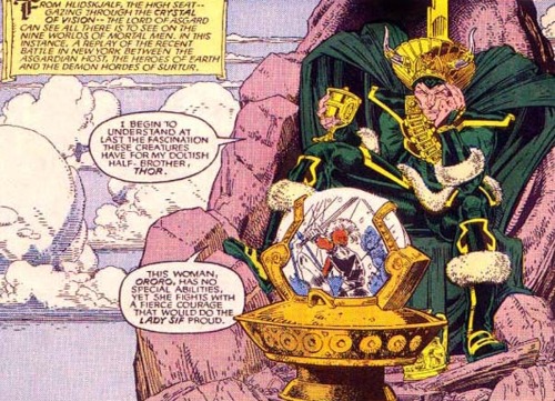
|
| Back to Top |
profile
| search
|
| |
Chad Carter
Byrne Robotics Member
Joined: 16 June 2005
Posts: 9584
|
| Posted: 18 October 2011 at 7:14pm | IP Logged | 12
|
|
|
|
| Back to Top |
profile
| search
|
| |


