| Author |
|
Brad Brickley
Byrne Robotics Member

Joined: 29 April 2004
Location: United States
Posts: 8301
|
| Posted: 10 January 2010 at 2:30pm | IP Logged | 1
|
|
|
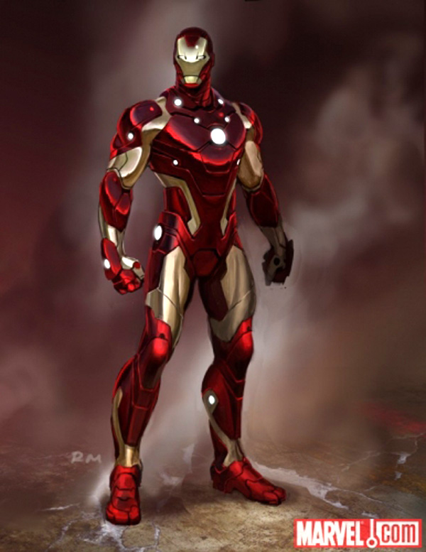
The silver and red just never looked right to my eye. I favor the traditional red and gold suit. I did like the movie version of the suit. The original suit is cool too when drawn by the right artist.
|
| Back to Top |
profile
| search
| www
|
| |
Greg McPhee
Byrne Robotics Member

Joined: 25 August 2004
Location: United Kingdom
Posts: 5196
|
| Posted: 10 January 2010 at 7:19pm | IP Logged | 2
|
|
|

Isn't this Sunturion??
|
| Back to Top |
profile
| search
|
| |
Greg McPhee
Byrne Robotics Member

Joined: 25 August 2004
Location: United Kingdom
Posts: 5196
|
| Posted: 10 January 2010 at 7:20pm | IP Logged | 3
|
|
|
Paid a visit to Bob Layton's website, and he has some great IM armour designs there.
|
| Back to Top |
profile
| search
|
| |
Derek Cavin
Byrne Robotics Member

Joined: 03 June 2005
Location: United States
Posts: 2403
|
| Posted: 10 January 2010 at 8:17pm | IP Logged | 4
|
|
|
I agree with Greg -- I liked the Silver and Red suit, I thought it was a good design, though I'll take the Gold and Red anyday. Just no insects or anime Ultron looks.
|
| Back to Top |
profile
| search
e-mail
|
| |
Paulo Pereira
Byrne Robotics Member

Joined: 24 April 2006
Posts: 15539
|
| Posted: 10 January 2010 at 9:35pm | IP Logged | 5
|
|
|
QUOTE:
| There was an emergency involving Rhodey so Tony cobbled together that spare parts costume. |
|
|
Thanks, Victor.
|
| Back to Top |
profile
| search
|
| |
Arc Carlton
Byrne Robotics Member

Joined: 13 April 2009
Location: Peru
Posts: 3492
|
| Posted: 10 January 2010 at 10:46pm | IP Logged | 6
|
|
|
No (Iron) Man should wear hips boots. I hate when male characters war hip boots. ______________________ I can think of a couple male heroes that would look good on hip boots ...
|
| Back to Top |
profile
| search
e-mail
|
| |
Mike Norris
Byrne Robotics Member

Joined: 16 April 2004
Location: United States
Posts: 4272
|
| Posted: 10 January 2010 at 11:12pm | IP Logged | 7
|
|
|
Kang turned evil becasue someone mocked his hipboots.
|
| Back to Top |
profile
| search
e-mail
|
| |
Stephen Churay
Byrne Robotics Member

Joined: 25 March 2009
Location: United States
Posts: 8369
|
| Posted: 11 January 2010 at 12:29am | IP Logged | 8
|
|
|
Looking at the new armor again, I wonder what the idea was behind the color scheming. I'm alright with the idea of it being red and silver, but the fact that the colors are SO interwoven makes no sense to me.
Bottom line: I don't find this armor graphically appealing.
|
| Back to Top |
profile
| search
e-mail
|
| |
Marcel Chenier
Byrne Robotics Member

Joined: 19 May 2006
Location: United States
Posts: 2723
|
| Posted: 11 January 2010 at 9:08am | IP Logged | 9
|
|
|
All that effort into a sleek new design and they STILL haven't given him "toe-socks" as boots yet? Why, they oughtta be ashamed!
Individual little toes on every boot--with lazerz on 'em. Sleek, car-racing lazerz!
|
| Back to Top |
profile
| search
|
| |
John Byrne

Grumpy Old Guy
Joined: 11 May 2005
Posts: 135854
|
| Posted: 11 January 2010 at 9:13am | IP Logged | 10
|
|
|
I liked the Silver and Red suit, I thought it was a good design, though I'll take the Gold and Red anyday.�� As I've mentioned before, the silver and red came about basically as a result of people getting a bit too clever. When I helped design that version of Iron Man's armor, I mentioned to Mark Gruenwald that the best I thought the suit had ever looked was when worn by Giant Man in the "Armored Avengers" issue of WHAT IF�? There is was BLUE and silver, which really said "iron" to me much more red and gold ever did! Unfortunately, Gruenie decided to go with red and silver, which in the comic was red and white, and looked like a coloring mistake. (There are precious few costumes that work with primaries and white as their color combos. Most of the time, the white looks more like something was left out, than a conscious decision.)
|
| Back to Top |
profile
| search
|
| |
Paul Go
Byrne Robotics Member

Joined: 19 April 2004
Location: United States
Posts: 1394
|
| Posted: 11 January 2010 at 9:24am | IP Logged | 11
|
|
|
I think the new armor needs more lights or glowing dots or whatever those are. Are glowing dots to the naughties that pouches were to the nineties?
I prefer the classic red and gold myself.
I do recall liking the blue and silver Giant Man in that issue of WHAT IF...?
|
| Back to Top |
profile
| search
|
| |
John Byrne

Grumpy Old Guy
Joined: 11 May 2005
Posts: 135854
|
| Posted: 11 January 2010 at 9:32am | IP Logged | 12
|
|
|
Glancing at this image again, I am suddenly struck by how careful artists are going to have to be when drawing certain angles on the figure, lest that inner thigh red segment end up looking, as it sort of does here, like the world's most assertive codpiece.
|
| Back to Top |
profile
| search
|
| |


