| Author |
|
Paulo Pereira
Byrne Robotics Member

Joined: 24 April 2006
Posts: 15539
|
| Posted: 08 January 2010 at 3:37pm | IP Logged | 1
|
|
|
Caleb wrote:
| I suppose it will eventually get to a point where Tony will just were awristwatch that does everything his IM Armor was capable of. |
|
|
Exactly; a watch that generates a force-field. Heck, why not a micro-chip?
Comics are a visual medium. You don't want to get bogged down in practicalities.
|
| Back to Top |
profile
| search
|
| |
Brad Teschner
Byrne Robotics Member

Joined: 01 June 2005
Location: United States
Posts: 3933
|
| Posted: 08 January 2010 at 3:42pm | IP Logged | 2
|
|
|
What Dwayne said!
|
| Back to Top |
profile
| search
|
| |
Michael Roberts
Byrne Robotics Member

Joined: 20 April 2004
Location: United States
Posts: 14909
|
| Posted: 08 January 2010 at 3:44pm | IP Logged | 3
|
|
|
I don't see what was wrong with the EXTREMIS armor he's been wearingfor the last few years. After multiple attempts (and failures) toupdate his armor, Granov final seemed to get it right.
---
I hated the Extremis armor. It made Iron Man look like an insect. I thought the movie armor was where Granov got it right.
|
| Back to Top |
profile
| search
|
| |
Brad Teschner
Byrne Robotics Member
Joined: 01 June 2005
Location: United States
Posts: 3933
|
| Posted: 08 January 2010 at 3:54pm | IP Logged | 4
|
|
|
y'know what...meh just doesn't sum it up. I friggin' hate that armor design! nothing cool about it...it sucks!!! it's butt ugly and just unworthy of Iron Man. it looks like something a nameless scrub employed by one of Iron Man's enemies would wear.
|
| Back to Top |
profile
| search
|
| |
Brian Tait
Byrne Robotics Member

Joined: 18 April 2004
Location: Canada
Posts: 1817
|
| Posted: 08 January 2010 at 3:58pm | IP Logged | 5
|
|
|
While I understand the idea of trying to make it sleek and futuristic, I don' t think it's necessary.
Classic '70s red and gold for me. I don't care for the "new" look either.
The armor in the comics lately hasn't been too bad, but for me, the simple, easy to draw look of the classic armor works the best.
The characters name is Iron Man after all. Give him some bulk.
|
| Back to Top |
profile
| search
e-mail
|
| |
John Bodin
Byrne Robotics Member

Purveyor of Rare Items
Joined: 16 April 2004
Location: United States
Posts: 3911
|
| Posted: 08 January 2010 at 4:12pm | IP Logged | 6
|
|
|
That doesn't say "Iron Man" to me at all -- looks more like some new character . . . like maybe "The Puzzler" or such, but definitely NOT Iron Man. The last "good" post-"Heroes Reborn" Iron Man armor design was Sean Chen's design, from the Busiek/Chen run, IMO -- it was instantly recognizable as Iron Man, and it even incorporated some nice retro touches (particularly the "pointy" mask). Interestingly, I did a quick Web search to try to find a good pic of the "Chen armor," and I couldn't find any static poses -- all the pics I found online in a quick search were action-type poses, with nary a "pin-up"-type shot to be found. That kind of speaks volumes about how far we've come in a very short time -- the Chen/Busiek run wasn't that long ago, and I've re-read it all within the past few years, and I definitely I don't recall it being "decompressed," there were few "talking head" pages, little re-used art for the sake of dramatic (yet redundant) "pauses," and Chen seemed to focus more on drawing the STORIES, rather than trying to produce pin-up pages that could be sold at a higher premium.
EDITED TO ADD: Found this cover with a decent picture of the Chen armor: 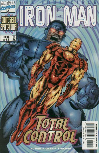
Edited by John Bodin on 08 January 2010 at 8:58pm
|
| Back to Top |
profile
| search
e-mail
|
| |
Francesco Vanagolli
Byrne Robotics Member

Joined: 03 June 2005
Location: Italy
Posts: 3130
|
| Posted: 08 January 2010 at 4:25pm | IP Logged | 7
|
|
|
The Chen armor, if I recall correctly, was more an Alex Ross armor. And it was very good. Later, new awful version replaced that and Iron Man started to look like Ultron. Luckily, I had dropped the book.
Quite odd, I never liked the extremis armor in comics, but for me in the movie it looked perfect!
Anyway, I don't dislike this new armor, in fact I think it's the best since the Busiek run. And I agree with this: The inspiration for the new design came from thinking about a sleeker,leaner, tougher Iron Man," revealed Fraction. "If technology isincreasingly getting smaller and lighter it seems like the Iron Manshould do the same: ergonomic and aerodynamic.
I have wondered for years why Tony Stark, with all the new technologies he surely owns, couldn't design a smaller armor. I had the same idea when I was 14...
Edited by Francesco Vanagolli on 08 January 2010 at 4:27pm
|
| Back to Top |
profile
| search
e-mail
|
| |
Michael Huber
Byrne Robotics Member

Joined: 27 August 2007
Location: United States
Posts: 3337
|
| Posted: 08 January 2010 at 4:41pm | IP Logged | 8
|
|
|
I like it! It's pretty! But it ain't Iron Man. I'd soon call that something like, hmm, Booster Gold?
|
| Back to Top |
profile
| search
|
| |
Sam Karns
Byrne Robotics Member

Joined: 26 December 2004
Location: United States
Posts: 7624
|
| Posted: 08 January 2010 at 4:42pm | IP Logged | 9
|
|
|
I really like Granov interpretation of Iron Man's armor. Not to worrry about these design changes are never permenant.
|
| Back to Top |
profile
| search
|
| |
Paulo Pereira
Byrne Robotics Member
Joined: 24 April 2006
Posts: 15539
|
| Posted: 08 January 2010 at 4:52pm | IP Logged | 10
|
|
|
I don't envy the guy who has to draw that on a monthly (bimonthly? whenever?) basis.
|
| Back to Top |
profile
| search
|
| |
Todd Douglas
Byrne Robotics Member
Joined: 14 July 2004
Posts: 4101
|
| Posted: 08 January 2010 at 5:00pm | IP Logged | 11
|
|
|
I don't mind it at all. Truth be told, I've never cared much for the "classic" 70's armor, despite being the standard when I first started reading comics. I can't really articulate why, beyond saying it just didn't "click" for me.
|
| Back to Top |
profile
| search
|
| |
Andrew W. Farago
Byrne Robotics Member

Joined: 19 July 2005
Location: United States
Posts: 4075
|
| Posted: 08 January 2010 at 5:06pm | IP Logged | 12
|
|
|
The designer also worked on the Watchmen movie, and did a lot of work on those costumes.
I still think Ditko's redesign is my favorite of the Iron Man costumes. Keep it simple. Yellow facemask, arms, legs and chestplate circle, red gloves, boots and everything else. Elegance of design, and simple enough for a kid with crayons to approximate on some scrap paper.
|
| Back to Top |
profile
| search
| www
e-mail
|
| |


