| Author |
|
William Lukash
Byrne Robotics Member

Joined: 17 May 2006
Location: United States
Posts: 1404
|
| Posted: 08 January 2010 at 2:40pm | IP Logged | 1
|
|
|
http://marvel.com/news/comicstories.10844.marvel_unleashes_i ron_man~apos~s_new_armor From the article: "The inspiration for the new design came from thinking about a sleeker, leaner, tougher Iron Man," revealed Fraction. "If technology is increasingly getting smaller and lighter it seems like the Iron Man should do the same: ergonomic and aerodynamic. We were looking for something that felt as sleek and glossy as a sports car Tony Stark would covet. I love what we've come up with. It feels like the next evolutionary step in the Iron Man's design." I wonder if they've seen this? 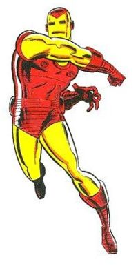
|
| Back to Top |
profile
| search
|
| |
Paulo Pereira
Byrne Robotics Member

Joined: 24 April 2006
Posts: 15539
|
| Posted: 08 January 2010 at 2:43pm | IP Logged | 2
|
|
|
I prefer the design you posted. Or the movie version.
The new one? Blech. Did they say "improved?"
Edited by Paulo Pereira on 08 January 2010 at 4:50pm
|
| Back to Top |
profile
| search
|
| |
Eric Lund
Byrne Robotics Member

Joined: 15 April 2004
Location: United States
Posts: 2072
|
| Posted: 08 January 2010 at 2:44pm | IP Logged | 3
|
|
|
The "Classic" Red and Gold armor of the 70's for me is the only Iron Man. It conveyed POWER and simplicity all at the same time.
|
| Back to Top |
profile
| search
|
| |
James Johnson
Byrne Robotics Member

Joined: 16 March 2009
Location: United States
Posts: 2353
|
| Posted: 08 January 2010 at 2:54pm | IP Logged | 4
|
|
|
My take on the new armor:
WOW!*
It's not Tony Stark who's constantly redesigning his armor, it's the nuts at M^^^^^ that let the next piece of eye-candy dictate how the armor should look.
* Worst of the Worst!
|
| Back to Top |
profile
| search
|
| |
Dwayne Gassmann
Byrne Robotics Member

Joined: 22 September 2006
Location: United States
Posts: 3448
|
| Posted: 08 January 2010 at 2:58pm | IP Logged | 5
|
|
|
Meh.
|
| Back to Top |
profile
| search
| www
|
| |
Michael Roberts
Byrne Robotics Member

Joined: 20 April 2004
Location: United States
Posts: 14909
|
| Posted: 08 January 2010 at 3:00pm | IP Logged | 6
|
|
|
I really dislike that design, but I do like that someone understands that as technology advances it gets smaller, lighter, and sleeker. Too many artists have been making Iron Man's armor clunkier to show that the technology is more advanced.
|
| Back to Top |
profile
| search
|
| |
Thom Price
Byrne Robotics Member
L’Homme Diabolique
Joined: 29 April 2004
Location: United States
Posts: 7592
|
| Posted: 08 January 2010 at 3:01pm | IP Logged | 7
|
|
|
Although I prefer the classic Iron Man armor from the 70s and 80s, I think this new design is better than what's used in the movies. The movie armor looks lumpy and clunky to me, like something put together with metallic Legos.
|
| Back to Top |
profile
| search
| www
e-mail
|
| |
Paul Greer
Byrne Robotics Security

Joined: 18 August 2004
Posts: 14203
|
| Posted: 08 January 2010 at 3:01pm | IP Logged | 8
|
|
|
While I REALLY prefer the classic armor that is posted above, I kinda dug the armor he had been wearing for the past few years. This new version actually looks more busy than the last one.
|
| Back to Top |
profile
| search
|
| |
Brad Krawchuk
Byrne Robotics Member

Joined: 19 June 2006
Location: Canada
Posts: 5814
|
| Posted: 08 January 2010 at 3:08pm | IP Logged | 9
|
|
|
I didn't mind the movie armour in the movie - because it worked. It moved, it had articulation, it could be worn by a real person but it was still undeniably Iron Man both in colour and design.
They don't have those limitations in comics. Keep the classic look - you don't need to explain why the yellow is near skin tight with no joints yet it still bends when Tony moves. So many of these new designs are trying to make the armour look real - it only needs to do that in reality. In a comic, it can look like anything.
|
| Back to Top |
profile
| search
e-mail
|
| |
Ed Love
Byrne Robotics Member
Joined: 05 October 2004
Location: United States
Posts: 2711
|
| Posted: 08 January 2010 at 3:19pm | IP Logged | 10
|
|
|
Despite the statement, it is still far from sleek looking as a sports-car with all of the odd shaped and odd placement of plates and joints to the armor. If going for that look, it should be simpler and more iconic looking with fewer visible joints and seams. It really is hard to get more sleek than the classic 70's red and yellow.
|
| Back to Top |
profile
| search
| www
|
| |
Paulo Pereira
Byrne Robotics Member
Joined: 24 April 2006
Posts: 15539
|
| Posted: 08 January 2010 at 3:23pm | IP Logged | 11
|
|
|
I don't mind a little elaboration and "clunkiness." I think it looks more imposing.
Edited by Paulo Pereira on 08 January 2010 at 4:18pm
|
| Back to Top |
profile
| search
|
| |
Caleb M. Edmond
Byrne Robotics Member

Joined: 20 May 2006
Location: United States
Posts: 762
|
| Posted: 08 January 2010 at 3:32pm | IP Logged | 12
|
|
|
I don't see what was wrong with the EXTREMIS armor he's been wearing for the last few years. After multiple attempts (and failures) to update his armor, Granov final seemed to get it right. Now just a few years later, there's suddenly a NEED for a newer one? Ridiculous.
Following the 'technology is getting smaller and smaller' philosophy, I suppose it will eventually get to a point where Tony will just were a wristwatch that does everything his IM Armor was capable of.
|
| Back to Top |
profile
| search
e-mail
|
| |


