| Author |
|
Andrew Burton
Byrne Robotics Member

Joined: 04 January 2009
Location: United States
Posts: 116
|
| Posted: 05 January 2010 at 9:51am | IP Logged | 1
|
|
|
Don't know if this has been posted before and if so sorry...
Just wondering what everyone including JB thinks of the Batman design by Gary Frank?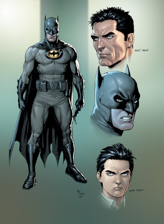
|
| Back to Top |
profile
| search
|
| |
John Byrne

Grumpy Old Guy
Joined: 11 May 2005
Posts: 135935
|
| Posted: 05 January 2010 at 9:56am | IP Logged | 2
|
|
|
The black utility belt makes sense, but the I-forgot-to-put-my-trunks-on look didn't work the last time, so why go there again?And why did Bruce fire the tailor that was able to make him Bat costumes without visible seams? (If this was being used in a new ElseWorld titled something like BATMAN: 1920, I'd have little or no problem with it. But extrapolating from the costume Batman has been wearing more or less unchanged -- allowing for artistic license -- since the 1940s, this seems a giant step backwards.)
|
| Back to Top |
profile
| search
|
| |
Mike Farley
Byrne Robotics Member
Joined: 16 April 2004
Location: United States
Posts: 2701
|
| Posted: 05 January 2010 at 10:01am | IP Logged | 3
|
|
|
It should be noted that this is the design for the new "Earth One" version of Batman not the regular DCU version.
I don't like the seams in the costume. None of MY shirts have seams down the front and I fail to see what possible purpose they have on Batman's suit. Same with the seams on his cowl. I fail to see why adding seams to comicbook costumes makes them more "realistic." Especially when they add them in places where real world clothing WOULDN'T have seams.
And taking away the trunks, coupled with the seam down the middle makes Batman look like he's wearing long underwear.
|
| Back to Top |
profile
| search
|
| |
Adam Hutchinson
Byrne Robotics Member

Joined: 15 December 2005
Location: United States
Posts: 4502
|
| Posted: 05 January 2010 at 10:02am | IP Logged | 4
|
|
|
JB this design is being used in DC's new Earth-1 series of original graphic novels. The Batman one is a Year One take on the character, I believe.
|
| Back to Top |
profile
| search
|
| |
John Byrne
Grumpy Old Guy
Joined: 11 May 2005
Posts: 135935
|
| Posted: 05 January 2010 at 10:03am | IP Logged | 5
|
|
|
JB this design is being used in DC's new Earth-1 series of original graphic novels. The Batman one is a Year One take on the character, I believe.�� Makes no difference to my comments, unless, as noted, "year one" is 1920.
|
| Back to Top |
profile
| search
|
| |
Andrew Burton
Byrne Robotics Member
Joined: 04 January 2009
Location: United States
Posts: 116
|
| Posted: 05 January 2010 at 10:04am | IP Logged | 6
|
|
|
Sorry forgot to mention the "Earth One" line it's going to be a part of.
I do like Batman with the trunks on and have never been a fan of seeing seems in a costume.
Do like how the cape/cowl attaches to the Bat symbol and the utility belt is cool looking as well...
Andrew
|
| Back to Top |
profile
| search
|
| |
John Byrne
Grumpy Old Guy
Joined: 11 May 2005
Posts: 135935
|
| Posted: 05 January 2010 at 10:08am | IP Logged | 7
|
|
|
The no-trunks look underscores one of the stranger conceits of superhero costumes -- and one of the reasons trunks are so often part of the costumes. That's the way the legs, sleeves and trunk cling like paint, yet become suddenly undefined around the naughty bits.
|
| Back to Top |
profile
| search
|
| |
John Bodin
Byrne Robotics Member

Purveyor of Rare Items
Joined: 16 April 2004
Location: United States
Posts: 3911
|
| Posted: 05 January 2010 at 10:09am | IP Logged | 8
|
|
|
More seams for the artist to draw so they can concentrate on creating cool ultra-detailed super-"realistic" pinup-type panels, rather than focusing drawing panels that convey coherent action while actually serving to tell a story through words AND pictures. Meh. That said, I can't say that I hate the look overall, but the "no-trunks" approach seems un-Batman-like, and the raised emblem which seems to serve as a clasp for the cape really looks clunky and non-functional (or perhaps it's intended to have some sort of actual clunky function -- like Batman with a chest flashlight . . . or maybe the Bat-Unibeam?).
|
| Back to Top |
profile
| search
e-mail
|
| |
John Byrne
Grumpy Old Guy
Joined: 11 May 2005
Posts: 135935
|
| Posted: 05 January 2010 at 10:11am | IP Logged | 9
|
|
|
Do like how the cape/cowl attaches to the Bat symbol��� If the intent is "realism", the artist should consider that a solid, hard (or even rubber) chest emblem like that would buckle and/ or pull away from his chest every time Batman moved his arms.
|
| Back to Top |
profile
| search
|
| |
Chris Geary
Byrne Robotics Member

Joined: 19 January 2009
Location: United Kingdom
Posts: 1158
|
| Posted: 05 January 2010 at 10:22am | IP Logged | 10
|
|
|
Never really understood the idea behind the seams myself. If only from the point that it means having to draw more.
At least there's not been a fashion for people to be drawn with sweat stains.
|
| Back to Top |
profile
| search
|
| |
Brad Teschner
Byrne Robotics Member

Joined: 01 June 2005
Location: United States
Posts: 3933
|
| Posted: 05 January 2010 at 10:27am | IP Logged | 11
|
|
|
meh.
just another step in a long line of steps making super heroes look less like super heroes.
did I mention...meh.
|
| Back to Top |
profile
| search
|
| |
Mike Farley
Byrne Robotics Member
Joined: 16 April 2004
Location: United States
Posts: 2701
|
| Posted: 05 January 2010 at 10:30am | IP Logged | 12
|
|
|
QUOTE:
| At least there's not been a fashion for people to be drawn with sweat stains. |
|
|
Quiet, you! They could be listening!
|
| Back to Top |
profile
| search
|
| |


