| Author |
|
Paulo Pereira
Byrne Robotics Member

Joined: 24 April 2006
Posts: 15539
|
| Posted: 28 June 2009 at 11:18am | IP Logged | 1
|
|
|
Chad, yep; like that. Or, even baseball--
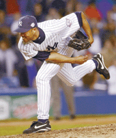  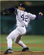
I have these on file because I think they make for great reference and/or inspiration.
|
| Back to Top |
profile
| search
|
| |
Paulo Pereira
Byrne Robotics Member

Joined: 24 April 2006
Posts: 15539
|
| Posted: 28 June 2009 at 11:20am | IP Logged | 2
|
|
|
More to the point, guys in suits and ties can be drawn dynamically and bigger than life. Look at John Buscema's stuff, for example.
|
| Back to Top |
profile
| search
|
| |
John Byrne

Grumpy Old Guy
Joined: 11 May 2005
Posts: 135600
|
| Posted: 28 June 2009 at 11:22am | IP Logged | 3
|
|
|
I saw an NFL cornerback at his restaurant in his street clothes, my jeans had seams and wrinkles but his looked painted on.�� A few years back, before I had a cellphone with a camera in it, I was having lunch with friends at a local eatery when Hank McCoy came in and sat down at the next table. And i mean, this was Hank McCoy. The same guy I'd been drawing in HIDDEN YEARS. He was wearing dark slacks and a white, short sleeved shirt, and he looked like Neal Adams had drawn him, hair, glasses, snug shirt, the works. Didn't get a look at his feet!
|
| Back to Top |
profile
| search
|
| |
John Byrne

Grumpy Old Guy
Joined: 11 May 2005
Posts: 135600
|
| Posted: 28 June 2009 at 11:25am | IP Logged | 4
|
|
|
There's more dynamism in this one move, one move out of hundreds of thousands this player will make in one season, than in all of Frank Quietly's artist ilk combined. �� And a great deal of that has to do with the moment at which the picture was taken. The photographer was probably just holding down the shutter button, as the camera went tchk tchk tchk tchk tchk , but then he or the editor chose that shot. Not the one before, not the one after. Problem with a lot of current artists, they almost always seem to chose the one before, or the one after.
|
| Back to Top |
profile
| search
|
| |
Paulo Pereira
Byrne Robotics Member

Joined: 24 April 2006
Posts: 15539
|
| Posted: 28 June 2009 at 11:27am | IP Logged | 5
|
|
|
Exactly, JB. It's odd that even some photographers seem to have a stronger sense of drama and storytelling than some comic book artists.
|
| Back to Top |
profile
| search
|
| |
Vinny Valenti
Byrne Robotics Member

Joined: 17 April 2004
Location: United States
Posts: 8486
|
| Posted: 28 June 2009 at 12:37pm | IP Logged | 6
|
|
|
When it comes to artists conveying grandeur these days, it's hard to top Alan Davis:
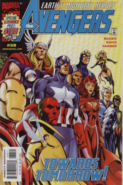
Even for a cover where the characters are basically standing around, he just *gets it*.
|
| Back to Top |
profile
| search
|
| |
Wallace Sellars
Byrne Robotics Member

Joined: 01 May 2004
Location: United States
Posts: 17810
|
| Posted: 28 June 2009 at 12:43pm | IP Logged | 7
|
|
|
Even for a cover where the characters are basically standing around, he just
*gets it*.
---
Yup! And I'm glad that the story of the time allowed him to put Iron Man in
some decent armor!
|
| Back to Top |
profile
| search
| www
|
| |
Bill De Simone
Byrne Robotics Member

Joined: 06 May 2004
Location: United States
Posts: 84
|
| Posted: 28 June 2009 at 12:47pm | IP Logged | 8
|
|
|
JB,
As a non-pro artist, I find your explanation of how Adams' art works fascinating. I knew I liked his art, and that imitators fell flat, but I wasn't able to articulate why.
This kind of discussion is completely (well, except right here) absent in comics nowadays.
Reviewers of comics,film, tv, etc. are so concerned with being fastest and first, that they forget actual analysis.
The Comics Journal had a column called The Reticulated Rainbow years ago, and the writer, RC Harvey, put out Art of the Comic Book, both doing a lot of what you did right here; but similar discussions are hard to find.
I would love to read similar discussions from you about other artists' work. Simonson to start, because again, "I know what I like but not why", and since you mentioned him, Jim Lee.
|
| Back to Top |
profile
| search
e-mail
|
| |
Steve De Young
Byrne Robotics Member

Joined: 01 April 2008
Location: United States
Posts: 3519
|
| Posted: 28 June 2009 at 1:53pm | IP Logged | 9
|
|
|
I'm curious as to what you would base such an
assumption on. His Superman is a guy in an ill-fitting Superman
costume. His Wonder Woman is a woman in an ill-fitting Wonder Woman
costume. And when he has drawn Batman before, it has been, as here, a
guy in an ill-fitting Batman costume.
------------------------------------------------------
First, keep in mind here, I'm not defending Frank Quitely's art, just that my hypothesis that his 'baggy Batman' was a deliberate choice. Here's a few images by him that I think give a different look to some of the above mentioned characters:
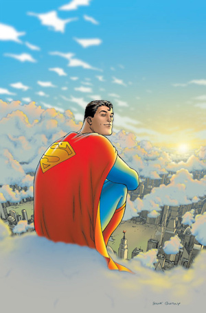
From All-Star #1. Narry a wrinkle in sight that I can see in this image, other than the cape. Keep in mind that part of what Quitely was doing over the of All-Star, a story in which Superman is slowly dying, is making his costume look baggier each issue to convey that he's wasting away. Here's another one of Superman while he was still healthy:
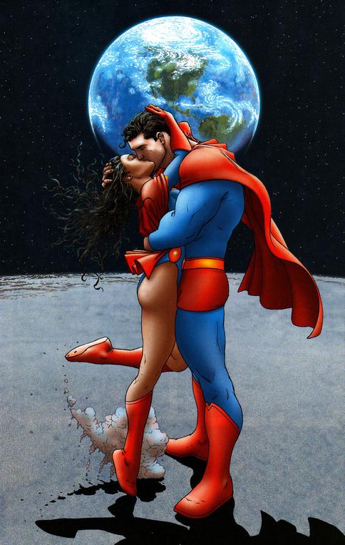
I'd say that both his costume, and Lois' Superwoman costume are pretty darn form-fitting. He's drawing Superman at his peak.
Here's one of Wonder Woman, where the costume may be ill-fitting (in the sense of looking a bit too small), but it certainly isn't baggy.
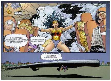
And finally, one of the whole JLA. Compare Batman in this image (Bruce) to the way he's drawing Dick in the costume:
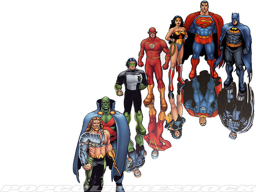
I honestly think that Quitely is trying to do meta-commentary on what's going on in the story with his art, and that works counter to a ripping good superhero story sometimes.
|
| Back to Top |
profile
| search
|
| |
Al Cook
Byrne Robotics Member

Joined: 21 December 2004
Posts: 12735
|
| Posted: 28 June 2009 at 1:58pm | IP Logged | 10
|
|
|
Frank Quitely and superheroes are a bad fit, period.
And he draws really, really, really ugly women.
I'd check him out on a Tarzan book, maybe.
|
| Back to Top |
profile
| search
|
| |
John Byrne

Grumpy Old Guy
Joined: 11 May 2005
Posts: 135600
|
| Posted: 28 June 2009 at 1:59pm | IP Logged | 11
|
|
|
Not the best pictures you could have chosen for "deliberate choices". What the heck's up with Superman's cape? Even if we assume Superman would use his powers to do something so Peter Pan as to sit on a cloud, his cape would drape across the cloud? Or billow in the airless vacuum of the Moon?As to the line-up -- it looks like an old MAD cover to me, not a drawing by anyone who actually respects the characters. (And, after all, in "meta-fiction" respect is anathema, isn't it?)
|
| Back to Top |
profile
| search
|
| |
Steve De Young
Byrne Robotics Member

Joined: 01 April 2008
Location: United States
Posts: 3519
|
| Posted: 28 June 2009 at 2:02pm | IP Logged | 12
|
|
|
As to the line-up -- it looks like an old MAD cover to me, no a drawing by anyone who actually respects the characters. (And, after all, in "meta-fiction" respect is anathema, isn't it?)
------------------------------------------
I agree, JB. Like I said, not defending his art, nor holding up those images as examples of 'grandeur', just pointing out that he doesn't always draw costumes as baggy.
The whole meta-fiction thing drives me nuts from him and Morrison.
|
| Back to Top |
profile
| search
|
| |


