| Author |
|
John Byrne

Grumpy Old Guy
Joined: 11 May 2005
Posts: 135601
|
| Posted: 27 June 2009 at 7:53am | IP Logged | 1
|
|
|
Another installment of one of my top ten pet peeves.
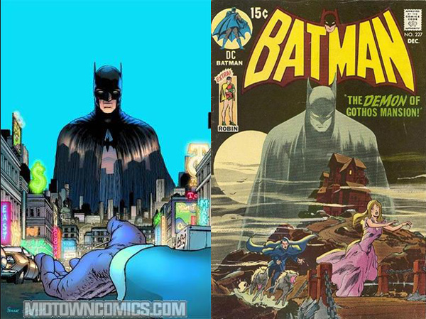
On the left, a drawing of a guy in a Batman costume, on the right BATMAN.

|
| Back to Top |
profile
| search
|
| |
Michael Huber
Byrne Robotics Member

Joined: 27 August 2007
Location: United States
Posts: 3338
|
| Posted: 27 June 2009 at 8:02am | IP Logged | 2
|
|
|
honestly, if the guy on the left was going for a realistic portrayal of a real man in a suit, he's off a bit. Eyes waaaay too wide.
But I agree with your point. I don''t read comics for reality, I try to get that from the news (another topic, another thread), I read comics for entertainment and escapism. The one on the left just doesn't do it. I've seen real people posed for movie posters that were far more dynamic than that. aAnd the sad part is, when pencil first hit paper (or whatever medium was used) he had total absolute control of what was to follow, it could have been anyway at all, even physics were bendable, if it told the story better. It's like my composition teacher said, use the best word for the moment, and no more.
|
| Back to Top |
profile
| search
|
| |
Jean-Francois Joutel
Byrne Robotics Member

Joined: 06 November 2008
Location: Canada
Posts: 314
|
| Posted: 27 June 2009 at 8:11am | IP Logged | 3
|
|
|
Well, the image on the left is Dick Greyson in the bat suit, not Bruce Wayne. So JB is absolutely right when he says it's just a guy in the Batsuit. That's part of what the new Batman and Robin series is about.
So far (as I've read, and there has only been one issue released of the new Batman and Robin comic), Dick seems almost regretful of having donned the Bat suit. He seems to want to go back to being his own identity, his own man. However, he knows he was trained to replace Batman, but could never be Wayne's Batman.
I'm not a big fan of Frank Quietly, but I think he's subtly put Dick's remorse through the bat suit. Though I prefer Wayne determination in the Bat suit (if that makes any sense).
|
| Back to Top |
profile
| search
| www
|
| |
Keith Thomas
Byrne Robotics Member

Joined: 06 April 2009
Location: United States
Posts: 3082
|
| Posted: 27 June 2009 at 8:12am | IP Logged | 4
|
|
|
lol how dynamic, he looks poised to strike, what an odd
transparency effect too.
|
| Back to Top |
profile
| search
|
| |
John Byrne

Grumpy Old Guy
Joined: 11 May 2005
Posts: 135601
|
| Posted: 27 June 2009 at 8:14am | IP Logged | 5
|
|
|
Well, the image on the left is Dick Greyson in the bat suit, not Bruce Wayne. So JB is absolutely right when he says it's just a guy in the Batsuit. That's part of what the new Batman and Robin series is about.�� Most excellent missing of the point. Based on his other work, do you honestly think "Quitely" would have drawn that figure noticeably differently if it was supposed to be Bruce?
|
| Back to Top |
profile
| search
|
| |
Jean-Francois Joutel
Byrne Robotics Member

Joined: 06 November 2008
Location: Canada
Posts: 314
|
| Posted: 27 June 2009 at 8:15am | IP Logged | 6
|
|
|
Most excellent missing of the point.
-----
Yeah, I tend to do that a lot.
Sorry.
|
| Back to Top |
profile
| search
| www
|
| |
B. Morningway
Byrne Robotics Member

Joined: 12 June 2009
Location: Canada
Posts: 54
|
| Posted: 27 June 2009 at 8:40am | IP Logged | 7
|
|
|
Quitely doesn't exactly have a dynamic style. Quite the contrary, he makes
characters look weak and sickly. While flipping through the first issue of this
series, it looked to me as if Dick was wearing a batsuit that was too big for
him, as it was all baggy; it really looked ridiculous.
|
| Back to Top |
profile
| search
|
| |
Robert White
Byrne Robotics Member

Joined: 16 April 2004
Location: United States
Posts: 4560
|
| Posted: 27 June 2009 at 8:43am | IP Logged | 8
|
|
|
What bugs me about Quietly's art is some of the poses and the body language he gives the characters--Batman looks depressed half the time when he draws him. I mean does Dick Grayson already miss his Nightwing duds that much?
I think he's a talented artists, I just feel his style doesn't quite mesh with superhero themes. I checked out some of his All-Star Superman run, and while I liked the art on a technical basis, there was something sardonic about his characters that was always off-putting to me...
|
| Back to Top |
profile
| search
|
| |
Joe Hollon
Byrne Robotics Member

Joined: 08 May 2004
Location: United States
Posts: 13739
|
| Posted: 27 June 2009 at 8:48am | IP Logged | 9
|
|
|
Picture on the left, first word that came to my mind: mundane.
|
| Back to Top |
profile
| search
| www
e-mail
|
| |
Joe Zhang
Byrne Robotics Member

Joined: 16 April 2004
Location: United States
Posts: 12843
|
| Posted: 27 June 2009 at 8:48am | IP Logged | 10
|
|
|
I think Quitely (Quietly?) is talented, but his style isn't suited for superheroes.
|
| Back to Top |
profile
| search
e-mail
|
| |
John Byrne

Grumpy Old Guy
Joined: 11 May 2005
Posts: 135601
|
| Posted: 27 June 2009 at 8:50am | IP Logged | 11
|
|
|
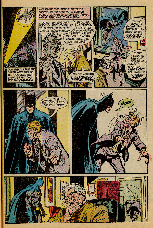
You all know I never miss a chance to post this page, but today I am using it to a purpose other than the one that usually inspires me�
Right here is why everyone who wants to draw superheroes "realistically" should look at Neal Adams. Look at Gordon and the other guy. Their clothing is normal, and looks perfectly natural. Their poses are human, utterly "normal". These shots could have been drawn from photographs. The Batman enters and -- this is the Adams Magic -- he also looks like he could have been drawn from a photograph -- but a photograph of Batman, not a photograph of a guy wearing a Batman costume. As I said in another thread recently, when Bruce Wayne puts on the Batman costume, he does not become Bruce Wayne in a Batman costume. He becomes BATMAN. (And notice, too, that Neal is not afraid to "switch styles". He draws the Batman in the first and last panels in which he appears quite differently from how he draws him in the second and third panels. He draws him as suits the effect he is after -- but still keeps him "larger than life". Which is what superheroes, even if they are "just guys in suits", are supposed to be.)
|
| Back to Top |
profile
| search
|
| |
John Byrne

Grumpy Old Guy
Joined: 11 May 2005
Posts: 135601
|
| Posted: 27 June 2009 at 9:01am | IP Logged | 12
|
|
|
Incidentally, if you look closely at the individual panels of that page, you will see something Neal does to make the pictures look how they should look, rather than how they would look.Very often, the individual parts of the image are not really parts of the same image. Based on the perspective established by the wall in the background of the first picture, for instance, either Gordon is standing on a chair or Arthur is standing in a hole. But that doesn't matter, because it is the overall effect that Adams is going for. Same in the second panel. Batman and Arthur seem to be on the same plane, but Gordon looks "pasted in". But, again, doesn't matter, because it works as a whole. This is a little trick for which I sometimes find myself cursing Neal's name, as I am so married to perspective grids I cannot pull it off without everything looking wonky!
|
| Back to Top |
profile
| search
|
| |


