| Author |
|
Thanos Kollias
Byrne Robotics Member

Joined: 19 June 2004
Location: Greece
Posts: 5009
|
| Posted: 18 June 2009 at 5:56am | IP Logged | 1
|
|
|
So many really cool logos (70s Avengers, Steranko X-Men, Original FF, Superman, Adams Batman, the Cap-Falcon, the webbed Spider-Man) I honestly have a really hard time picking one.
So, just so that I can add to the discussion, I'll pick the Daredevil logo from the Frank Miller era and the Action Comics one.
|
| Back to Top |
profile
| search
| www
e-mail
|
| |
Brian Deuser
Byrne Robotics Member

Joined: 17 April 2004
Location: United States
Posts: 895
|
| Posted: 18 June 2009 at 7:44am | IP Logged | 2
|
|
|
My favorite is the Incredible Hulk logo, and yet, the more I think about it, what does having a brick-laid font really say about the Hulk? He's a brick $h!thouse and he probably weighs a ton? I don't know - I just like it!
|
| Back to Top |
profile
| search
e-mail
|
| |
Guests
Byrne Robotics Visitor
Joined: 01 October 2003
Posts: -26
|
| Posted: 18 June 2009 at 7:50am | IP Logged | 3
|
|
|
Charles V -
Me too! :-) I also like this one.

|
| Back to Top |
profile
| search
|
| |
Derek Rogers
Byrne Robotics Member

Joined: 07 April 2006
Location: United States
Posts: 523
|
| Posted: 18 June 2009 at 8:14am | IP Logged | 4
|
|
|
Dial B for Blog has an awesome article about Gaspar Saladino - letterer and type designer extraordinaire!
http://www.dialbforblog.com/archives/500/g1thenatural.html
With that said, I really dig this logo!

|
| Back to Top |
profile
| search
|
| |
Brad Danson
Byrne Robotics Member

Joined: 02 May 2007
Posts: 1440
|
| Posted: 18 June 2009 at 8:52am | IP Logged | 5
|
|
|
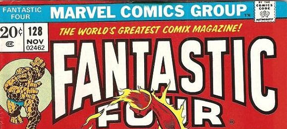
I'm partial to a lot of the 70's revised logos too, even though I'm an "80's kid": Batman, Avengers and Fantastic Four all seemed to have more "oomph" than their original logos did.
It might have been Fred Hembeck that said when he first saw the original Fantastic Four logo on the newsstand, he thought it was a funny animal comic. And I agree. It's just too goofy looking for me.
|
| Back to Top |
profile
| search
|
| |
Erik Larsen
Byrne Robotics Member

Joined: 19 February 2008
Location: United States
Posts: 344
|
| Posted: 18 June 2009 at 1:22pm | IP Logged | 6
|
|
|
By the time I was reading the FF it had the logo Dan Walsh posted. I
preferred the original though, when I saw it.
I still have a strong affinity for the '70s Marvel trade dress. I love that strip
along the top and characters in a circle. That's why I emulated it for a time
in Savage Dragon and still use it from time to time when I have an excuse.
|
| Back to Top |
profile
| search
| www
|
| |
Vinny Valenti
Byrne Robotics Member

Joined: 17 April 2004
Location: United States
Posts: 8146
|
| Posted: 18 June 2009 at 1:33pm | IP Logged | 7
|
|
|
When Marvel first instituted that trade dress, I rcall that they then restricted the cover art to a square under the logo, which I thought was a huge step backwards. Take a look at Neal Adams' Avengers covers during the Kree-Skrull War for an example - the change occurred right in the middle of it. I believe they resolved that within a year or so.
|
| Back to Top |
profile
| search
|
| |
Erik Larsen
Byrne Robotics Member

Joined: 19 February 2008
Location: United States
Posts: 344
|
| Posted: 18 June 2009 at 1:35pm | IP Logged | 8
|
|
|
It took them a while to fine tune it.
|
| Back to Top |
profile
| search
| www
|
| |
Guests
Byrne Robotics Visitor
Joined: 01 October 2003
Posts: -26
|
| Posted: 18 June 2009 at 1:56pm | IP Logged | 9
|
|
|
By the time I was reading the FF it had the logo Dan Walsh posted. I
preferred the original though, when I saw it.
Erik,
What issue was your first off the spinner-rack FF? Mine was #142 followed by MGC #44 (reprint of FF #61).
I still have a strong affinity for the '70s Marvel trade dress. I love that strip
along the top and characters in a circle. That's why I emulated it for a time
in Savage Dragon and still use it from time to time when I have an excuse.
Me too! Wish Marvel would bring it back, but that's probably not going to happen!
|
| Back to Top |
profile
| search
|
| |
Keith Thomas
Byrne Robotics Member

Joined: 06 April 2009
Location: United States
Posts: 3082
|
| Posted: 18 June 2009 at 2:00pm | IP Logged | 10
|
|
|
Ah, yes, we all remember how Iron Man had delineated
musculature on his super shiny original grey armor, don't
we? grumble grumble grumble
That's always bothered me about the Sentinels too, though
they were always kinda drawn that way.
|
| Back to Top |
profile
| search
|
| |
Erik Larsen
Byrne Robotics Member

Joined: 19 February 2008
Location: United States
Posts: 344
|
| Posted: 18 June 2009 at 4:36pm | IP Logged | 11
|
|
|
Dan Walsh wrote:
What issue was your first off the spinner-rack FF?
|
|
|
FF #147, I think.
|
| Back to Top |
profile
| search
| www
|
| |
Guests
Byrne Robotics Visitor
Joined: 01 October 2003
Posts: -26
|
| Posted: 18 June 2009 at 4:37pm | IP Logged | 12
|
|
|
One of my favorites!
|
| Back to Top |
profile
| search
|
| |


