| Posted: 13 June 2009 at 2:35am | IP Logged | 8
|
|
|
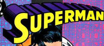
All time favorite: Superman.

Readable, recognizable, nicely designed. Pretty much the perfect logo for the character. Almost looks like it's flying towards the reader. Beautiful, but almost too beautiful since if DC were to change it in a massive way Superman's fans would be apoplectic. And that includes me. It's perfect, don't mess with it, hands off... back away from the logo.
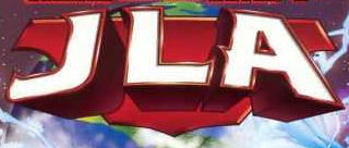
The JLA design was really nice and is certainly readable but something occurred to me: You have to know what JLA stands for to get the title. Doesn't matter if a casual fan sees it and recognizes it if it doesn't tell you what it's about.

And a logo so perfectly matched to a character that they've hardly ever mucked around with it: The Warlord. The scroll and the font both tell you what kind of story it is (fantasy), and also lend an aura of class to the comic. The only thing missing in the logo would be some element to differentiate it from a normal fantasy story and work in the fact that the Warlord is from our world and has a gun. Though that could overcomplicate the logo.

Edited by Steve D Swanson on 13 June 2009 at 2:35am
|


