| Author |
|
Peter Martin
Byrne Robotics Member

Joined: 17 March 2008
Location: Canada
Posts: 16393
|
| Posted: 02 October 2008 at 3:16am | IP Logged | 1
|
|
|
You can't beat the classic red and gold. I quite liked the red and silver at the time, but acknowledge that it was a little too bulky. Had no problem with the Jackson Guice/post-Armour Wars one, but it wasn't quite as good as the classic R&G.
|
| Back to Top |
profile
| search
|
| |
John Caliber
Byrne Robotics Member

Joined: 19 July 2008
Location: United Kingdom
Posts: 363
|
| Posted: 02 October 2008 at 4:30am | IP Logged | 2
|
|
|
I liked the red/silver armour the best, specifically because of the clunkyness of the helmet and backpack, the 'Robbie the Robot' aesthetic. I preferred John Byrne's interpretations of it during his Avengers West Coast and Hulk years.
|
| Back to Top |
profile
| search
|
| |
Flavio Sapha
Byrne Robotics Member

Joined: 16 April 2004
Location: Brazil
Posts: 12912
|
| Posted: 02 October 2008 at 6:28am | IP Logged | 3
|
|
|
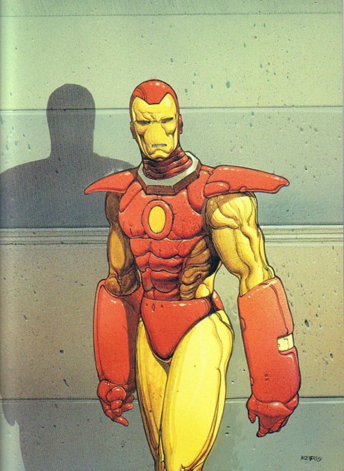
I was under the impression that this MOEBIUS IRON MAN was what made everybody else do the armor less like a skin-tight costume. True or false?

|
| Back to Top |
profile
| search
|
| |
Anthony Szilagyi
Byrne Robotics Member

Joined: 12 October 2007
Location: United States
Posts: 79
|
| Posted: 02 October 2008 at 6:56am | IP Logged | 4
|
|
|
WOW! That is awful looking!
|
| Back to Top |
profile
| search
|
| |
Peter Martin
Byrne Robotics Member

Joined: 17 March 2008
Location: Canada
Posts: 16393
|
| Posted: 02 October 2008 at 8:09am | IP Logged | 5
|
|
|
Nice to see that Stark has carved the shape of his lower gums into the face-plate of the helmet in that Moebius pic...
|
| Back to Top |
profile
| search
|
| |
Joel Tesch
Byrne Robotics Member

Joined: 19 May 2006
Posts: 2834
|
| Posted: 02 October 2008 at 9:04am | IP Logged | 6
|
|
|
I was under the impression that this MOEBIUS IRON MAN was what made everybody else do the armor less like a skin-tight costume. True or false?
False
|
| Back to Top |
profile
| search
|
| |
Philippe Cordier
Byrne Robotics Member

Joined: 07 September 2006
Location: France
Posts: 175
|
| Posted: 02 October 2008 at 9:05am | IP Logged | 7
|
|
|
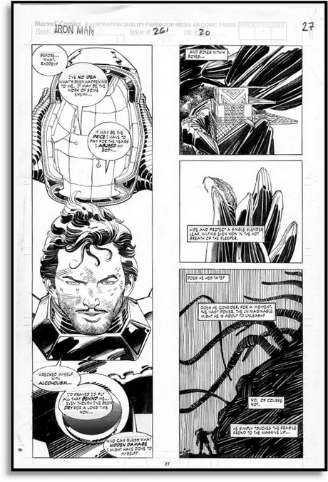
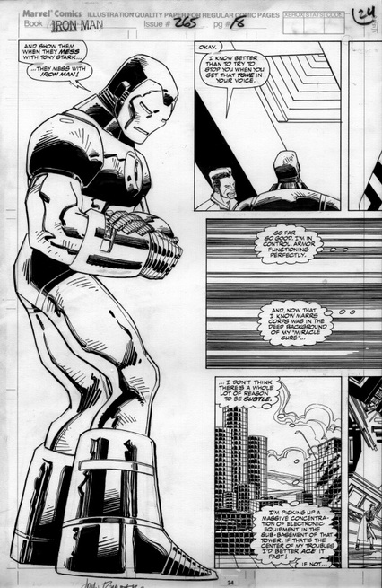
"my" best Iron Man will always be the one John Romita jr designed when JB was writing the title, not to mention the nice errol Flynn touch that he gave Tony

|
| Back to Top |
profile
| search
|
| |
Tshombe K. Hamilton
Byrne Robotics Member

Joined: 01 July 2008
Location: United States
Posts: 427
|
| Posted: 02 October 2008 at 9:05am | IP Logged | 8
|
|
|
I really got into Iron Man during the JR, Bob Layton, run. i have always enjoyed that armor. Made him truly look more like an Iron Man than an Iron robot.
|
| Back to Top |
profile
| search
|
| |
Philippe Cordier
Byrne Robotics Member

Joined: 07 September 2006
Location: France
Posts: 175
|
| Posted: 02 October 2008 at 9:05am | IP Logged | 9
|
|
|

|
| Back to Top |
profile
| search
|
| |
Joel Tesch
Byrne Robotics Member

Joined: 19 May 2006
Posts: 2834
|
| Posted: 02 October 2008 at 9:07am | IP Logged | 10
|
|
|
Yes, Philippe...that one was my favorite too! I loved drawing it. Especially the big boots. Has some size while still retaining an overall sleek look.
|
| Back to Top |
profile
| search
|
| |
Paulo Pereira
Byrne Robotics Member

Joined: 24 April 2006
Posts: 15539
|
| Posted: 02 October 2008 at 9:15am | IP Logged | 11
|
|
|
I dig that run, but I'm still not in love with those boots. JR Jr did make that armor look good, overall.
|
| Back to Top |
profile
| search
|
| |
Philippe Negrin
Byrne Robotics Member

Joined: 01 August 2007
Location: France
Posts: 2643
|
| Posted: 02 October 2008 at 9:30am | IP Logged | 12
|
|
|
I'd never seen that Moebius Iron Man. Strange that he succeeded in some parts of the design but failed in most.
|
| Back to Top |
profile
| search
|
| |


