Active Topics | Member List | Search | Help | Register | Login
The John Byrne Forum
Byrne Robotics > The John Byrne Forum << Prev Page of 4
Topic: Q for JB - Comics Logos (Topic Closed Topic Closed) Post ReplyPost New Topic
Author
Message
John Byrne
Avatar
Grumpy Old Guy

Joined: 11 May 2005
Posts: 133315
Posted: 29 September 2008 at 11:26am | IP Logged | 1  

That actually looks a lot like my original version of my ALPHA FLIGHT logo,
which "blended" the letters more, and which Shooter rejected as
"unreadable".

I guuuueeeessss if I didn't know what it said, I might think that logo said
alplia.
Back to Top profile | search
 
Wallace Sellars
Byrne Robotics Member
Avatar

Joined: 01 May 2004
Location: United States
Posts: 17699
Posted: 29 September 2008 at 2:08pm | IP Logged | 2  

I really liked the corner icons, too.  Does anyone know why they "fell out of favor"... ?
Back to Top profile | search | www
 
Chad Carter
Byrne Robotics Member
Avatar

Joined: 16 June 2005
Posts: 9584
Posted: 29 September 2008 at 3:21pm | IP Logged | 3  


Wasn't the corner logo designed so that kids could find a wanted comic while in spinner racks or newsstands?

With Direct Market comic shops, I guess there wouldn't be a need to "find" your comics with the old hunt and peck method.

Back to Top profile | search
 
Jason Czeskleba
Byrne Robotics Member
Avatar

Joined: 30 April 2004
Posts: 4620
Posted: 30 September 2008 at 12:03am | IP Logged | 4  

 Warren Leonhardt wrote:
The Superman logo is a classic. I love that one.


I really love that great old Superman logo, designed by lettering great Ira Schnapp (who also designed the logo for Action Comics and many others).  I really hate the revised version they started using in 1983.  Blech.  Too bad that's the version JB's run was stuck with.  It especially chaps my hide that they're using the crappy redesigned logo on the Superman Showcase volumes.  That just ain't right.  And the "Superman in the Forties", "Superman in the Fifties" et al TPBs don't feature the classic original logo either, but a crummy attempt at recreating it. 
Back to Top profile | search
 
Bob Neill
Byrne Robotics Member
Avatar

Joined: 03 December 2007
Posts: 877
Posted: 30 September 2008 at 4:16pm | IP Logged | 5  

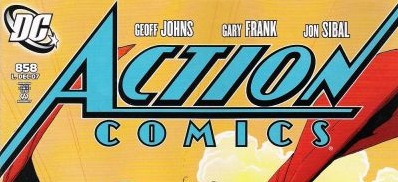
I remember when DC changed the Superman logo-presumably as a 45th anniversary thing, but at the time, they never mentioned they were going to do it.

The difference in the logo was very subtle, but even at age 9, I picked up on it, and wondered why DC didn't make a bigger deal of it at the time.

(Todd Klein's blog has some info on the logo change, in an entry dated Aug. 17th):

http://kleinletters.com/Blog/?p=156

In retrospect, I almost wish DC could have gotten JB on  the Superman line about three years earlier, because 1983 saw a lot of gimmicky, and ultimately meaningless, changes to the characters-the 'new' Braniac, Luthor's battle armor, Superman and Lois 'break up', Perry White's marriage on the skids, Steve Lombard fired...it was a lame attempt to 'fix' a tired formula.

Back to Top profile | search
 
Lars Sandmark
Byrne Robotics Member
Avatar

Joined: 05 October 2007
Location: Canada
Posts: 3144
Posted: 30 September 2008 at 7:15pm | IP Logged | 6  

JB answered: "Love."

Well said John. Thanks for such a great answer.
Back to Top profile | search
 
David Lopez
Byrne Robotics Member
Avatar

Joined: 03 July 2005
Location: United States
Posts: 1343
Posted: 01 October 2008 at 12:04pm | IP Logged | 7  

One of my favorite logos was always the Amazing Spider-Man. I was thrilled when it was initially reported that they were going to use it as the title for the first Spider-Man sequel - imagine seeing that logo projected on the big screen! Unfortunately, Raimi and company dropped the idea in post-production, and decided to go with the much-more imaginative  "Spider-Man 2". 
Back to Top profile | search
 
Jay Famous
Byrne Robotics Member
Avatar

Joined: 30 November 2007
Location: United States
Posts: 646
Posted: 01 October 2008 at 11:34pm | IP Logged | 8  

Post deleted. I had asked a question that I just found an answer to.


Edited by Jay Famous on 01 October 2008 at 11:43pm
Back to Top profile | search
 
Mike Norris
Byrne Robotics Member
Avatar

Joined: 16 April 2004
Location: United States
Posts: 4274
Posted: 02 October 2008 at 3:54am | IP Logged | 9  

I've never understood the constant change in Batman's logo in the past few decades.

Earlier ones seemed to work

The "Classic"

The Infantino update

This one was cool. I recall it being used in Brave and the Bold.

My favorite

After that they just went down hill. Odd batshapes and ugly fonts.


Back to Top profile | search e-mail
 
Flavio Sapha
Byrne Robotics Member
Avatar

Joined: 16 April 2004
Location: Brazil
Posts: 12912
Posted: 02 October 2008 at 6:54am | IP Logged | 10  

That last Batman logo was just tremendous.  Last week I opened a package of back issues and an old Batman comic with that logo was on top. I freaked.  Smacks you right on the nose.  
Back to Top profile | search
 
Thomas Moudry
Byrne Robotics Member
Avatar

Joined: 16 April 2004
Location: United States
Posts: 5060
Posted: 02 October 2008 at 10:29am | IP Logged | 11  

I love that the "1970's Batman logo" lasted so long; I loved this particular use of it:


I like this version of the "Brave & Bold Batman logo" that includes Robin:


I like this one, too, but prefer the 1970's options:


Isn't it great to see this classic back as it should be?

Back to Top profile | search
 

Sorry, you can NOT post a reply.
This topic is closed.

<< Prev Page of 4
  Post ReplyPost New Topic
Printable version Printable version

Forum Jump
You cannot post new topics in this forum
You cannot reply to topics in this forum
You cannot delete your posts in this forum
You cannot edit your posts in this forum
You cannot create polls in this forum
You cannot vote in polls in this forum

 Active Topics | Member List | Search | Help | Register | Login