| Author |
|
Flavio Sapha
Byrne Robotics Member

Joined: 16 April 2004
Location: Brazil
Posts: 12912
|
| Posted: 28 September 2008 at 5:53pm | IP Logged | 1
|
|
|
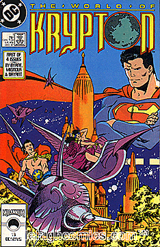
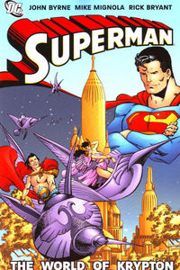
Compare with the tpb cover:
|
| Back to Top |
profile
| search
|
| |
Joel Tesch
Byrne Robotics Member

Joined: 19 May 2006
Posts: 2830
|
| Posted: 28 September 2008 at 5:56pm | IP Logged | 2
|
|
|
You know what...I like the design of the World of Krypton logo better, BUT the Superman logo really jumps out at you more. I would notice that on a crowded newstand rack much more than the WoK logo.
|
| Back to Top |
profile
| search
|
| |
Lars Sandmark
Byrne Robotics Member

Joined: 05 October 2007
Location: Canada
Posts: 3144
|
| Posted: 28 September 2008 at 6:18pm | IP Logged | 3
|
|
|
Somewhat related,
I always had a special appreciation for JB's corner icons on Fantastic Four.
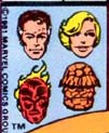 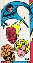 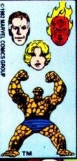 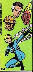
I like this little switch too.
JB what prompted you to do the extra work to switch the images every
month like that?
Either way, it was a great idea!
|
| Back to Top |
profile
| search
|
| |
Warren Leonhardt
Byrne Robotics Member

Joined: 10 July 2008
Location: Canada
Posts: 454
|
| Posted: 28 September 2008 at 6:56pm | IP Logged | 4
|
|
|
The Superman logo is a classic. I love that one.
One of the reasons I remember buying Marvel as a kid was because of those corner icons. SO much easier to find who I wanted off the drugstore spinner rack. Just look for the little Spider-Man, the tiny Conan, and some random one and that was my allowance & entertainment for the 3 hour car ride to grandma's...
Back to logos: Again, check out Todd's blog! When I say it's all there, I really mean it! He even posted a 'how-to' the old school way - hand lettered! I mean, with guys like that posting tips, a poorly designed comic book logo simply shouldn't exist...but hey, different tastes abound.
|
| Back to Top |
profile
| search
|
| |
Greg Cordier
Byrne Robotics Member

Joined: 16 April 2004
Location: United States
Posts: 579
|
| Posted: 28 September 2008 at 7:08pm | IP Logged | 5
|
|
|
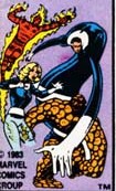
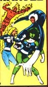
I have always loved those corner heads and figures on team books too. Great on the FF as well as Avengers and X-Men!
|
| Back to Top |
profile
| search
e-mail
|
| |
Chad Carter
Byrne Robotics Member

Joined: 16 June 2005
Posts: 9584
|
| Posted: 28 September 2008 at 8:21pm | IP Logged | 6
|
|
|
All right: my favorite all-time corner logos.
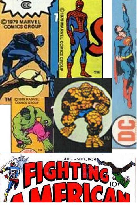
Far as I know, the Black Panther logo only appeared one time, the last issue of the 1970s version of his comic.
The Thing was on MARVEL'S GREATEST COMICS.
|
| Back to Top |
profile
| search
|
| |
Ferran Delgado
Byrne Robotics Member
Joined: 10 October 2006
Posts: 580
|
| Posted: 29 September 2008 at 1:17am | IP Logged | 7
|
|
|
Since Marvel decided to letter most of his books in house to save money, the
quality of his lettering, logos and graphic design has lowered till amateurish
levels. Not to speak of the decision to use lower case for the lettering of all
the books!
|
| Back to Top |
profile
| search
|
| |
Michael Heide
Byrne Robotics Member

Joined: 26 July 2007
Location: Germany
Posts: 398
|
| Posted: 29 September 2008 at 1:28am | IP Logged | 8
|
|
|
That reminds me of the "indecent" corner figure that Marvel had for years on the Cable covers.
Looks like that techno-virus changed more than just his arm and his eye.
|
| Back to Top |
profile
| search
|
| |
Flavio Sapha
Byrne Robotics Member
Joined: 16 April 2004
Location: Brazil
Posts: 12912
|
| Posted: 29 September 2008 at 6:18am | IP Logged | 9
|
|
|
Eye of the beholder...
|
| Back to Top |
profile
| search
|
| |
John Byrne
Grumpy Old Guy
Joined: 11 May 2005
Posts: 133315
|
| Posted: 29 September 2008 at 6:26am | IP Logged | 10
|
|
|
I always had a special appreciation for JB's corner icons on Fantastic Four.
++
JB what prompted you to do the extra work to switch the images every
month like that?
��
Love.
|
| Back to Top |
profile
| search
|
| |
Bill Dowling
Byrne Robotics Member

Joined: 07 July 2004
Location: United States
Posts: 2176
|
| Posted: 29 September 2008 at 7:30am | IP Logged | 11
|
|
|
JB: Have you ever seen this logo?:
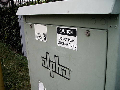
I first started seeing it at least a year or two after your Alpha Flight logo, and I always thought the two Alphas looked similar (or the "lpha" part anyway, since they use a lower case a).
|
| Back to Top |
profile
| search
e-mail
|
| |
Joe Smith
Byrne Robotics Member

Joined: 29 August 2004
Location: United States
Posts: 6667
|
| Posted: 29 September 2008 at 11:22am | IP Logged | 12
|
|
|
Fry the bastards!
|
| Back to Top |
profile
| search
| www
e-mail
|
| |


