| Author |
|
Brian Miller
Byrne Robotics Member

Joined: 28 July 2004
Location: United States
Posts: 31170
|
| Posted: 28 September 2008 at 12:57pm | IP Logged | 1
|
|
|
They are marching towards Ultimatum.
|
| Back to Top |
profile
| search
|
| |
Ed Deans
Byrne Robotics Member

Joined: 27 July 2007
Location: United States
Posts: 763
|
| Posted: 28 September 2008 at 2:10pm | IP Logged | 2
|
|
|
|
| Back to Top |
profile
| search
|
| |
Ed Deans
Byrne Robotics Member
Joined: 27 July 2007
Location: United States
Posts: 763
|
| Posted: 28 September 2008 at 2:34pm | IP Logged | 3
|
|
|
Edited by Ed Deans on 28 September 2008 at 2:35pm
|
| Back to Top |
profile
| search
|
| |
Ed Deans
Byrne Robotics Member
Joined: 27 July 2007
Location: United States
Posts: 763
|
| Posted: 28 September 2008 at 2:58pm | IP Logged | 4
|
|
|
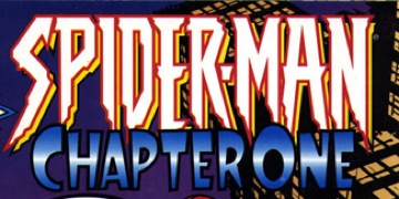
Josh, you asked about awful logos and immediately the pointy Spider-Man
logo came to mind.
|
| Back to Top |
profile
| search
|
| |
Thomas Moudry
Byrne Robotics Member

Joined: 16 April 2004
Location: United States
Posts: 5060
|
| Posted: 28 September 2008 at 3:09pm | IP Logged | 5
|
|
|
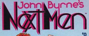
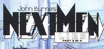
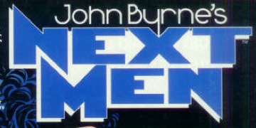
I love the Next Men logo that's third from the top; it's very striking and easy to see from a distance.
|
| Back to Top |
profile
| search
|
| |
Corey Johnson
Byrne Robotics Member

Joined: 16 April 2004
Location: United States
Posts: 2021
|
| Posted: 28 September 2008 at 3:18pm | IP Logged | 6
|
|
|
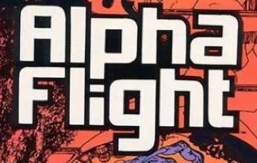
I've always loved that new Alpha Flight logo...very "modern" looking.
|
| Back to Top |
profile
| search
|
| |
Cliff Richard
Byrne Robotics Member
Joined: 10 September 2008
Posts: 132
|
| Posted: 28 September 2008 at 3:19pm | IP Logged | 7
|
|
|
JB designed "FX", too.
|
| Back to Top |
profile
| search
|
| |
Warren Leonhardt
Byrne Robotics Member

Joined: 10 July 2008
Location: Canada
Posts: 454
|
| Posted: 28 September 2008 at 3:26pm | IP Logged | 8
|
|
|
JB's Citizen Zero logo is nice too. I like the Alpha Flight one the best up there. Thanks Ed!
I second the nomination for Todd Klein's blog. Excellent stuff if you're curious about what makes a logo tick...http://kleinletters.com/Blog/
|
| Back to Top |
profile
| search
|
| |
JT Molloy
Byrne Robotics Member
Joined: 19 February 2008
Posts: 2092
|
| Posted: 28 September 2008 at 3:40pm | IP Logged | 9
|
|
|
I like the pointy Spider-Man logo.
|
| Back to Top |
profile
| search
|
| |
Wallace Sellars
Byrne Robotics Member

Joined: 01 May 2004
Location: United States
Posts: 17699
|
| Posted: 28 September 2008 at 4:17pm | IP Logged | 10
|
|
|
That third NEXT MEN logo is my favorite of the three. I like the old SPIDER-
MAN logo. The pointy one just doesn't feel right to me.
|
| Back to Top |
profile
| search
| www
|
| |
Carmen Bernardo
Byrne Robotics Member
Joined: 08 August 2006
Location: United States
Posts: 3666
|
| Posted: 28 September 2008 at 4:22pm | IP Logged | 11
|
|
|
There's something in hand-designing your own logos which I doubt could be replicated in any standard word processing or graphics program. I have a couple that I did years ago and I just might get one started this week, after some years of doing nothing but sketches. You might be able to create a logo on the computer, but most efforts would just be... static.
|
| Back to Top |
profile
| search
|
| |
Flavio Sapha
Byrne Robotics Member

Joined: 16 April 2004
Location: Brazil
Posts: 12912
|
| Posted: 28 September 2008 at 5:51pm | IP Logged | 12
|
|
|
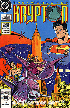
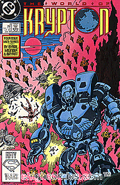
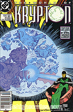
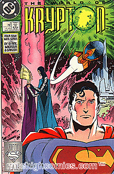
The WORLD OF KRYPTON mini-series sports my favorite comics logo. In
terms of color and production values, it seems to me to have reached the
pinnacle of good taste. All downhill from there.
Edited by Flavio Sapha on 28 September 2008 at 5:52pm
|
| Back to Top |
profile
| search
|
| |


