| Author |
|
Ed Deans
Byrne Robotics Member

Joined: 27 July 2007
Location: United States
Posts: 763
|
| Posted: 27 September 2008 at 11:47pm | IP Logged | 1
|
|
|
Lately interested in the subject, I was wondering what logos you've
designed. I seem to recall those for Next Men were your work, were Alpha
Flight's? Is there a checklist?
For those you didn't design yourself, what kind of input did you have on
the logos used on titles you debuted?
Any other remarks or insights on logo design you would like to share
would be appreciated.
Thanks!
|
| Back to Top |
profile
| search
|
| |
John Byrne

Grumpy Old Guy
Joined: 11 May 2005
Posts: 133315
|
| Posted: 28 September 2008 at 4:44am | IP Logged | 2
|
|
|
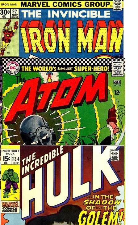
The various NEXT MEN logos were mine, as were DANGER: UNLIMITED, BABE,
the second ALPHA FLIGHT, NAMOR and a modified HULK when I was first on
the book.
The most important aspect of logos, I feel, is that they must be readable, or
baring that recognizable, at a distance. The best logo ever was ROM,
which could be read from up to two blocks away! The original FANTASTIC
FOUR logo, while not easy to read at a distance, was nonetheless
immediately recognizable. Same with Superman.
|
| Back to Top |
profile
| search
|
| |
Tom French
Byrne Robotics Member

Joined: 07 January 2005
Location: United States
Posts: 4154
|
| Posted: 28 September 2008 at 6:37am | IP Logged | 3
|
|
|
That's something I've always been curious about. What made you change the NEXT MEN logo as often as you did?
|
| Back to Top |
profile
| search
|
| |
John Byrne
Grumpy Old Guy
Joined: 11 May 2005
Posts: 133315
|
| Posted: 28 September 2008 at 6:39am | IP Logged | 4
|
|
|
NEXT MEN is not a combination of letters that lends itself to a great degree
of legibility at a distance, so I was looking for a design that, like FANTASTIC
FOUR, would stand out on the rack without having to be read.
|
| Back to Top |
profile
| search
|
| |
Chad Carter
Byrne Robotics Member
Joined: 16 June 2005
Posts: 9584
|
| Posted: 28 September 2008 at 10:09am | IP Logged | 5
|
|
|
The most important aspect of logos, I feel, is that they must be readable, or
baring that recognizable, at a distance.
I think these were some of the best at that!
|
| Back to Top |
profile
| search
|
| |
John Byrne
Grumpy Old Guy
Joined: 11 May 2005
Posts: 133315
|
| Posted: 28 September 2008 at 10:48am | IP Logged | 6
|
|
|
Of the many things that have gone astray due to increased use of technology
in American comics, one of the most glaring is the use of Photoshop and
fonts to create logos. It is now possible to type a logo, resulting in
combinations of forms and styles that even the most amateurish hand
letterer (like, say, ME, in my fan days) would never have attempted.
|
| Back to Top |
profile
| search
|
| |
Gerry Turnbull
Byrne Robotics Member

Joined: 16 April 2004
Location: Scotland
Posts: 8766
|
| Posted: 28 September 2008 at 10:50am | IP Logged | 7
|
|
|
Todd Kleins blog is always worth a visit for logo information
|
| Back to Top |
profile
| search
| www
e-mail
|
| |
Joe Hollon
Byrne Robotics Member

Joined: 08 May 2004
Location: United States
Posts: 13697
|
| Posted: 28 September 2008 at 10:57am | IP Logged | 8
|
|
|
I had never put much thought into comparing older logos with modern designs. After reading this thread I thought I would go to midtowncomics.com and scan through some new release comics to see if I could find any "bad" logo designs.....look what was the FIRST image to pop up on the FIRST page:
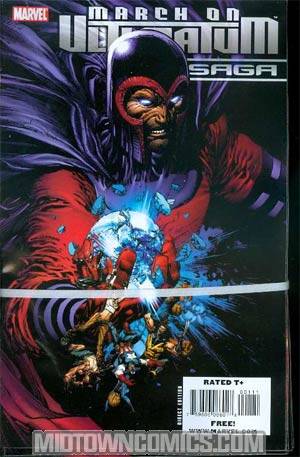
Thank you M***** for yet another perfect example of what not to do when publishing comic books!
|
| Back to Top |
profile
| search
| www
e-mail
|
| |
Chad Carter
Byrne Robotics Member
Joined: 16 June 2005
Posts: 9584
|
| Posted: 28 September 2008 at 10:59am | IP Logged | 9
|
|
|
Speaking of logo designers, "Dial B for Blog" has a huge dedication to Gaspar Saladino:
At least seven pages worth!
http://www.dialbforblog.com/archives/500/g1thenatural.html
|
| Back to Top |
profile
| search
|
| |
Josh Goldberg
Byrne Robotics Member

Joined: 25 October 2005
Location: United States
Posts: 2080
|
| Posted: 28 September 2008 at 11:08am | IP Logged | 10
|
|
|
Anyone have some examples of some really bad logos?
|
| Back to Top |
profile
| search
|
| |
John Byrne
Grumpy Old Guy
Joined: 11 May 2005
Posts: 133315
|
| Posted: 28 September 2008 at 11:12am | IP Logged | 11
|
|
|
One of the worst was Marvel's PIZZAZZ teen magazine, which couldn't seem
to decide if it said PIZZAS or PISS ASS.
In the 70s, Charlton did one called MONSTER HUNTERS, which Roger Stern
used to to BLURGULURGHLAH HUNTER due to the unfortunate design.
|
| Back to Top |
profile
| search
|
| |
Ray Brady
Byrne Robotics Member

Joined: 16 April 2004
Location: United States
Posts: 3740
|
| Posted: 28 September 2008 at 12:29pm | IP Logged | 12
|
|
|
Sorry, does that say "March on Ultimatum Saga"?
Does that actually mean something?
|
| Back to Top |
profile
| search
| www
|
| |


