| Author |
|
Joe Smith
Byrne Robotics Member

Joined: 29 August 2004
Location: United States
Posts: 6667
|
| Posted: 11 March 2008 at 9:34am | IP Logged | 1
|
|
|
this JrJr guy makes it look so easy. But then, he's done it sooooo much.
|
| Back to Top |
profile
| search
| www
e-mail
|
| |
Adam Hutchinson
Byrne Robotics Member

Joined: 15 December 2005
Location: United States
Posts: 4502
|
| Posted: 11 March 2008 at 9:44am | IP Logged | 2
|
|
|
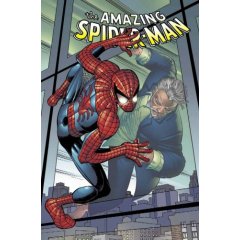
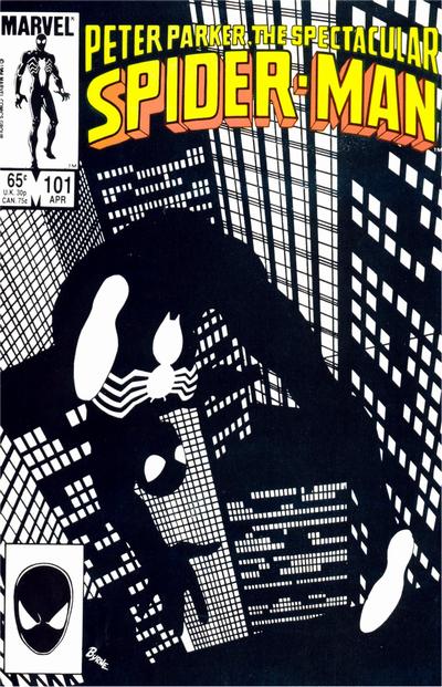
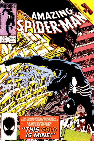
JB, you were responsible for a few fairly iconic covers with the black costume, and I was just curious what you're feelings about it were?
Theses are the covers that I was thinking of:
|
| Back to Top |
profile
| search
|
| |
John Byrne

Grumpy Old Guy
Joined: 11 May 2005
Posts: 133326
|
| Posted: 11 March 2008 at 9:46am | IP Logged | 3
|
|
|
Not a fan of the black costume.
|
| Back to Top |
profile
| search
|
| |
Brian Kirk
Byrne Robotics Member

Joined: 02 November 2004
Location: United States
Posts: 1243
|
| Posted: 11 March 2008 at 9:47am | IP Logged | 4
|
|
|
Just another reason why Ditko is God.
A lanky-ass teenager in a goofy costume...my favorite!!
|
| Back to Top |
profile
| search
| www
|
| |
John Byrne
Grumpy Old Guy
Joined: 11 May 2005
Posts: 133326
|
| Posted: 11 March 2008 at 9:47am | IP Logged | 5
|
|
|
this JrJr guy makes it look so easy
��
Unfortunately the colorist evidently thinks it is coffin lining.
|
| Back to Top |
profile
| search
|
| |
Dan Avenell
Byrne Robotics Member
Joined: 06 March 2008
Posts: 1038
|
| Posted: 11 March 2008 at 10:12am | IP Logged | 6
|
|
|
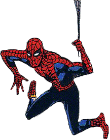
I love the fact that the 'scallops' change depending on the angle. I noticed this 'cheat' back when I was a kid, and like the fact that Ben Grimm's rock formation is never drawn the same way twice, it's great use of artistic license.
Also, his web-shooters are shown to be quite bulky, but disappear to wrist thickness once in costume. Same with the belt and the rarely used Spider-Signal. And of course his eyes somehow manage to be very expressive - in the cartoons he would sometimes blink when regaining consciousness!
One of the reasons I think Spider-Man is successful is that the webbing design really sells any foreshortening. Once you add that 'mesh' to the bare figure it fair jumps off the page. Lots of characters have gloves, boots and body-describing lines that give a 3-D look. This is why I generally don't like heroes wearing street clothes or all-in-one uniforms like Spider-Man's black costume - it often hurts the dynamism of the art.
Edited by Dan Avenell on 11 March 2008 at 10:16am
|
| Back to Top |
profile
| search
|
| |
Matt Hawes
Byrne Robotics Member

Joined: 16 April 2004
Location: United States
Posts: 16502
|
| Posted: 11 March 2008 at 10:13am | IP Logged | 7
|
|
|
For the past few years, colorists have put these odd little highlights on Spider-Man's webbing in an effort, I guess, to make the webbing look like the movie version of Spider-Man's outfit. Thankfully, that seems to have been a passing thing, as I don't see it done as much anymore.
|
| Back to Top |
profile
| search
| www
|
| |
Greg Kirkman
Byrne Robotics Member

Joined: 12 May 2006
Location: United States
Posts: 15775
|
| Posted: 11 March 2008 at 10:34am | IP Logged | 8
|
|
|
The subtle "nose" and "mouth" in the mask's web-pattern is just a brilliant visual concept. Ditko began using it later in his run, and Romita really perfected it.
And the movie costume cheated the amount of web-lines quite cleverly, I think.
Edited by Greg Kirkman on 11 March 2008 at 10:35am
|
| Back to Top |
profile
| search
e-mail
|
| |
Derek Cavin
Byrne Robotics Member

Joined: 03 June 2005
Location: United States
Posts: 2403
|
| Posted: 11 March 2008 at 11:12am | IP Logged | 9
|
|
|
Unfortunately the colorist evidently thinks it is coffin lining.
Agreed. On that run, the colorist always added highlights that made Spider-Man's costume look like it was padded.
edited: typOs and grammartical errors
Edited by Derek Cavin on 11 March 2008 at 11:13am
|
| Back to Top |
profile
| search
e-mail
|
| |
Stephen Sadowski
Byrne Robotics Member
Joined: 31 March 2006
Posts: 334
|
| Posted: 11 March 2008 at 11:41am | IP Logged | 10
|
|
|
Never noticed the different web direction before...doesnt make any sense to do it that way !
<grumbles...> I aint doin it that way...
|
| Back to Top |
profile
| search
| www
|
| |
Dan Avenell
Byrne Robotics Member
Joined: 06 March 2008
Posts: 1038
|
| Posted: 11 March 2008 at 2:06pm | IP Logged | 11
|
|
|
But look at John Romita's yes and no guide... don't you think that the 'correct' way describes the arm in an pleasing way that convinces the eye that each... column... is at a different point on the... er, wristal axis..., while the 'wrong' one looks, as JB says, like coffin lining?
Have there been any Spider-Man artists who didn't keep to this 'secret' style guide?
|
| Back to Top |
profile
| search
|
| |
Stephen Sadowski
Byrne Robotics Member
Joined: 31 March 2006
Posts: 334
|
| Posted: 11 March 2008 at 2:10pm | IP Logged | 12
|
|
|
I'd say MANY.
To have it change direction, mid costume, just doesnt look right to MY eye, anyway.
And what do you do if you have a shot were the forearm meets the elbow? just switch mid arm?
Another of the fakes is where the mask seperates from the neck..theres generally more lines at the neck than there are on the face...discovered THAT little problem recently myself!!
Edited by Stephen Sadowski on 11 March 2008 at 2:14pm
|
| Back to Top |
profile
| search
| www
|
| |


