| Author |
|
Eric Russ
Byrne Robotics Member

Joined: 13 March 2006
Location: United States
Posts: 2006
|
| Posted: 15 March 2008 at 7:45pm | IP Logged | 1
|
|
|
The shame with Miller's newest drawing style is that I like it because it's
so completely insane & weird. But before, I liked his work because it was
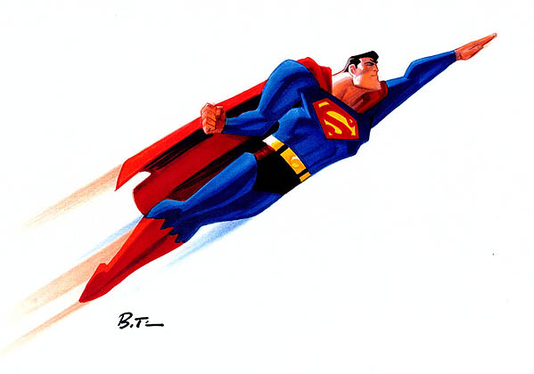
so completely good. His B&W sin city art (much like that Superman pic)
was so incredibly designed and drawn that I fear he peeked. His more
abstract newer work seems to dare the average viewer to not like it. You
know he's doing it on purpose, so the argument that he can't draw is
moot. You just gotta go with it and embrace the weird, or stay away...
Dave Aikins -
Yeah, I think it's the thing of, "Everyone is drawing fists and they can
draw fists well but nobody can draw a fist like me." And/Or, "What can I
do to have a unique voice and communicate what this represents"
Like Bill Sienkiewicz, who stretches the boundaries of his design, Frank
seems to be doing the same thing.
Both of their works, as observed by the viewer probably does not readily
communicate what they (the viewer) is used to seeing.
Whereas someone might draw a fist round and organic , Frank and Bill will
define it with sharp triangular like shapes. Their work sways toward
impressionism and allows your mind to play along with the design.
It gives the work more impact and goes outside of the immediately
recognized zone while communicating visually and mentally.
Edited by Eric Russ on 15 March 2008 at 7:45pm
|
| Back to Top |
profile
| search
|
| |
Eric Russ
Byrne Robotics Member
Joined: 13 March 2006
Location: United States
Posts: 2006
|
| Posted: 15 March 2008 at 7:46pm | IP Logged | 2
|
|
|
Early Sprouse.. -
Eric Smearman -
Ha! Thanks for the post.
Edited by Eric Russ on 15 March 2008 at 7:46pm
|
| Back to Top |
profile
| search
|
| |
Ron Chevrier
Byrne Robotics Member
Joined: 16 April 2004
Location: Canada
Posts: 1641
|
| Posted: 15 March 2008 at 7:55pm | IP Logged | 3
|
|
|
These are all fine examples of comic book art that is allowed to be what it is, regardless of the artists' individual styles. My biggest pet peeve is the stuff that colorists slather their Photoshop all over in a horrible murky mess, in a vain (and I mean that as both arrogant and futile) attempt to emulate video game characters.
|
| Back to Top |
profile
| search
|
| |
Eric Russ
Byrne Robotics Member
Joined: 13 March 2006
Location: United States
Posts: 2006
|
| Posted: 15 March 2008 at 10:55pm | IP Logged | 4
|
|
|
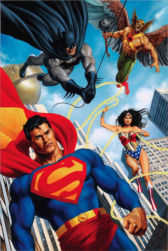
Joe Jusko -
|
| Back to Top |
profile
| search
|
| |
Eric Russ
Byrne Robotics Member
Joined: 13 March 2006
Location: United States
Posts: 2006
|
| Posted: 15 March 2008 at 10:56pm | IP Logged | 5
|
|
|
Chris Bachalo -
|
| Back to Top |
profile
| search
|
| |
Eric Russ
Byrne Robotics Member
Joined: 13 March 2006
Location: United States
Posts: 2006
|
| Posted: 15 March 2008 at 10:59pm | IP Logged | 6
|
|
|
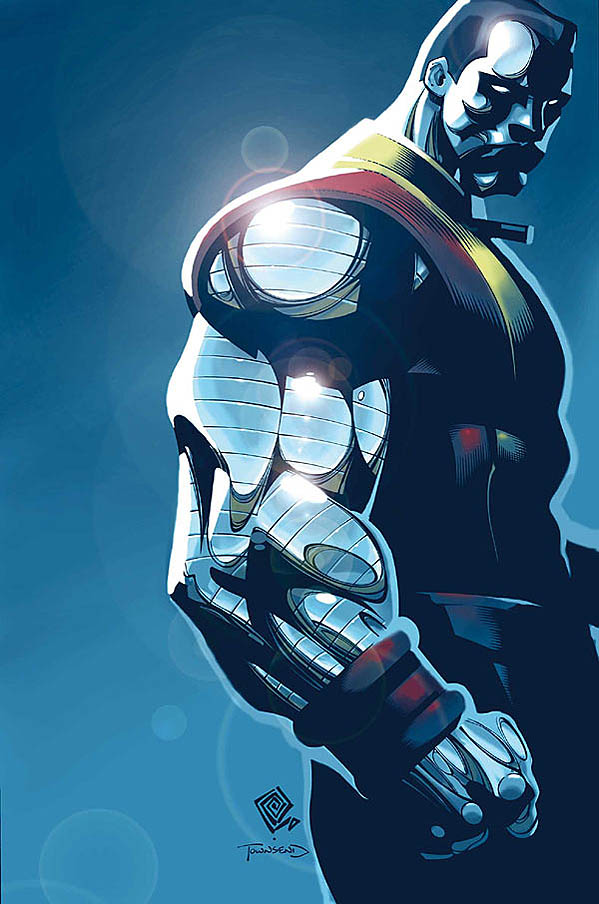
Walt Simonson -
|
| Back to Top |
profile
| search
|
| |
Eric Russ
Byrne Robotics Member
Joined: 13 March 2006
Location: United States
Posts: 2006
|
| Posted: 15 March 2008 at 10:59pm | IP Logged | 7
|
|
|
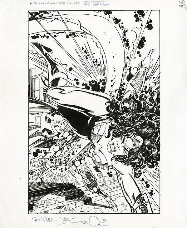
Jason Pearson -
|
| Back to Top |
profile
| search
|
| |
Eric Russ
Byrne Robotics Member
Joined: 13 March 2006
Location: United States
Posts: 2006
|
| Posted: 15 March 2008 at 11:00pm | IP Logged | 8
|
|
|
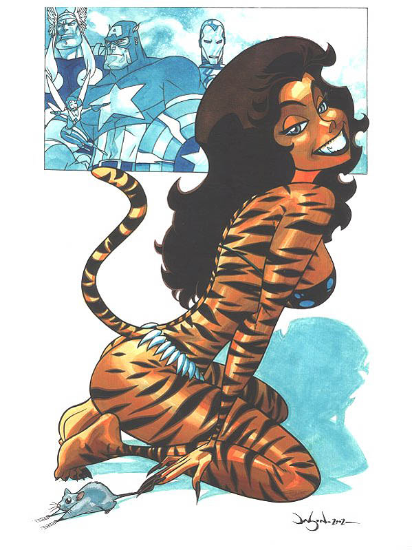
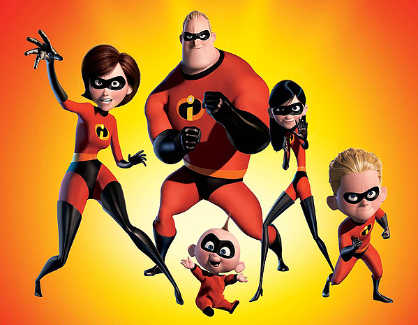
Bruce Timm -
|
| Back to Top |
profile
| search
|
| |
Eric Russ
Byrne Robotics Member
Joined: 13 March 2006
Location: United States
Posts: 2006
|
| Posted: 16 March 2008 at 1:14am | IP Logged | 9
|
|
|
I wish current comics art wasn�t so shiny.
Felicity Walker -
Felicity, If you are talking about the use of digital highlights I agree. I think
that subtlety is key...not always but a mixture is needed.
|
| Back to Top |
profile
| search
|
| |
Eric Russ
Byrne Robotics Member
Joined: 13 March 2006
Location: United States
Posts: 2006
|
| Posted: 16 March 2008 at 1:24am | IP Logged | 10
|
|
|
My biggest pet peeve is the stuff that colorists slather their Photoshop all
over in a horrible murky mess, in a vain (and I mean that as both
arrogant and futile) attempt to emulate video game characters.
Ron Chevrier -
I hear you. Hopefully with time it will come together. When Photoshop
first came out everyone was very keen on using all the bells and whistles
making effects very obvious. I think what you are saying goes in hand to
what Felicity mentioned.
Hopefully as I mentioned before it will all come together. A blend of the
flat color from the early days and a good treatment for dimensional color.
I would be curious to see what Bruce Timms work would look like if
colored like the following -
Edited by Eric Russ on 16 March 2008 at 1:25am
|
| Back to Top |
profile
| search
|
| |
Eric Smearman
Byrne Robotics Member

Joined: 02 September 2006
Location: United States
Posts: 5823
|
| Posted: 16 March 2008 at 4:30am | IP Logged | 11
|
|
|
Love that Jusko JLA, Eric. Where's it from?
|
| Back to Top |
profile
| search
e-mail
|
| |
Carmen Bernardo
Byrne Robotics Member
Joined: 08 August 2006
Location: United States
Posts: 3666
|
| Posted: 16 March 2008 at 6:49am | IP Logged | 12
|
|
|
My preference varies from time to time. Sometimes, I pick a realistic artist like JB or Ryoichi Ikegami (manga artist whose work is on titles like "Crying Freeman" or "Mai the Psychic Girl"). At others, a more cartoony mix is preferred, such as Jack Kirby, Walt Simonson or Ken-Ichi Sonoda ("Gunsmith Cats"). My own personal style, is, of course, a mixture of most of these artists.
|
| Back to Top |
profile
| search
|
| |


