| Author |
|
Tim O Neill
Byrne Robotics Security
Joined: 16 April 2004
Location: United States
Posts: 10924
|
| Posted: 08 September 2018 at 12:08pm | IP Logged | 1
|
post reply
|
|
I don�t like Palmer�s inks on this. He didn�t just overpower JB�s pencils, he changed the piece completely. I believe this was a cover image, so maybe he felt an obligation to make it grand with detail. But JB�s Silver Surfer is powerful in his sleekness and simplicity. And when you keep the character design simple, the coloring works much better. Silver Surfer will be white, and we have heard much on the Forum about the graphic power of white space. When the inker and the colorist try to fill in this white space, they are not considering the overall work. Sometimes less is more.
And to be clear, this is not a knock on Tom Palmer. I just love his work on X-MEN HIDDEN YEARS. I was disappointed when the series didn�t feature JB inking has own work, but having Palmer on the book turned out to be a stroke of genius. Palmer provided a kind of connective tissue between the Neal Adams run and the �all new all different� iteration that featured JB.
|
| Back to Top |
profile
| search
|
| |
Shane Matlock
Byrne Robotics Member

Joined: 12 August 2012
Location: United States
Posts: 1760
|
| Posted: 08 September 2018 at 12:30pm | IP Logged | 2
|
post reply
|
|
I definitely prefer the Surfer's face in the original pencils and just that whole piece in general. It's gorgeous. The finished product made for a great cover too but, man, those pencils are superb.
|
| Back to Top |
profile
| search
|
| |
Peter Martin
Byrne Robotics Member

Joined: 17 March 2008
Location: Canada
Posts: 15777
|
| Posted: 08 September 2018 at 2:24pm | IP Logged | 3
|
post reply
|
|
I quite like the changes that Palmer made to the right leg (i.e. back) leg, but apart from that, I find the changes tend to diminish rather than add, particularly the face, the lighting (the dramatically-lit torso going to those abs most of all), and the cosmic swirl behind. Sad that we lost those beautifully smoothly curves in the background.
Edited by Peter Martin on 08 September 2018 at 2:26pm
|
| Back to Top |
profile
| search
|
| |
Christopher Frost
Byrne Robotics Member
Joined: 24 October 2016
Location: Canada
Posts: 484
|
| Posted: 08 September 2018 at 8:40pm | IP Logged | 4
|
post reply
|
|
Palmer tends to have a pretty heavy handed style and usually overwhelms the pencils on most of the projects he works on. Sometimes his style fits well with the penciller (inking Gene Colan comes to mind), but I find he tends to dominate the work. He has worked with some excellent pencilers like Byrne, Colan, Buscema and Epting and manages to make them all look like they were drawn by the same person.
I think a successful inker is one who is able to embellish the penciled art and add a touch of their own style but doesn't overwhelm the piece. Their job is to enhance not take over and Palmer too often falls into that trap of making it his own.
|
| Back to Top |
profile
| search
|
| |
Joel Biske
Byrne Robotics Member

Joined: 18 January 2007
Location: United States
Posts: 761
|
| Posted: 13 September 2018 at 10:54am | IP Logged | 5
|
post reply
|
|
Man Nathan, thanks for posting this!! Never saw the original pencils.
Now I want whoever owns the pencil original to post a nice high res scan of them so we can all enjoy it....
|
| Back to Top |
profile
| search
| www
e-mail
|
| |
Joel Biske
Byrne Robotics Member
Joined: 18 January 2007
Location: United States
Posts: 761
|
| Posted: 13 September 2018 at 11:00am | IP Logged | 6
|
post reply
|
|
From an inking standpoint, I'd say that I really prefer the movement JB had in the background. These are pretty finished pencils and some of Palmer's additions are, to me, questionable. (And I LOVE Palmer's inking)
When I see him as inker, I expect a significant contribution, but when looking at these pencils, I wonder why some of these decisions were made.
|
| Back to Top |
profile
| search
| www
e-mail
|
| |
Nathan Greno
Byrne Robotics Member

Joined: 20 April 2006
Location: United States
Posts: 9154
|
| Posted: 13 September 2018 at 2:02pm | IP Logged | 7
|
post reply
|
|
Joel: I wonder why some of these decisions were made.
----
The small changes confuse me most. For example, SS's screen right leg was completely redrawn. Look at where the knee lines up with the surfboard on both drawings... why change that?
|
| Back to Top |
profile
| search
|
| |
Mark Haslett
Byrne Robotics Member
Joined: 19 April 2004
Location: United States
Posts: 6094
|
| Posted: 14 September 2018 at 9:31am | IP Logged | 8
|
post reply
|
|
The lines on the surfboard jump out to me as another "Huh? Why redraw that?'
There are so many changes done to something I wouldn't want to change at all
so every detail brings its own mystery.
I can only suppose Mr. Palmer felt or was told that it needed a lot of fixes.
|
| Back to Top |
profile
| search
|
| |
Joe Boster
Byrne Robotics Member

Joined: 29 April 2004
Location: United States
Posts: 3160
|
| Posted: 14 September 2018 at 2:18pm | IP Logged | 9
|
post reply
|
|
Also, keep in mind that this was inked in to published on 1982's printing presses. The final colored page looks amazing! (tho I it looks even less like JB) But some things might have been approached from that sort of perspective.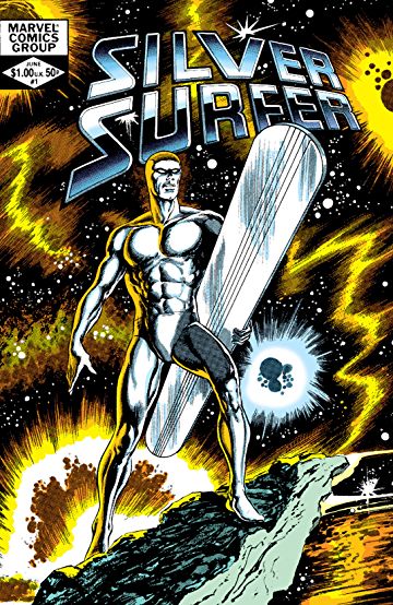
|
| Back to Top |
profile
| search
e-mail
|
| |
David Allen Perrin
Byrne Robotics Member
Joined: 15 April 2009
Location: United States
Posts: 3531
|
| Posted: 15 September 2018 at 1:01am | IP Logged | 10
|
post reply
|
|
Ive seen this cover many times.
I had no idea this was a John Byrne pencilled piece.
|
| Back to Top |
profile
| search
|
| |
Tim O Neill
Byrne Robotics Security
Joined: 16 April 2004
Location: United States
Posts: 10924
|
| Posted: 15 September 2018 at 11:28am | IP Logged | 11
|
post reply
|
|
Palmer knew it was a cover image, so maybe there was a sense by him or the editors to make it Grand. So they spilled a lot of ink on it!
The only good thing about this instance is that the penciled art gets some attention. The pencilled piece is more cosmic and grand than the inked piece to me!
|
| Back to Top |
profile
| search
|
| |
Brian Miller
Byrne Robotics Member

Joined: 28 July 2004
Location: United States
Posts: 30884
|
| Posted: 15 September 2018 at 1:43pm | IP Logged | 12
|
post reply
|
|
This is the comic that really made me not like Palmer�s inks over JB pencils. Don�t like them here and don�t like them on XMHY.
|
| Back to Top |
profile
| search
|
| |


