| Author |
|
Nathan Greno
Byrne Robotics Member

Joined: 20 April 2006
Location: United States
Posts: 9154
|
| Posted: 07 September 2018 at 11:15am | IP Logged | 1
|
post reply
|
|
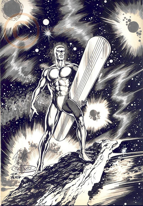
I recently came across the JB's penciled cover for the Silver Surfer One Shot. I know Palmer can be heavy handed, but I was surprised at the amount of redrawing that went on with this piece. For my own tastes, I think the inks are too overpowering here.
There's been a lot of inking talk recently in the "Pencil Practice" thread -- I thought it might be interesting to carry some of that conversation into this thread... starting with the examination of this piece:
Feel free to comment on the cover above and/or post other pencil/inks comparisons for discussion...
|
| Back to Top |
profile
| search
|
| |
Mark Haslett
Byrne Robotics Member

Joined: 19 April 2004
Location: United States
Posts: 6097
|
| Posted: 07 September 2018 at 12:05pm | IP Logged | 2
|
post reply
|
|
First thought for me is a question: I wonder how many changes were enough
for me to not recognize the finished piece as John Byrne art?
I feel like that effect would have been achieved if all Mr. Palmer re-drew was
the face. But the finished torso definitely would have sealed the deal. If
everything else were inked faithfully, I still probably wouldn't have known this
was drawn by my favorite artist.
It's nice, but I didn't know it was JB for years after it came out. Even after I
knew the story was drawn by JB, I wondered who drew the cover.
|
| Back to Top |
profile
| search
|
| |
John Byrne
Grumpy Old Guy
Joined: 11 May 2005
Posts: 132239
|
| Posted: 07 September 2018 at 12:23pm | IP Logged | 3
|
post reply
|
|
Not sure why Tom redrew the face. I was going for Kirby�s version.
|
| Back to Top |
profile
| search
|
| |
Robert Shepherd
Byrne Robotics Member

Joined: 30 March 2014
Location: United States
Posts: 1268
|
| Posted: 07 September 2018 at 1:05pm | IP Logged | 4
|
post reply
|
|
I've tried to mature over the years and look at Tom's inks with open eyes, but in the spirit of this post...
I'm not a fan of the redraws Tom did on the Surfer. The more I look at both images side-by-side, the more I see how much Tom changed for the worse.
I do like the stone out cropping though. That looks cool.
Edited by Robert Shepherd on 07 September 2018 at 1:06pm
|
| Back to Top |
profile
| search
| www
e-mail
|
| |
Jonathan A. Dowdell
Byrne Robotics Member
Joined: 17 July 2016
Location: United States
Posts: 417
|
| Posted: 07 September 2018 at 1:12pm | IP Logged | 5
|
post reply
|
|
Was this a directed attempt to make the Surfer on the cover look more like John Buscema's Silver Surfer of the 1969/70 series? Or just an inker's prerogative (style coming through)?
|
| Back to Top |
profile
| search
|
| |
Joe Hollon
Byrne Robotics Member

Joined: 08 May 2004
Location: United States
Posts: 13675
|
| Posted: 07 September 2018 at 2:35pm | IP Logged | 6
|
post reply
|
|
I was there when the finished, inked piece above was
signed by Stan Lee. Good memory. One of the neatest
pieces of original art I've seen in person.
|
| Back to Top |
profile
| search
| www
e-mail
|
| |
Dave Kopperman
Byrne Robotics Member

Joined: 27 December 2004
Location: United States
Posts: 3135
|
| Posted: 07 September 2018 at 3:11pm | IP Logged | 7
|
post reply
|
|
A game I like to play to amuse - or maybe that's 'abuse' - my friends is to look at a page from our share vintage ('79 - '89, roughly) and name the penciller and inker. Not from memory, mind you, but from the visual cues. It's easy enough to do with most pairings, specifically with full pencils and sympathetic inkers.
This one, on the other hand? I cannot see the Byrne in the final for the life of me. The approach to the musculature, the treatment of the light source, the complete redrawing of the face, etc. I love Palmer, but he's really meant to work on layouts. Giving him reasonably finished pencils like the above, which is (I think) deliberately impressionistic but still full of detailed visual information just results in the loss of the original work and creation of a new one in its place. He's changing and adding details in places where the original pencils deliberately elide them (the abdominals and rock face) and eliminating details where the original pencils are quite clear (the Kirby crackle).
All of that would still leave some Byrne showing, but ignoring many of the lighting cues - one of JB's real 'tells' - just hides the original completely. In the original pencils, you can see that the primary light source is very clearly coming from below (shadows on the face, cast shadows on the left foot and right leg, etc.). Palmer discarded those and went for a more ambient source that makes it difficult to tell just where the light is supposed to be coming from, so a lot of the internal logic of the original drawing is lost (to me).
I can see how some would see it as an improvement - Palmer's line and tone is LUSH as FUCK and very appealing, and I think he's technically a superior inker (as in artist who works in ink) to JB. But this is a case where I prefer the original. |
| Back to Top |
profile
| search
| www
|
| |
Eric Ladd
Byrne Robotics Member

Joined: 16 August 2004
Location: Canada
Posts: 4506
|
| Posted: 07 September 2018 at 3:15pm | IP Logged | 8
|
post reply
|
|
The one stylistic change from the pencils to the inks that I would have liked to see preserved is how much of the figure JB represented with the black background. In the pencils, the surfboard and very few white areas make the Surfer require a black outline. With JB's pencils, the majority of the figure is indicated by the background instead of a traditional black outline. With Tom's inks, white areas have been added that require the figure to be almost entirely outlined. I've been looking at lots of John Buscema lately and when the background is leveraged to indicate the Surfer I find the effect more striking.
Case in point: 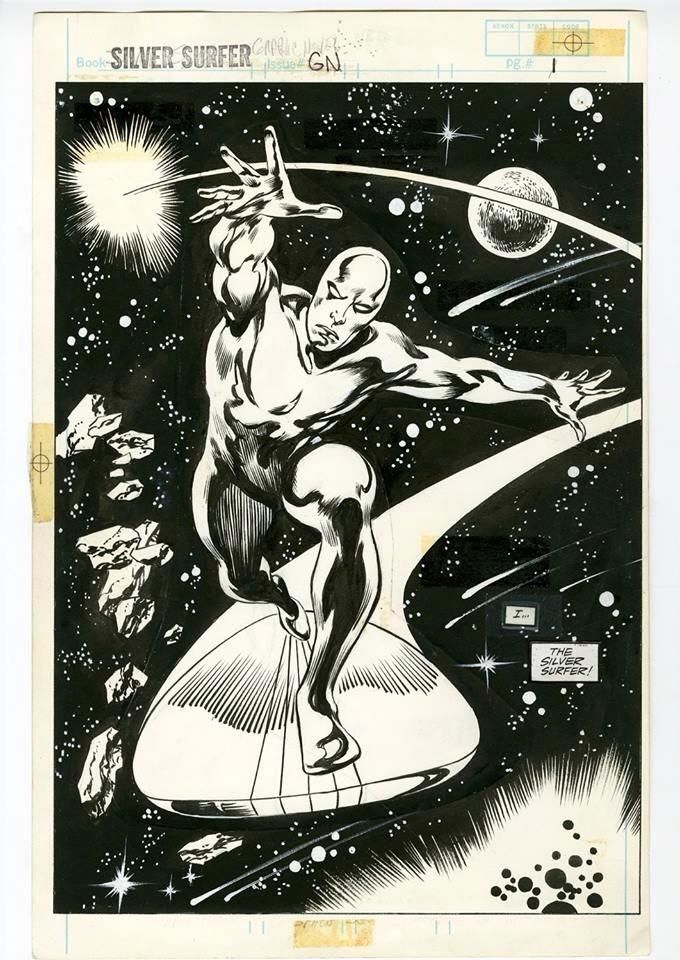
|
| Back to Top |
profile
| search
|
| |
Eric Ladd
Byrne Robotics Member
Joined: 16 August 2004
Location: Canada
Posts: 4506
|
| Posted: 07 September 2018 at 3:23pm | IP Logged | 9
|
post reply
|
|
One other complete change from pencil to ink that I think distracts for me is the change in motion for the background. The swirling nature of the background makes it seem tempestuous, but the inks have lost that chaos behind the Surfer. The lower right change is particularly rough on my eye when it changed from a swirl to linear movement. It gives me the impression that the Surfer is looking back on the direction he has traveled. It looks like the asteroid is moving from right to left through space and the Surfer is looking backward instead of the direction he is going.
|
| Back to Top |
profile
| search
|
| |
Nathan Greno
Byrne Robotics Member
Joined: 20 April 2006
Location: United States
Posts: 9154
|
| Posted: 07 September 2018 at 3:38pm | IP Logged | 10
|
post reply
|
|
Something just occurred to me...
The original penciled cover still exists (Palmer light boxed the pencils onto a piece of Craftint board)... and the final inked cover is pretty heavily redrawn... seems to me the original art that was actually used for the cover SHOULDN'T be called a piece of "John Byrne original art" at auction.
Right?
|
| Back to Top |
profile
| search
|
| |
Doug Centers
Byrne Robotics Member

Joined: 17 February 2014
Location: United States
Posts: 5458
|
| Posted: 07 September 2018 at 5:04pm | IP Logged | 11
|
post reply
|
|
I guess technically it's original Palmer inks, but since this version was used for the cover I would have to call it "original cover art by Byrne and Palmer.
As for Palmer's inks on this, I think it's very slick. But I like JB's version. Tom loses that classic Byrne stature, shoulders pinned back, chest out, a slight head angle up. I guess a majestic look is what I see.
|
| Back to Top |
profile
| search
|
| |
Nathan Greno
Byrne Robotics Member
Joined: 20 April 2006
Location: United States
Posts: 9154
|
| Posted: 07 September 2018 at 6:59pm | IP Logged | 12
|
post reply
|
|
Doug: I guess technically it's original Palmer inks, but since this version was used for the cover I would have to call it "original cover art by Byrne and Palmer.
---
JB should get cover credit for the printed comic, no doubt... but on the inked original cover art...
For instance, if another person light boxed those same SS pencils and inked it... would that person be able to say the piece was "original art by Byrne and ____. " I feel like you HAVE to say it's a light boxed piece of art if the penciller didn't physically touch the piece.
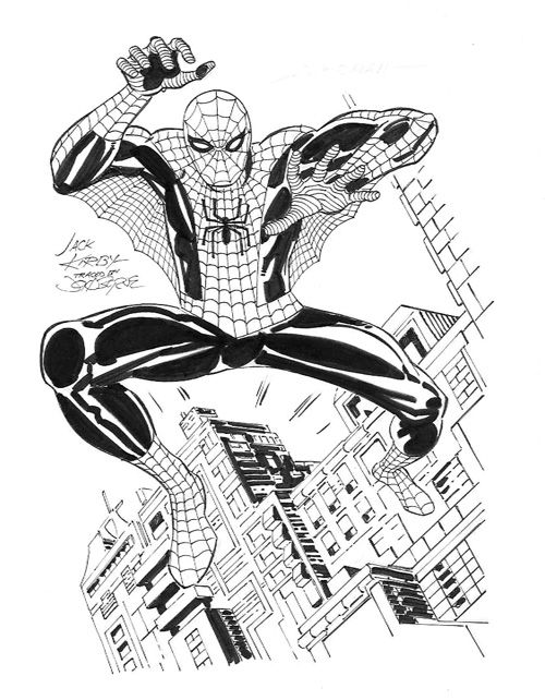
Makes me think of this piece JB inked...
|
| Back to Top |
profile
| search
|
| |