| Author |
|
John Byrne

Grumpy Old Guy
Joined: 11 May 2005
Posts: 132338
|
| Posted: 29 June 2017 at 7:17am | IP Logged | 1
|
|
|
I think Spider-Man's costume was originally red and black, and certainly prefer when he is colored that way, but seem to recall reading somewhere that Steve Ditko now says it was always red and blue.�� Ditko talked about the shade of blue he wanted on the hi-lites and many of the Blue Brigade have pounced on this to claim he wanted the suit be be red and blue. But blue is a traditional hi-lite on black, which many fans, even long time fans, don't seem to grasp. (This is why the mini-brains ask why no one spots Clark Kent is Superman since they both have "blue hair". And this is why MY hair turns gray. . . ) The costume turned to red and blue (actually blue mixed with flesh tones) for the most prosaic of reasons: Deadlines. Steve was constantly chasing them, and as with so many characters over the years -- Batman, the X-Men -- the blacks slowly dropped out. He also greatly simplified the web pattern. Fewer lines mean the pages get done faster.
|
| Back to Top |
profile
| search
|
| |
Michael Penn
Byrne Robotics Member

Joined: 12 April 2006
Location: United States
Posts: 12448
|
| Posted: 29 June 2017 at 7:20am | IP Logged | 2
|
|
|
When these color questions come up, I feel so distant from them because as a little kid-reader they never entered my mind. Spider-Man's costume color was... what it was, what it appeared to be on the page, namely, red-black-blue. Bruce Wayne's hair was black-blue. I just accepted whatever colors were offered. No questions because no confusion because there wasn't any reason for it.
As an adult -- but not an active reader since I was a teen -- I can only think that these kinds of questions about coloring is a matter strictly for professionals to discuss, debate, and decide. If Steve Ditko says Spider-Man's costume was always red and blue, fine, so be it. What I see on the pages of all the issues he worked on doesn't change at all. And if another professional disagrees and states Spider-Man was always red and black, fine, so be it! On the page, I still see what I've always seen, and it's always been and always will be Spider-Man.
I can't think why any of this is any non-professional's business. It's not a matter of lacking curiosity. It's a matter of ruining your own experience as a reader by thinking beyond a boundary where you are utterly irrelevant to the process and production. |
| Back to Top |
profile
| search
|
| |
Robert Bradley
Byrne Robotics Member

Joined: 20 September 2006
Location: United States
Posts: 4830
|
| Posted: 29 June 2017 at 7:41am | IP Logged | 3
|
|
|
As a kid I had it figured out that Superman's hair wasn't actually blue (because blue hair made absolutely no sense at all!) - but the color of Spider-Man's costume did change dramatically from the original with all the blacks spotted to the contemporary red & blue version.
Personally, I think the red & black looks much better.
|
| Back to Top |
profile
| search
| www
|
| |
Robert Bradley
Byrne Robotics Member
Joined: 20 September 2006
Location: United States
Posts: 4830
|
| Posted: 29 June 2017 at 7:46am | IP Logged | 4
|
|
|
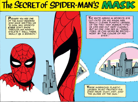
As for the mask, this comes from THE AMAZING SPIDER-MAN ANNUAL #1 -
|
| Back to Top |
profile
| search
| www
|
| |
Wallace Sellars
Byrne Robotics Member

Joined: 01 May 2004
Location: United States
Posts: 17671
|
| Posted: 29 June 2017 at 10:12am | IP Logged | 5
|
|
|
The way highlights are used in comics was easy for me to understand as a kid.
Aurora and Northstar had black hair with white highlights used to show curl
patterns/texture.
Spider-Man's original costume is red and black with blue highlights.
Storm's original costume is black and yellow (gold?) with white highlights.
Superman's hair is black with blue highlights used to show curl
patterns/texture.
I never thought the blue (or gray or white) used on the Black Panther's
costume meant that the outfit wasn't black.
|
| Back to Top |
profile
| search
| www
|
| |
Eric Ladd
Byrne Robotics Member

Joined: 16 August 2004
Location: Canada
Posts: 4506
|
| Posted: 29 June 2017 at 10:30am | IP Logged | 6
|
|
|
The literal interpretation of highlight color baffles me. In the past, when the use of a highlight color to show form came up I usually asked why they had no issues with every single person in comics having a thin black line surrounding their bodies, limbs, etc. Accepting some of the conventions of comic art, but not others seems intentionally stupid.
|
| Back to Top |
profile
| search
|
| |
Jeremy Simington
Byrne Robotics Member

Joined: 10 April 2011
Location: United States
Posts: 687
|
| Posted: 30 June 2017 at 8:52am | IP Logged | 7
|
|
|
I'm so jealous of Wallace. I was an adult before I fully understood those things. Also, I agree with Eric Ladd about accepting the conventions. I don't want to waste time arguing with anyone who is OK with a man who has the powers of a spider but insists that his costume must be blue not black.
Edited to make a more appropriate analogy for this thread.
Edited by Jeremy Simington on 30 June 2017 at 8:54am
|
| Back to Top |
profile
| search
|
| |
Rob Ocelot
Byrne Robotics Member

Joined: 07 December 2008
Location: Canada
Posts: 1231
|
| Posted: 01 July 2017 at 9:03am | IP Logged | 8
|
|
|
A lot of this argument boils down to the readers expectations of what the colour should be. On an uncoloured page (and with no preconcieved bias as to what the colour is intended to be), almost no one will say Spider-man's costume is white because the highlights are white. It's only because 'red and blues' to describe the costume has now entered popular culture that people now *expect* it to be blue.
Funny enough, yesterday my young cousin visited and he had his (normally blonde) hair coloured a very dark blue -- so dark that my first reading of it was 'black'. It was only when the light hit it in certain ways that I could see the blue.
It was literally the perfect (and timely) real world explanation for the blue/black conundrum. So my take on it is thus:
Spider-man's costume is red and very very dark blue, so dark that in most lighting conditions it looks black. Under the glare of a streetlight at the right angle you can see a hint of blue.
Human eyesight is pretty poor compared to other animals and a lot of the perception and interpretation is offloaded to the visual cortex of the brain. A lot of times we need something else right in front of us to make a comparison and it's amazing how wrong our brains can interpret things when information is missing. Case in point, many times purple objects are read as blue unless there's something blue right next to it.
Edited by Rob Ocelot on 01 July 2017 at 9:07am
|
| Back to Top |
profile
| search
|
| |
Richard Stevens
Byrne Robotics Member

Joined: 04 May 2004
Location: United States
Posts: 1929
|
| Posted: 01 July 2017 at 9:32am | IP Logged | 9
|
|
|
Once it was explicitly clear to me (probably from this board) that Spider-Man's suit really *is* red and black, the idea of red and blue just feels sad. A compromise.
Red and black is SO MUCH COOLER.
|
| Back to Top |
profile
| search
| www
|
| |
Sam Houston
Byrne Robotics Member

Joined: 26 March 2005
Location: United States
Posts: 1693
|
| Posted: 02 July 2017 at 8:16am | IP Logged | 10
|
|
|
But blue is a traditional hi-lite on black...* * * Why not use a gray tone for the highlights? I have no idea how the colors were done in printing then or why blue was the choice of black highlights, but it would seem natural (for an artist at least) to use a lighter tone of black (i.e. grey) to convey black highlights.
Edited by Sam Houston on 02 July 2017 at 9:17am
|
| Back to Top |
profile
| search
e-mail
|
| |
Doug Centers
Byrne Robotics Member

Joined: 17 February 2014
Location: United States
Posts: 5485
|
| Posted: 02 July 2017 at 8:22am | IP Logged | 11
|
|
|
I believe blue was the more cost effective way to go. Not sure if it still holds true today.
|
| Back to Top |
profile
| search
|
| |
Joe Smith
Byrne Robotics Member

Joined: 29 August 2004
Location: United States
Posts: 6607
|
| Posted: 02 July 2017 at 9:22am | IP Logged | 12
|
|
|
That is correct. The gray would have added anotyer 'burn' to the black
plate. The blue plate was already being used, with the yellow and
magenta.
|
| Back to Top |
profile
| search
| www
e-mail
|
| |