| Author |
|
Matt Hawes
Byrne Robotics Member

Joined: 16 April 2004
Location: United States
Posts: 16506
|
| Posted: 15 April 2016 at 6:27pm | IP Logged | 1
|
|
|
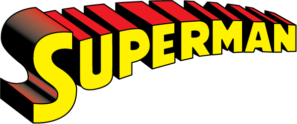
Inspired by the other thread about modern logos, I was wondering what are some of your favorite logos from any era?
My top three are pretty much all-time classic logos:


I also have a fondness for this one:

|
| Back to Top |
profile
| search
| www
|
| |
Doug Centers
Byrne Robotics Member

Joined: 17 February 2014
Location: United States
Posts: 5636
|
| Posted: 15 April 2016 at 7:00pm | IP Logged | 2
|
|
|
I gotta agree with Superman and Batman , my third in no particular order is this:When I first started reading comics F.F. had the slanted block letters. The old logo came back about 3 or 4 years later. I just loved it , kind of gave me a connection to the Silver Age in which I had only seen glimpses of back then.
|
| Back to Top |
profile
| search
|
| |
John Byrne

Grumpy Old Guy
Joined: 11 May 2005
Posts: 133580
|
| Posted: 15 April 2016 at 7:23pm | IP Logged | 3
|
|
|
The original Superman and FF logos are top of my list, along with several variants on the Batman logo. The BEST logo I've ever seen, tho, was ROM. Readable from blocks away. I know, cuz I did! By the way, Matt, that's not the "classic" Superman logo. That's the "rounded" version that came in during the Seventies.
|
| Back to Top |
profile
| search
|
| |
Brian Peck
Byrne Robotics Member

Joined: 16 April 2004
Location: United States
Posts: 1709
|
| Posted: 15 April 2016 at 7:35pm | IP Logged | 4
|
|
|
Here are my favorite DC logos:


This is really one but an earlier golden age green lantern version than a later
refined one.


|
| Back to Top |
profile
| search
| www
e-mail
|
| |
Robert Bradley
Byrne Robotics Member

Joined: 20 September 2006
Location: United States
Posts: 4887
|
| Posted: 15 April 2016 at 7:53pm | IP Logged | 5
|
|
|

|
| Back to Top |
profile
| search
| www
|
| |
Robert Bradley
Byrne Robotics Member

Joined: 20 September 2006
Location: United States
Posts: 4887
|
| Posted: 15 April 2016 at 7:54pm | IP Logged | 6
|
|
|
And of course -
|
| Back to Top |
profile
| search
| www
|
| |
Robert Bradley
Byrne Robotics Member

Joined: 20 September 2006
Location: United States
Posts: 4887
|
| Posted: 15 April 2016 at 7:58pm | IP Logged | 7
|
|
|

|
| Back to Top |
profile
| search
| www
|
| |
Ryan Maxwell
Byrne Robotics Member

Joined: 16 April 2004
Location: United States
Posts: 12960
|
| Posted: 15 April 2016 at 8:06pm | IP Logged | 8
|
|
|
The original Alpha Flight gives me a rise. The arrow Avengers and Uncanny X-men are also faves.
|
| Back to Top |
profile
| search
e-mail
|
| |
Marc Cheek
Byrne Robotics Member

Joined: 18 June 2014
Location: United States
Posts: 1785
|
| Posted: 15 April 2016 at 8:08pm | IP Logged | 9
|
|
|
I'm partial to the original FF logo!
Classic!
|
| Back to Top |
profile
| search
e-mail
|
| |
Stephen Churay
Byrne Robotics Member

Joined: 25 March 2009
Location: United States
Posts: 8369
|
| Posted: 15 April 2016 at 8:28pm | IP Logged | 10
|
|
|
The rounded "S" Superman logo as well as the late 70's
Batman. Big fan of the Captain America logo used during
JB's run. That was the one thing I appreciated about
Liefeld's Cap run. He brought back that logo.
The Batman logo from Loeb/ Lee's Hush run was excellent as
well.
|
| Back to Top |
profile
| search
e-mail
|
| |
Matt Hawes
Byrne Robotics Member

Joined: 16 April 2004
Location: United States
Posts: 16506
|
| Posted: 15 April 2016 at 8:36pm | IP Logged | 11
|
|
|
JB wrote:
| ...By the way, Matt, that's not the "classic" Superman logo. That's the "rounded" version that came in during the Seventies... |
|
|
OOPS! I forgot about the changes! I like both versions, though.
|
| Back to Top |
profile
| search
| www
|
| |
Peter Martin
Byrne Robotics Member

Joined: 17 March 2008
Location: Canada
Posts: 16002
|
| Posted: 15 April 2016 at 8:43pm | IP Logged | 12
|
|
|
Classic Superman, FF and Batman logos are all great.
I also like:
and this Batman logo, though it was short-lived and intermittent, appealed to me:
|
| Back to Top |
profile
| search
|
| |


